mountaindewgirl
Active member
14219852:powpatrol said:
I mean yeah they're sick skis and all... but my eyes burn when I look at them topsheets
14219852:powpatrol said:
14219879:KCoCM said:the reckoner top sheets are tits
but please...
make poachers great again
14137076:patagonialuke said:That's the 102, which I think I like better than the 112. The 122's graphic is by far my favorite of the series, which I think mostly just comes down to the colors. I just don't really love the cream color for some reason.
I do like the McFetridge limited-edition graphic though: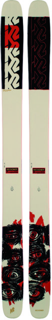

14219807:BradFiAusNzCoCa said:I had this ski. I really liked it in person aha
14137088:DilldoesDurango said:2013 Liberty Anitgens
View attachment 963783
Edit: I own a pair so I can talk shit....
**This post was edited on May 5th 2020 at 6:01:14pm
14137076:patagonialuke said:That's the 102, which I think I like better than the 112. The 122's graphic is by far my favorite of the series, which I think mostly just comes down to the colors. I just don't really love the cream color for some reason.

14221974:cyphers said:
14221643:DilldoesDurango said:I still have mine. My wife now uses it as a "powder" ski when I'm not beating them trying to learn rail shit that I'm a decade too old to do.
14225783:.Tom. said:Wow these are truly horrendous, the spurs used to look mean as well!

14225783:.Tom. said:Wow these are truly horrendous, the spurs used to look mean as well!

14225783:.Tom. said:Wow these are truly horrendous, the spurs used to look mean as well!
14226397:Simkiwinki said:Saw these at a shop a few days ago and thought they look pretty nice like definetly my favorite topshet from blizzard except for the black bodacious

14226700:poofartpee said:Still ride these regularly but shit I hate the colors so much
14221964:.Tom. said:This years NFX might be the most generic and dull graphic I've ever seen on a park ski.


14226242:gilbertressel said:
14226700:poofartpee said:Still ride these regularly but shit I hate the colors so much
14227190:.Tom. said:Not gunna lie I think these are dope.


14137088:DilldoesDurango said:2013 Liberty Anitgens
View attachment 963783
Edit: I own a pair so I can talk shit....
**This post was edited on May 5th 2020 at 6:01:14pm
14227368:MorganFrank said:
14227370:DesertStix said:Did anyone see those Reckoners on Karl’s story a few days ago? Highlighter yellow or something. [tag=109505]@bradwalters[/tag] ??
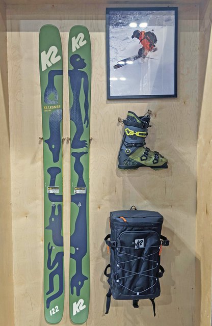
14227403:bradwalters said:The pop color on the Reckoner 112 is a bright yellow. Wanted something to contrast the dark red and black that is on the ski and help the illustration jump off the ski a little bit.
14227403:bradwalters said:The pop color on the Reckoner 112 is a bright yellow. Wanted something to contrast the dark red and black that is on the ski and help the illustration jump off the ski a little bit.
14227613:WillingdonBeauty said:The onlyyyy graphic I don’t like on the 2022 Reckoners are the 112’s... probably the only reason I’ll go with the 2021’s (cream with eyes) over the 2022’s...
I like the 122’s and the 102’s are just as nice but those 112’s are a sight for sore eyes
**This post was edited on Jan 14th 2021 at 11:03:01am
14227636:bradwalters said:All good! We’re keeping it moving over here so hopefully there is something for everyone! I’m currently skiing the eye ones also.
stoked you like the 122 and 102!

14227638:WillingdonBeauty said:View attachment 988890
Easilyyyy my favorite graphics other than the Bent Chetlers. The Reckoner 102’s are slowly becoming my favorite ski for Midwest shit
14137228:Jaxnson said:View attachment 963807
The K2 Juvy. They were my first twin tip ski as a kid but I absolutely hated the graphics. I’ve always hated the flashiness of bright colors on skis which is unfortunate now because I got Magnus 102s but these skis were just terrible to the eye. Not to mention that they were identical so there was no uniform to which ski went to which foot.

14234914:larilinesign said:

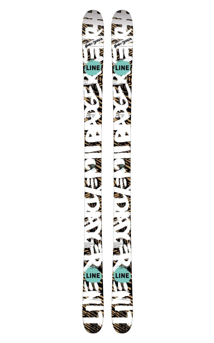
14234923:armchair_skier said:I swear Line's park skis get uglier every year
Their all mountain/powder skis look amazing though. Also the chronic looks great this year for once.
14234944:stinky_cheese said:I gotta say I do like the blends
but the honey badgers..not at all


14234914:larilinesign said:
14234916:Biffbarf said:Ok you can fuck right off I love these graphics
14235059:OregonDead said:lol . you do you mang. lots of people love Ed Hardy
14234973:lapinnopein said:Blizzard’s skis have always been on of my favourites. They would however be at the top if their desing.... would be a little bit more interesting ?
View attachment 991253
14235266:BradFiAusNzCoCa said:This is far from their worst. They had a period of like 2010-2015 where their skis were just the ugliest fucking things in the world. I do like the way the skis feel though
