little1337
Active member
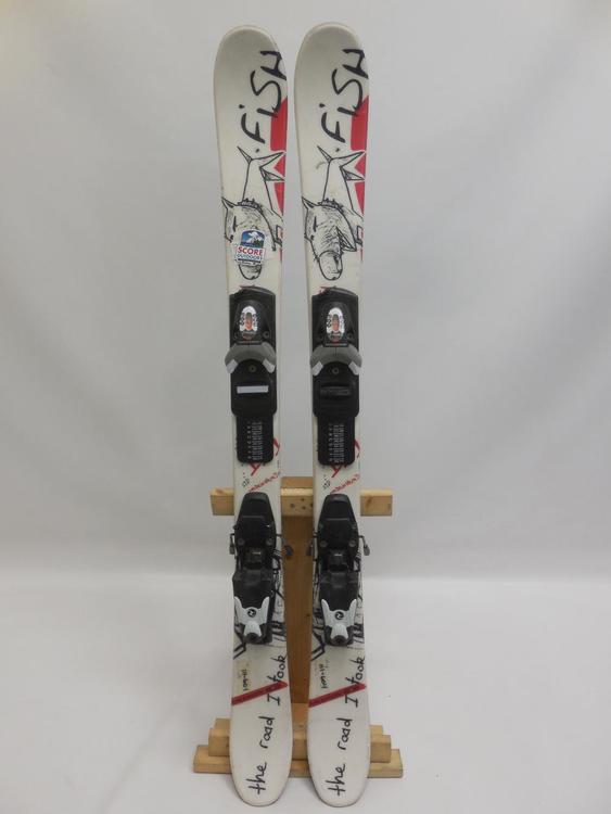
14137315:shinbangclan said:Started this same thread about a year ago because of this specific brand:
View attachment 963830
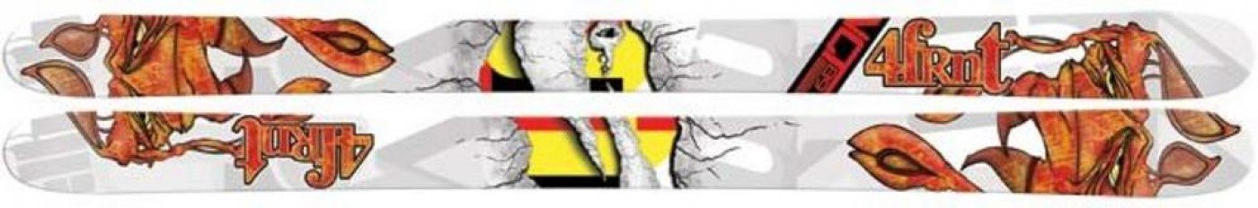
I don't know why it's so hard for some companies to not put actual throw up on their skis. Look at this fucking monstrosity. This looks like a microsoft powerpoint template.
Also, the italics... I don't think there's one season that goes by without a big brand throwing their logo in italics right across the tips and tails. Euro brands especially.
This shit gets me so worked up lol
Italics make you go faster


")