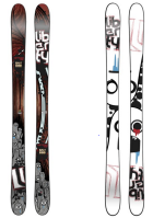
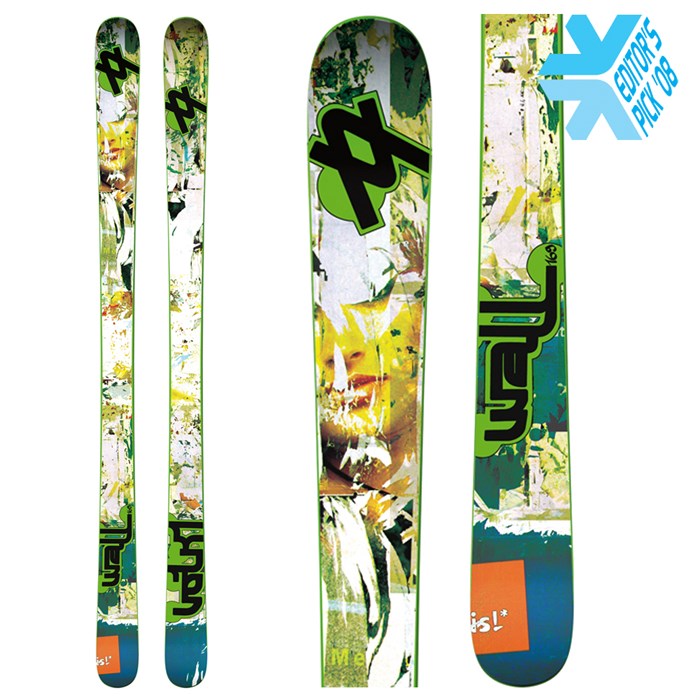
Ugliest ski graphic?

Hate to absolutely shamelessly copycat a reverse of a thread that's been around forever, and this has probably been done before but we're all bored as shit rn.

I had a pair of blizzard peacemakers as the first twin tips i ever bought and i loved the way they skied and used em till bhey broke but god damn who approved this graphic.
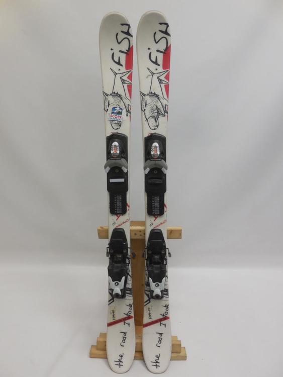
 
I used to have a pair of these when I was like 10 I thought they were sick at the time
069cb1f57ea809e6_small.jpeg


**This post was edited on May 3rd 2020 at 5:33:21pm
 
Damn bro I remember seeing a pair of those in a local second hand store when I was a kid and thinking they were siiiiiiick. oh how we change
 
14136867:little1337 said:
I used to have a pair of these when I was like 10 I thought they were sick at the time
069cb1f57ea809e6_small.jpeg


**This post was edited on May 3rd 2020 at 5:33:21pm

Oh my god dude the nostalgia, this was my first pair of twins ever. What’s the model?
 
14136961:animator said:
Oh my god dude the nostalgia, this was my first pair of twins ever. What’s the model?

Same here, they were the Salomon 1080 Fish from 2010 or 2011 I think
 
14136916:tcurle said:

black graphic on the tail doesn't look nice but tbh think these are pretty fly. maybe just because i feel like they'd pop nice against the background on camera.

icelantic has one of the best brand families/founder - plus travis, who does the topsheets, is a wonderful artist... but their ski topsheets are usually pretty gnarly.

simple is better
 
14136981:BigPurpleSkiSuit said:
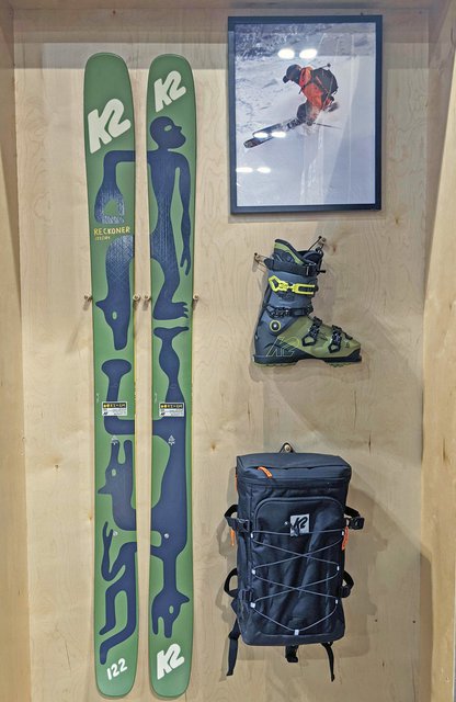
Reckoner 112 graphic does suck big anus

View attachment 963741

That's the 102, which I think I like better than the 112. The 122's graphic is by far my favorite of the series, which I think mostly just comes down to the colors. I just don't really love the cream color for some reason.

F20_Reckoner_112_Set_Tops-104x640.jpg
I do like the McFetridge limited-edition graphic though:

952844_926w_640h.jpeg
 
2013 Liberty Anitgens

963783.png

Edit: I own a pair so I can talk shit....

**This post was edited on May 5th 2020 at 6:01:14pm
 
14137076:patagonialuke said:
I do like the McFetridge limited-edition graphic though:

952844_926w_640h.jpeg

Damn I really like the look of that. Any word if it'll be available for sale? Quick google search didn't yeild anything
 
14137076:patagonialuke said:
That's the 102, which I think I like better than the 112. The 122's graphic is by far my favorite of the series, which I think mostly just comes down to the colors. I just don't really love the cream color for some reason.

F20_Reckoner_112_Set_Tops-104x640.jpg
I do like the McFetridge limited-edition graphic though:

952844_926w_640h.jpeg

limited edition ones kinda look like Keith Haring type artwork, i like

Someone should do a Keith Haring topsheet sometime tho
 
14137109:brogoldenhair said:
Damn I really like the look of that. Any word if it'll be available for sale? Quick google search didn't yeild anything

I'm not totally clear on the availability. I'm guessing they didn't make many but might be worth hitting up some K2 dealers this summer / fall.
 
14137135:little1337 said:
That screams 2013

I actually own a pair. I still have them and really like/liked the ski but I was always embarrassed by the top/bottom sheets.

They just sit in my basement since they are to ugly to hang...
 
14137109:brogoldenhair said:
Damn I really like the look of that. Any word if it'll be available for sale? Quick google search didn't yeild anything

The Geoff McFetridge x K2 project will be out this coming winter. Keep an eye out in Dec/Jan.
 
963807.jpeg

The K2 Juvy. They were my first twin tip ski as a kid but I absolutely hated the graphics. I’ve always hated the flashiness of bright colors on skis which is unfortunate now because I got Magnus 102s but these skis were just terrible to the eye. Not to mention that they were identical so there was no uniform to which ski went to which foot.
 
I'm looking through your gram and you do a lot of great stuff. This one did not tickle my pickle however. Clearly some people like it though. What other skis have you done art for?

14137225:bradwalters said:
It's a lifelong dream of mine to make it into the "Ugliest Ski Graphic" thread. :)
 
14137259:BigPurpleSkiSuit said:
I'm looking through your gram and you do a lot of great stuff. This one did not tickle my pickle however. Clearly some people like it though. What other skis have you done art for?

All good my friend! I am currently Senior Designer at K2 so there's going to be a lot of other graphics coming down the pipeline in the future. I did some work for Surface a while back on the Daily and Auburns but that was a few years ago. No hard feelings what so ever! I just love that K2 is back to giving people a reason to talk about our graphics again whether that be good or bad!
 
Started this same thread about a year ago because of this specific brand:

963830.jpeg

I don't know why it's so hard for some companies to not put actual throw up on their skis. Look at this fucking monstrosity. This looks like a microsoft powerpoint template.

Also, the italics... I don't think there's one season that goes by without a big brand throwing their logo in italics right across the tips and tails. Euro brands especially.

This shit gets me so worked up lol
 
14137315:hubbards said:
Started this same thread about a year ago because of this specific brand:

View attachment 963830

I don't know why it's so hard for some companies to not put actual throw up on their skis. Look at this fucking monstrosity. This looks like a microsoft powerpoint template.

Also, the italics... I don't think there's one season that goes by without a big brand throwing their logo in italics right across the tips and tails. Euro brands especially.

This shit gets me so worked up lol

It's this shit that makes some brands seem cold hearted, corporate, foreign entities whereas on3p, armada, etc. all at least have a sense of humor that reminds us they're real people. Those big brands know they can make the same skis every year, throw in new materials or make them lighter every once in a while and make consistent money. No soul in those skis
 
14137339:brogoldenhair said:
It's this shit that makes some brands seem cold hearted, corporate, foreign entities whereas on3p, armada, etc. all at least have a sense of humor that reminds us they're real people. Those big brands know they can make the same skis every year, throw in new materials or make them lighter every once in a while and make consistent money. No soul in those skis

Exactly, and it's why normie suburban boys think that snowboarding is the "cool" trick sport and skiing is the "lame" groomer sport
 
Watching a game of SLVSH and had to circle back around to this thread. I usually don’t mind Völkl park ski graphics (even like the coming lineup) but god are these ugly.

964570.jpeg
 
Back
Top