You are using an out of date browser. It may not display this or other websites correctly.
You should upgrade or use an alternative browser.
You should upgrade or use an alternative browser.
Graffiti Artists
- Thread starter SPECK
- Start date
Wood_Wizard
Member


Brock.
Active member
i actually am surrounded by friends of whom I showed this thread because we are about to go out and have a big sesh on my new shisha pipe. Its raining though so im still inside and ranting on this thread against complete toy which is pathetic on my part so I apologies.
Also you are a retard. read the fucking thread nort
Also you are a retard. read the fucking thread nort
MN_Nice
Active member
What the fuck just happened in this thread? You guys gotta stop hating on each other so much.
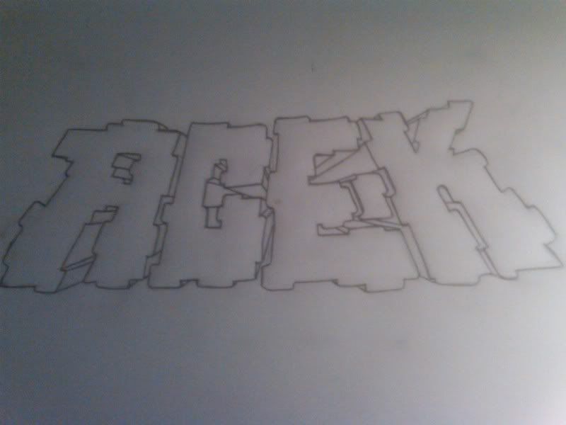
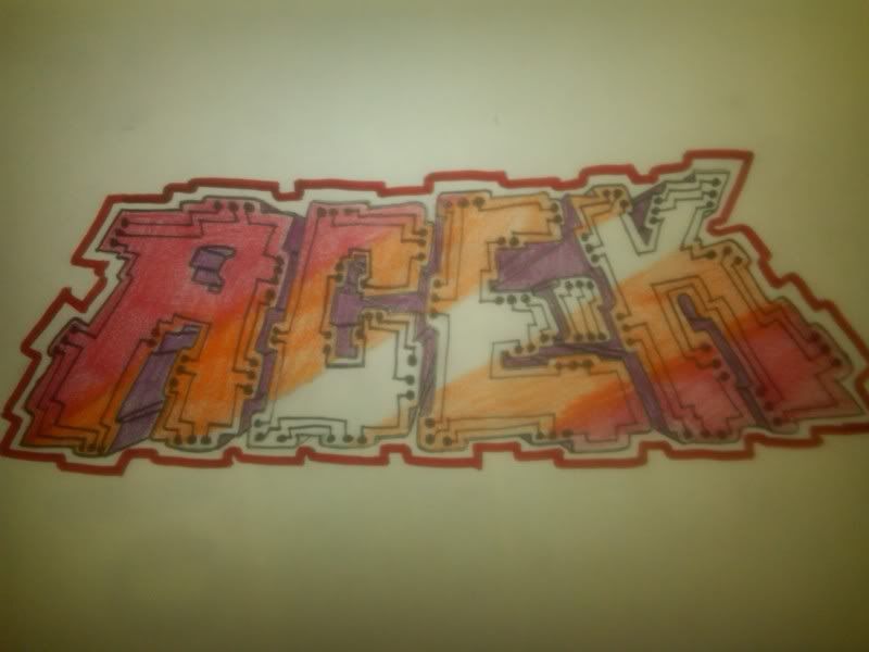
And Speck, I thought about doing that before you posted, but went with the original idea. Kind of regret it now. But I did add in some computer chip style stuff. I'll post it when I'm done.
And Speck, I thought about doing that before you posted, but went with the original idea. Kind of regret it now. But I did add in some computer chip style stuff. I'll post it when I'm done.


Wood_Wizard
Member
Thanks man
Poikenz
Active member
Being/ having a techie kind of feel to it (greens and blues would have looked better) I would have liked it to be a little more straight cut and uniform. As in the K is larger than the other letters and the "forcefield" really shows it off if you know what I mean. Instead of being straight it curves up.


Raz.
Active member
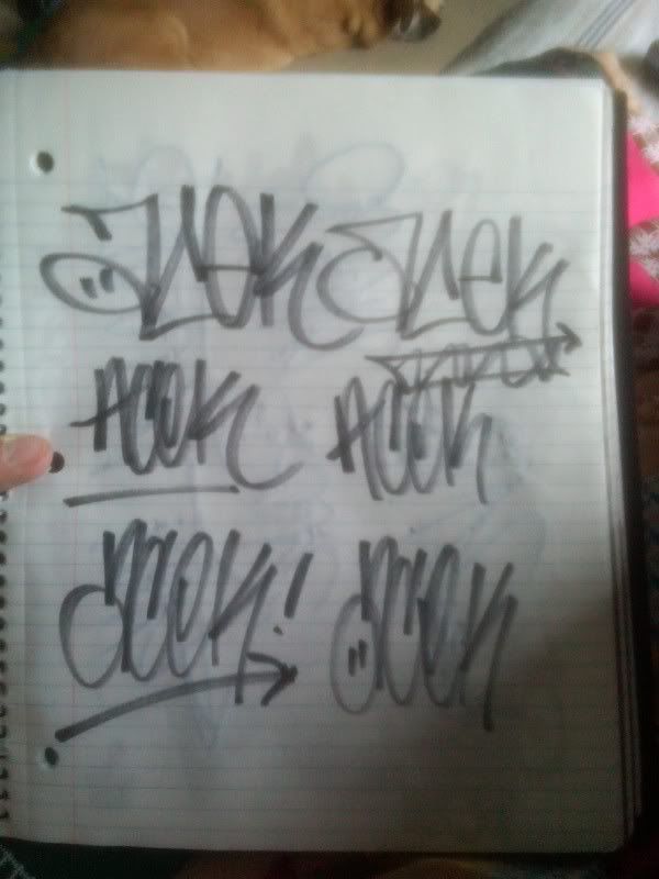
Yo Kamu those handstlyes were actually fucking sick in you'r blackbook. you'r throwies need some work, but everybodies do haha. just try too make em nice and curvy, but only curves when necessary. you dont want your shit lookin like spongebob.
and Ace.K
that bottom left handstlye is fucking fresh.
and Ace.K
that bottom left handstlye is fucking fresh.
