You are using an out of date browser. It may not display this or other websites correctly.
You should upgrade or use an alternative browser.
You should upgrade or use an alternative browser.
2013-2014 gear
- Thread starter -emile-
- Start date
The-RZA-Of-Ski
Member
thread for next images
AlexFromTarget
Member
The one in comptons picture is the dropkick tho even he said so
84891jnf92048
Active member
the pockets are definitely very different. just because its black doesn't make it the same.
jkauffman22
Active member
Threads
zzzzzzzzzzzz
Member
those T-walls are disgusting
linus_deboss
Active member
Hot Doggers are ugly... god everythings ugly next year-.- at least everything from every brand I liked this year...
fudgenuggets
Member
most of the full tilts are ugly
fudgenuggets
Member
but the new buckles look nice, hopefully will solve the durability issue
posted from nick goeppers website. http://www.nickgoepper.com/schedule-ng/
TACO-DOG.exe
Active member
i think next years full tilts look sick.
84891jnf92048
Active member
Even the two-color stuff seems a little over the top to me. It just seems like there are weird seams all over the Anomie stuff, and crazy patches everywhere. The Fatigue, while mellower, mostly pulls its visual interest from colors. I really want to see more earth-tone, single color outerwear that's made interesting not because of seams and crazy cuts and pockets, but instead because of its overall design, things it takes influence from. I like outerwear that I might as well just wear on the street as I would on the mountain.
I don't mean to cut down what you guys do at all; you guys have found yourself a niche and killed it there. However, I'd really like to see some of that gear from a ski brand and I think you guys are probably the ones to do it.
I don't mean to cut down what you guys do at all; you guys have found yourself a niche and killed it there. However, I'd really like to see some of that gear from a ski brand and I think you guys are probably the ones to do it.


Ghini
Active member
New Fritschi tech binding:
all info and photo's from wildsnow.com
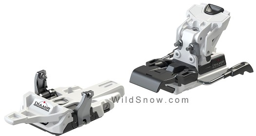
In a world where a new tech binding seems to pop up almost weekly, one tends to yawn at each iteration. After all, most are really just copies of one another. Not so the Diamir Zenith 12. This grabber includes a rather intriguing side release at the toe that’s claimed to allow a full 11 mm of elasticity, mode change on the fly, and other interesting features that may perhaps even be innovative. More to expound when we have a tester, for now here is some official verbiage and imagery. Catalog PDF is also available off our server. Catalog weight is a totally competitive 499 grams per binding.
http://www.wildsnow.com/9176/diamir-zenith-fritschi-review-skiing/
all info and photo's from wildsnow.com
In a world where a new tech binding seems to pop up almost weekly, one tends to yawn at each iteration. After all, most are really just copies of one another. Not so the Diamir Zenith 12. This grabber includes a rather intriguing side release at the toe that’s claimed to allow a full 11 mm of elasticity, mode change on the fly, and other interesting features that may perhaps even be innovative. More to expound when we have a tester, for now here is some official verbiage and imagery. Catalog PDF is also available off our server. Catalog weight is a totally competitive 499 grams per binding.
http://www.wildsnow.com/9176/diamir-zenith-fritschi-review-skiing/
tomfallon.
Member

A-Z0-9_-*+=
Member
If you want to see some of the next year Line skis just watch the new Line Traveling Circus video
A-Z0-9_-*+=
Member
https://www.newschoolers.com/watch/602231.0/LINE-Traveling-Circus-5-4-The-Loonies?c=11