You are using an out of date browser. It may not display this or other websites correctly.
You should upgrade or use an alternative browser.
You should upgrade or use an alternative browser.
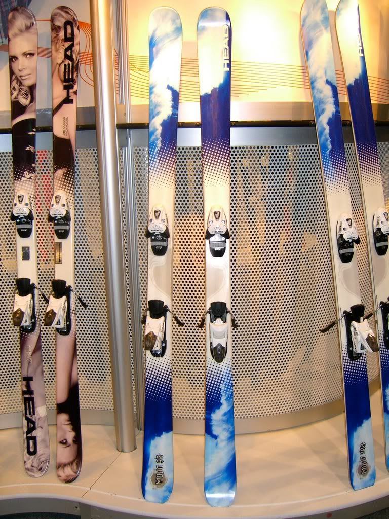
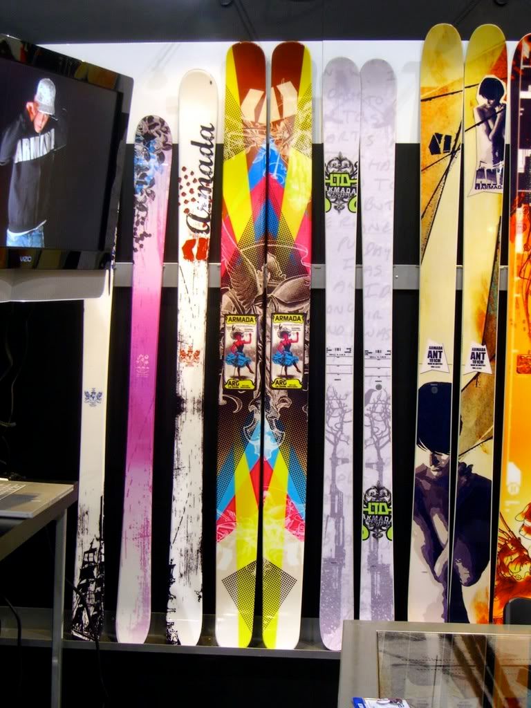
07/08 Ski Picture Thread
- Thread starter nothanks
- Start date

schmies
Active member
We don't make a Seth Pistol, and yes, it IS puke! Seth's head is puking an avalanche of snow morphing into little demon heads and skulls mixed in with razor blades that are chopping up pieces of his life, helicoptors, Cadilacs, snowmobiles, Northwest Indian totem pole, etc. All cascading down to crush a snow covered idyllic village in the tail.
Its really cluttered. I'd like the line to go back to its basics, first/second generation style. The union jack bottoms were the shit.
ARSpickert
Member
holy balls. thank you!


4frnt's look alright, but the Thruster looks like... god knows what. What the hell, can't ski companies make nice attractive graphics to put on their skis? Who told them theres a market for ugly looking skis?
Jib_This
Active member
fuck it, K2 and their army of people who get paid to spend time on NS get super angry when you rip on them and/or anything they do, whether or not you have very valid reasons. There's no winning.
BTW, you're wrong, the graphics on the Seth look alright. Then again, I'm comparing to shit like the Apache series.
Why doesn't anyone ever get offended by all the REALLY crappy graphics out there?! Huh!?! Yeah!
BTW, you're wrong, the graphics on the Seth look alright. Then again, I'm comparing to shit like the Apache series.
Why doesn't anyone ever get offended by all the REALLY crappy graphics out there?! Huh!?! Yeah!
almostaskier
Active member
i have to say, i like the look of the hellbents and the public enemies...
almostaskier
Active member
oh, and the rossi's are the type of ski i would make... white, red and black... so beautiful.
bowlripper
Active member
i like all the 4frnts
Dude, if I disagree with something a ski company I really like and buy from does, I'm sure as hell going to voice my opinion. I said that I dont like the graphics, and thats that. They're unappealing to me. And its sad, because the Seth is such a great ski.
And I am pissed about the "REALLY crappy graphics" every other ski company has decided to come out with this year. But then again, I dont respect those companies as much as I respect K2, and thus, I'm not interested in what they do.
Honestly, I'm can understand why K2 company people could be angry, but I think that public feedback is needed for any successful product. This is my feedback, and others will say differently about it. There are probably many people out there that believe it looks better than Jessica Alba. However, in my opinion, I'd have to pass.

cobra_commander
Active member
or you should just grow some balls and get a pair of 180's
nkimmes_40
Member
nope. they still have the ar6