You are using an out of date browser. It may not display this or other websites correctly.
You should upgrade or use an alternative browser.
You should upgrade or use an alternative browser.
07/08 Ski Graphics are terrible!
- Thread starter LineBoarder
- Start date
KRAMPUSNTROLLZ
Active member
The invaders don't look that bad this year niether do a lot of skis. There are too many different skis to say that one year has better creativity than another.
abek
Active member
having a little experience in the matter I would say there's a lot to ski designing that you are overlooking. To design a ski you can't just think about how it looks on a computer screen, or what the art actually is.. you have to think about every possible situation in which that ski will be seen, and for skis it's a LOT different than say.. art hanging in an art gallery.
how will the art look from 500 feet away flying through the air? how will it look up close in a shop when you are examining it? how will it look in the shop next to all the other skis? for the MSP's this year i tried to do what i could do best in thinking about all of these situations, and i feel like the versatility and the different view you get from each situation worked out kind of well, in my opinion. The multiple ski thing? yeah that's kind of silly, but think about it from a selling point. a shop might only buy one size usually, but hey look these all fit together and make a huge picture, what a great idea, i'll buy all 4 and keep them in stock and in the front of my store on display.. up close looking at them there's a ton of detail so pesky people can be satisfied.. and then from far away we have bright colors and big blobs that i think look neat.
an example picture i think exemplifies this thought-

You can't even tell there are mountains or kids skateboarding or little fliers with all of the past 4frnt logos on there.. all you see is some sweet colors that look good together from far away (in my opinion, again).
So... i'm not trying to justify the art, because everyone has their own opinions about what looks good; however, for you to sit on your computer and tell the world how much nobody even TRIED in terms of ski artwork, and how a ski covered in a big mountain is completely unoriginal..just gets me a little bit.
think about the big picture.
good day.
how will the art look from 500 feet away flying through the air? how will it look up close in a shop when you are examining it? how will it look in the shop next to all the other skis? for the MSP's this year i tried to do what i could do best in thinking about all of these situations, and i feel like the versatility and the different view you get from each situation worked out kind of well, in my opinion. The multiple ski thing? yeah that's kind of silly, but think about it from a selling point. a shop might only buy one size usually, but hey look these all fit together and make a huge picture, what a great idea, i'll buy all 4 and keep them in stock and in the front of my store on display.. up close looking at them there's a ton of detail so pesky people can be satisfied.. and then from far away we have bright colors and big blobs that i think look neat.
an example picture i think exemplifies this thought-
You can't even tell there are mountains or kids skateboarding or little fliers with all of the past 4frnt logos on there.. all you see is some sweet colors that look good together from far away (in my opinion, again).
So... i'm not trying to justify the art, because everyone has their own opinions about what looks good; however, for you to sit on your computer and tell the world how much nobody even TRIED in terms of ski artwork, and how a ski covered in a big mountain is completely unoriginal..just gets me a little bit.
think about the big picture.
good day.
SteveStepp
Active member
I kinda agree. the only graphics i really like this year are 4frnts and K2.
I do like the wolf graphic on the Lines too. Thats just badass
I do like the wolf graphic on the Lines too. Thats just badass
CoachG
Active member
Wow bro, you sound so ignorant
first of all there is nothing gay about Line's chronics. The "big ass bird" that you refer to is a crow which has been a constant theme throughout the chronic's history.
Did you ever stop to think aobut how a grpahic represents something? If you did, you'd realize that since Line was sued by a RICH rockstar for using him on last years anthems, they went with a DIRT POOR style graphic possibly to make a statement.
As for the 4frnt's, it's a great graphic concept. It shows a panorama of the same mountain at different times and conditions of the day. I think thats pretty original bro.
And Who cares if the STL's look like your little sisters drawings? Since when does a ski graphic have to have perfect text and look all professional and shit.
That's just my opinion. But just so you know, a graphic is designed by an Artist. And every artist has a story behind his or her work. So if you're going to be ignorant and bash the skis looks, you're bashing the artists as well.
AngryFromBend
Member
all the armada graphics are beyond dope.
being the street art fiend that i am, seeing madsteez design graphics for armada is amazing to me.
i have last years AR6's and they are probably the best looking skis in the history of earth.
david bowie and mr. t?
fuck yes.
and the new rossi steez graphics are beyond sick, you just gotta be able to live up to the bright and cocky colours. i might be buying a pair of those this year.... i need some pow pow skis.
if you want to talk about bad graphics, take a look at my old salomon 1080's:

the wings face the same way on both skis. they are totally lame looking... not bad park skis though.
by the way, that picture isn't actually me... just something from google.
being the street art fiend that i am, seeing madsteez design graphics for armada is amazing to me.
i have last years AR6's and they are probably the best looking skis in the history of earth.
david bowie and mr. t?
fuck yes.
and the new rossi steez graphics are beyond sick, you just gotta be able to live up to the bright and cocky colours. i might be buying a pair of those this year.... i need some pow pow skis.
if you want to talk about bad graphics, take a look at my old salomon 1080's:
the wings face the same way on both skis. they are totally lame looking... not bad park skis though.
by the way, that picture isn't actually me... just something from google.
AngryFromBend
Member
try this again.
AngryFromBend
Member
and here are last years dope armadas:
solitaryman
Active member
what about the jon olsson pro model!?!?!?!
keystoner1
Active member
i like most of the graphics this year. thrusters, jo pro, sir francis bacons, ep pros, seths, hellbents, walls, and a lot of others
Jamie_Baril
Active member
the anthems are sick
freshlyDIPPED
Active member
flyers kindA SICK not really though
DJSTEVEINNIAMIXX
Active member
i have to agree with you a bit.espicially dynastars trouble lineup,so ugly i think.
treesmann
Active member
PEs do have sick graphics, i have a pair for salehttp://cgi.ebay.com/New-2008-K2-Pub...ryZ21244QQssPageNameZWDVWQQrdZ1QQcmdZViewItem
jacobski
Member
"The anthems with the wolf = looks the shirts that trailor trash dudes wear, everytime i look at these skis, I think of dudes with mullets with that print on their shirt."
You say that like it's a bad thing, don't hate on the wolf. The fact that we've all seen shirts like that in truckstops is what makes them so baller. This thread just reminded me I want to order the shirt with that graphic on it.
You say that like it's a bad thing, don't hate on the wolf. The fact that we've all seen shirts like that in truckstops is what makes them so baller. This thread just reminded me I want to order the shirt with that graphic on it.
=KillaKyle=
Member
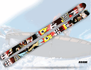
I didnt think anything could be worse then last years Foils well until I saw this years AR6 that is.
Why does everyone like the jon olsons so much? pretty girls? everything else about them is boring and cliche. there's nothing to the graphics.
The Ar6s are horrible too... what a cop out on madsteez' part. he paints some sick pictures. then he goes and does his stupid ass weenimals?Does anyone know about him that claims to be his "fans"? He does (or has done in the past ) HUNDREDS of those in a short amount of time for some company (redbul, mountain dew, nike, something xtreme) to give away to their clients/investors /suppliers. They are stupid as hell. the only thing good about them is the bright colors for brand identification like what Abe was talking about.Â
The rest of armada's/ line... don't get me started The El Ray, ARV,tanner, pipecleaner... i don't like any of them.
As for the rest of the skiing world though... Dynastar, k2, line, volkl, most others slayed a complete line of graphics that are pretty solid.
exactly, it's all opinion, and this thread was based on opinion, and it's all about talking about our individual opinions. I was taking it a step further rather than saying "I hate the ar6 lollerzzzz" i gave a reason.Â
I'm an art major, graphic designer, photographer. Art IS debatable. based on opinions. I don't buy skis based on graphics anyways, as I'm sure noone does. If i don't like them I paint over them.Â
I'm an art major, graphic designer, photographer. Art IS debatable. based on opinions. I don't buy skis based on graphics anyways, as I'm sure noone does. If i don't like them I paint over them.Â
liaosongfang
Member
this years FUGLIEST SKIS (in no particular order)
1. K2 Hellbents
2. Line Invaders
3. Rossignol Steeze
4. Dynastar Trouble Maker
5-9. All the Nordica skis
and the DOPEST graphics are (in no particular order)
1. Volkl Wall
2. Volkl Bridge
3. Line Elizabeth
4. Line Sir Francis Bacon
5. Line EP Pro
that's my simple list. i just gotta reiterate how fugly nordicas skis are. fugly
midwestfreeski3
Member
anyone like the evil lookin hell bents?
I like... I also like the flue pink bases on the seths, graphics are to say the least original to lol
best graphics go to the volkl walls imo, the ghetto, TM and BT (both editions) don't look to bad either, Solly Gun is simple but nice, the Coomba looks a bit retro but the graphics just tell you: SKI ME, HARD! Rossi Bandit's are very nice. JP vs Julien look good to
Don't like the 4frnt graphics. Got to love the steeze haha
I don't agree with you this year is so bad, but you're right about the wolf stuff on the Ant's, don't like that stuff either
midwestfreeski3
Member
haha true that