SchizoSkier
Active member
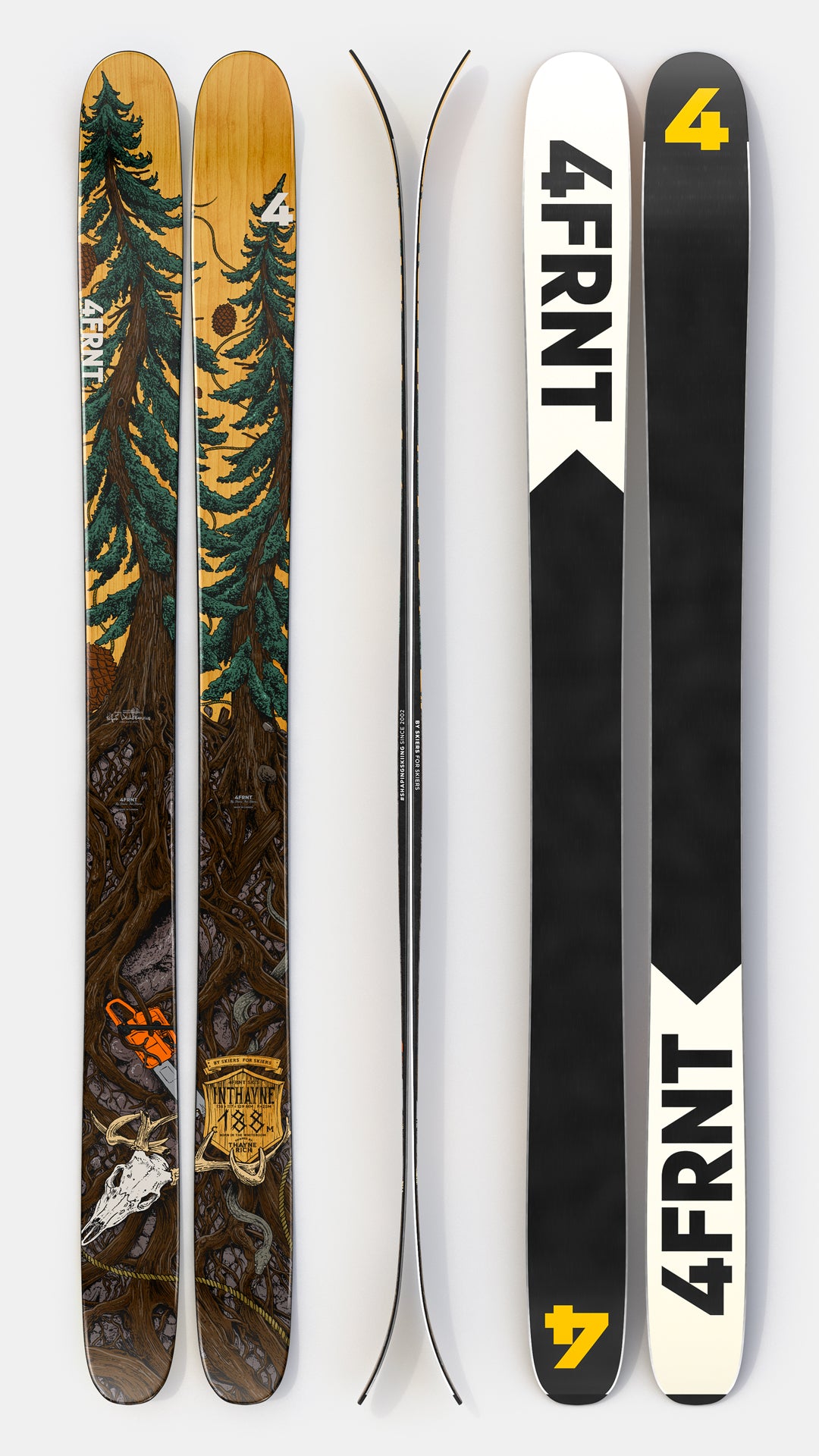
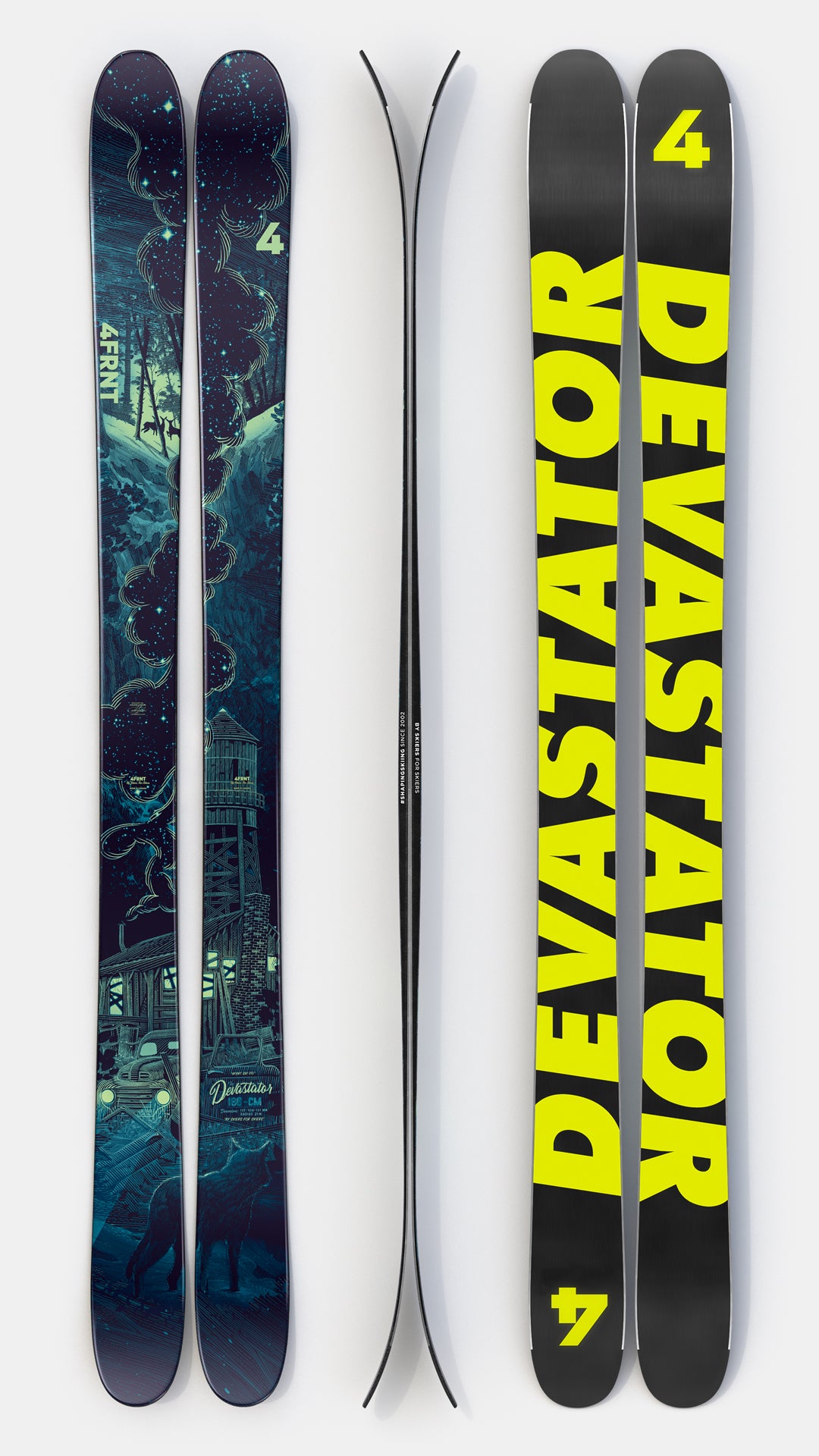
This year is seems like every company is doing some boring ass topsheets with no art or pattern or anything. Just saw this new surface royale and it’s literally just a white topsheet with “surface” written once on it

surface used to make some fire ass graphics look at the same ski but from 2 years ago

All I’m sayin is a ton of brands are switching to this minimalistic style but I think it’s gonna start to make skiing kinda bland.
surface used to make some fire ass graphics look at the same ski but from 2 years ago
All I’m sayin is a ton of brands are switching to this minimalistic style but I think it’s gonna start to make skiing kinda bland.


 Hot take alert