These guys have been working their asses off trying to come up with a logo for the Ski Movie Music site. Now I want to hear what you all have to say about them. Which one is the BEST? Most distinguishable? Worth making a sticker/shirt out of?
Bandana Guy -

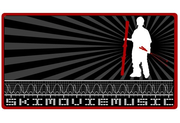
Silhouette Dude -

Box Logo -
Skull Man -

Bandana Guy -
Silhouette Dude -
Box Logo -
Skull Man -


