What do you look for in ski graphics?

jo-shmo

Member
For my portfolio for art school i was going to do a little graphic design project involving some skis. They will probably be girls skis but it could go either way... i might even do two if i have time. Anyway, what do people look for/like most in ski graphics? Oh, and the skis are gonna be called "The Media."
 
This is good keep it coming.

Oh and as much as id love to put a chick on them i dont think the examiners or whoever it is would appreciate it!
 
Have a scene of pirate fighting vikings. I came up with this idea in class today and was totally stoked on it. More so than genetics.
 
its really not whats in the graphic that matters it is more on how it is composed. if you look at some of the ski designs out there there isnt on that is the greatest they are all different. two skis that have a similar graphic build to them, ex a collage, one might be much better than another one due to how it is put together and if it flows with a common image. its not really what but more of how.
 
upgraded idea: one ski dedicated to pirates, and the other to vikings, preparing to battle, and when you do iron crosses, they are lined up so that a viking battle axe cuts through a pirate neck or something. Rad.
 
I look for something that kind of speaks to me. I've always had a thing for Ravens, dunno why. So I replaced my 06 Chronics with the 08's this season.

 
i hate girl skis theyre graphics are so gay pink flowers,rainbows and hearts with some purple and sparkes all over like the armadas this yrs they ruined it

ugh i wish theyd make girl skis more like the volkl pearls wich im hoping to get soon sick graphics light skis good stuff not skis for 4 yr olds with pink flowers all over it

ok im done feew had to get all that out of me...
 
don't look at graphics, just pick out the best ski for me that i can afford. usually this means shitty graphics but i Save mega cash for all kinds of stuff. maybe another pair of skis.
 
fairly sure you go to RISD.... but okay it's all about whatever relates to the individual. So the most successful ski graphics tend to be the most generic. Think HEAD JO Pro... hot chick relates to everyone. but it's not art.
 
girls or if your gay penis but other then that you look for something that you will never get bored of looking at and something that looks sick. basicly though you buy a ski for the performace of it and the ski that is right for you. graphics just sortta come along with it
 
that sounds pretty sick, like find a picture of telluride or some small ski town and paint it and use it as the background of your skis
 
i like simple ones. but also next year's 4frnt Madonna's are my ideal ski graphic. i think a brocade graphic would be cool too
 
i had jo pros but couldnt ski em cause i couldnt keep my eyes off em. get a cool pattern or graffiti. the base of the ski also has to have cool graphics.
 
Line and Armada (This years AR5s aside) have the dopest graphics. Refer to them. Line's next year shit is beautiful. Praxis skis has awesome graphics as well.
 
I look for composition and color contrasting. For example, one of my favorite skis are the Chronic 07's done by Zach Johnson (good artist to research for design). Know what though? Do something different, for example anamorphic art. That could have an interesting effect on skis. Personally, along with what I've said, they look for a theme; which I suppose yours is Media? Make a play on words and use multiple media forms to create your piece. Anywho, just throwing stuff out there, hope it turns out great :)
 
oh yes...gotta have those. haha

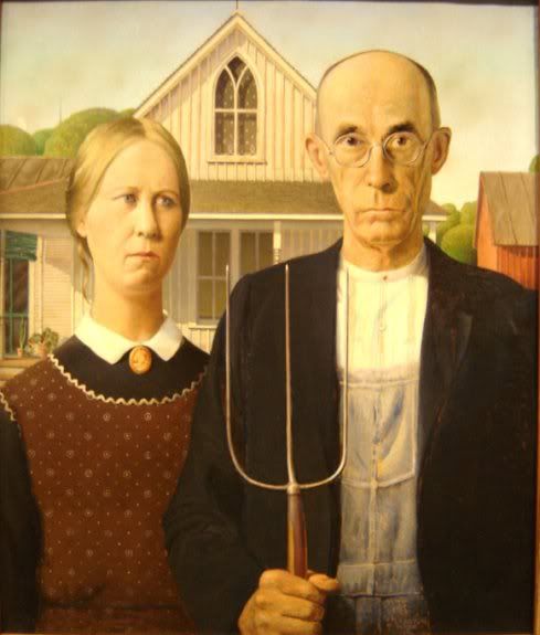
oh, they should make a ski with that picture of the old couple...the guys with the pitch fork and the woman next to him...i dont know what its called. but that'd be sweet.

any takers?
 
i found it...

KOHrails.jpg


lets hope the picture worked...but i think it would be sweet.
 
Back
Top