You are using an out of date browser. It may not display this or other websites correctly.
You should upgrade or use an alternative browser.
You should upgrade or use an alternative browser.
Ski-Related Tattoos
- Thread starter KMeanor
- Start date

saucybiscuits
Active member
get a tramp stamp like Eric Roner.
carbon.pulse
Active member
Damnnnnn any shots of the rest of her?
cultrara
Active member
hellomynameisjef
Active member
put a huge black dick on your cheek shooting a load into your mouth. that would be cool.
I got knuckle dragger across my knuckles
thebeesknees
Active member
that site has some decent ones
Hugh_Conway_jr
Member

Hugh_Conway_jr
Member
More pics of the hot chick!!
PAuL_Hellar
Active member
this that thing is hilarious
Hugh_Conway_jr
Member
...
Hugh_Conway_jr
Member
I suck at the internet.
the larger image is a pic of the famous tramp stamp
the larger image is a pic of the famous tramp stamp
LightAscension
Member
i got this one...

feihlination
Active member
when i saw the chick-snowboard tattoo it reminded me of that other not-so-hot girl i know who got a dallas cowboy QB (#7, idk who that is) over her calf. like the whole thing and it soo annoying. kinda the same.
the pray for snow one is legit, but most ski related ones (especially those with a clearly visible skier) are pretty lame.
the pray for snow one is legit, but most ski related ones (especially those with a clearly visible skier) are pretty lame.
rickroller
Active member
haha i saw that jibberish tat i lold

Bjerkan1993
New member
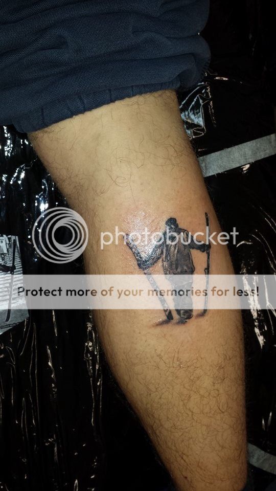
Took this to day, so stoked!:-D
Same consept as the tattoo up here, put e little more!")
Layd down for 1 hour)
Same consept as the tattoo up here, put e little more!
Layd down for 1 hour
)LiquorLanch
Active member
You must have some extra fingers there, like 4 extra knuckles.
so do you like, finger chicks super hard, like solid 7 finger spread?
so do you like, finger chicks super hard, like solid 7 finger spread?
Rafiki
Active member
really, you made an alias to post this?
as far as a tattoo critique, the line work on the skis themselves is pretty poor. looks like a hammer was taken to the edges of the skis. also, you had the artist do a dark sweatshirt with dark pants. if it weren't for that gigantic hem, there would be no division between the two and it would look like he was wearing a onesie. should have gone color or black/white with more contrast
as far as a tattoo critique, the line work on the skis themselves is pretty poor. looks like a hammer was taken to the edges of the skis. also, you had the artist do a dark sweatshirt with dark pants. if it weren't for that gigantic hem, there would be no division between the two and it would look like he was wearing a onesie. should have gone color or black/white with more contrast
Parks.
Active member
just got a my first tattoo but it doesnt have to do with skiing, it is a wolf but i kinda use it to inspire me and remind me to fear nothing. i think of it as my spirit animal and it connects a lot to my skiing. i will however eventually get a tattoo directly related to skiing.
just in case some one wants to see. (sorry it isnt directly a skiing one)
View attachment 670988
just in case some one wants to see. (sorry it isnt directly a skiing one)
View attachment 670988
Stose
Active member
Bjerkan1993
New member
Ofc it look dark when its fresh, the ink will fade out a little by time now, and it wil be the right color") never taken a tattoo before?-_^.
never taken a tattoo before?-_^.
And the edges will look better after its healing. And btw, the tattoo artis got 10 tattoo 1 prizes. And 20 years of tattooing
never taken a tattoo before?-_^.And the edges will look better after its healing. And btw, the tattoo artis got 10 tattoo 1 prizes. And 20 years of tattooing
maximiliaan
Active member
i really like this one

I was gonna say this. For some reason it's the first one I think of when I see these threads.
Somebody had one of a guy hiking up with his skis in each hand that was pretty sick too
Somebody had one of a guy hiking up with his skis in each hand that was pretty sick too
Bjerkan1993
New member
Ill take a new pic when the healing is done
So i hope that, the skiing the next 2 weeks dont make it ugly its just 1 cm above the ski boot edge at top
So i hope that, the skiing the next 2 weeks dont make it ugly
its just 1 cm above the ski boot edge at top Rafiki
Active member
actually ya, i do have one. it's about 1/3 of a chest piece. the edges aren't gonna look much better once it's healed. it's not like the lines shift when it heals. where the ink is right now is pretty much how it's going to stay, unless you pick/rub the scabs off prematurely. yes the ink will fade, but that wasn't my point. having 2 dark things connecting (in this case, the jacket and pants) doesn't offer itself to contrast. fading of the ink isn't going to help with the contrast at all.
Rafiki
Active member
i don't have any remorse for people who get poor tattoos, whether it's their fault or the artists. while the tattoo in question is a great idea, on the artists part it was poorly executed before it was even on skin. i'm just giving facts to him straight so he's not disappointed in the long run by thinking it's gonna magically morph into something it isn't ever going to become