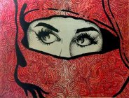
POST YOUR ARTWORK HERE!!!

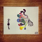
Re-intepretation of a Van Gogh painting. I forget the name. One of my best, I've had people offer to buy this before!696041.jpeg

Dr. Seuss type landscape. Fauve style. The building at the bottom I was picturing arches with being able to see through to sets of stairs.

696037.jpeg

Snake going through eyes of the skull. Classic dark art

696036.jpeg

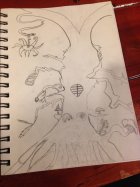
Playing around with chinese letters (some more at the top of the sketch) and an OM symbol designed on a skull. And on top of that the skull is coming out of a lotus flower!

696038.jpeg

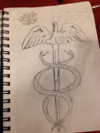
Caduceus stick. (What you see on the ambulances.)

696039.jpeg

Messing around when my thoughts were going wild. Trippy tree

696040.jpeg

 
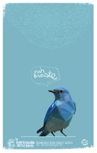
Having some fun with a fake poster. Want to juxtapose the clean low poly/geometric style against the grunge typography and border elements.

696517.jpeg

 
bump

tumblr_n1s77rsVN01rp8qh1o1_1280.jpg
 
that bird is really sick! would you mind sharing your work process? Always wondered how to get the tones to give it a 3d vibe.
 
It might have been my ongoing narcolepsy tricking me but I was staring

at that thinking it was a MacBook decal for the better part of a minute.

@Shuksan, that's one sweet bird and style you have going on there.
 
Man, I'm so humbled that people are liking my work! Thanks to everyone that has commented and upvoted over the past few days. I really love posting on this thread, and seeing what everyone else is working on too.

To dillinger, The process varies from project to project, but this one was pretty easy. I use the color picker and pick the "average" tone that best represents an area. If I uploaded it properly, this should be a .gif of the general process.

698139.gif

 
I'm really feeling the skeletal study of that horse!

Heres a quickie from in between classes.

699601.jpeg

I realy like doing pencil portraits, but I feel like I need to broaden my artistic (and creative) horizons. Maybe move into abstract, or keep practicing design.. I dunno. whatever I want to do I guess.
 
lol :D Didnt even see, a friend of mine found a similiar pic on the internet somewhere and thought it looked awesome so she asked me to try it :D Yours looks better though ;)

 
Wow, stunned that this thread is still going strong!!! some dope ass artwork.

Gonna post some of my recent artwork now that i actually posses some artistic ability.
 
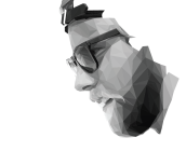
So I'm trying to do this low poly portrait of Jossi, and I just cant go any further right now. Trying to generate convincing polygons for pretty the super subtle shading in the black areas is really rough, and trying to do the hair is even tougher. I'm getting kinda frustrated actually, and if anyone has a critique, and any words of advice, I could use the outside perspective.

704411.png
 
I don't have advice because I don't do this sort of thing but I can offer encouragement, this is super sick as it is, Finishing it out would be really cool but you could even just through a few lines back, implying it continues and have it kind of fade out, almost like the titles in art of flight, just a suggestion but nice work!
 
Had to design posters for a local club night, ended up jumping on the polygon bandwagon for one of them haha!

zlzDGDz.jpg


ENwzzAN.jpg


Please clicky!!!

(and LSD stands for last school day, it's a long-standing tradition around here)
 
Finished up this today.Overall I am pretty happy with it, and the pencil part of it was a lot easier than my first pencil project, but the colored pencil par was a pain in the ass, I really didn't know what I was doing as seen in the areas like the black waters fading to yellow, the odd looking whitewater, and the trees along the beach. But it was definitely a great learning experience

704836.jpeg

and here are the original pictures:

p17jstkbri1vhr1fen86iku0mel3.jpg


216931.jpg
 
maybe not overly helpful, but when I was designing this poster I had originally planned for there to be two whole figures and then ended up just having the figure fade into the background which is another route you could try to take.704838.png
 
made this portrait of my girlfriend

705163.jpeg

some kid saw it and asked me to make him an album cover similar so i came up with this

705164.jpeg

 
12936055:Shuksan said:
So I'm trying to do this low poly portrait of Jossi, and I just cant go any further right now. Trying to generate convincing polygons for pretty the super subtle shading in the black areas is really rough, and trying to do the hair is even tougher. I'm getting kinda frustrated actually, and if anyone has a critique, and any words of advice, I could use the outside perspective.

View attachment 704411

This is super sweet as is, let me know if you're planning on ever selling a print of it!
 
12944693:RimJobber said:
How do you guys do those polygon portraits?

I'll give my insight since I did mine from scratch instead of off a picture. I did all the shapes with the line tool in illustrator. I then went Into live paint and just adjusted the brightness of a shade of gray to get my color pallet. It's not really my style though so I'm sure others can give way more help
 
12945320:Stose said:
I'll give my insight since I did mine from scratch instead of off a picture. I did all the shapes with the line tool in illustrator. I then went Into live paint and just adjusted the brightness of a shade of gray to get my color pallet. It's not really my style though so I'm sure others can give way more help

Man! I'm so stoked that everyone is feeling the polygon style. You're right. I just use the pen tool to create shapes, only instead of live paint, I use the color sampler to generate an accurate shade. I'm also going to post I video of Breno Bitencourt's process, which pretty much mirrors mine. Also check out his work for more inspiration.

After I couple people asked, I tried to write a tutorial, but it was way too lengthy and way too confusing. So here's a pared down version. Actually, honestly, Low poly isn't really my forte...


BUT

knowing the concept of what you're trying to create is HUGE when when creating geometric portraits. Basically the goal is to create the impression a geometric "mesh" that wraps around the shape. Usually this is the result of making basic shapes with 3-D generating. Here's an image of a critique of a low poly image generated in 3-d. Achieving this effect in with a two dimensional program like illustrator, requires intimate knowledge of shape and shading. This is not something to try if you've never used professional grade design software.

low_poly_analysis_1.png


Gavin's style is really sick, and it is just a flatter take on the low poly influence. If you take a look, the shapes don't quite "wrap" around completely around the face. It's like doing a painting, not making a puzzle.

The big goal here is to try to make 'plains'. These plains form the mesh that wrap around the surface. Generally speaking, the greater the curve, the tighter the triangles. The flatter the curve, the more shapes there are. Also remember that the mes doesn't end at the edge, it wraps all the way around. Triangles inside each plain usually follow shading in that direction. On a smooth surface, the further from the light source, the darker the shading on the triangle. But, again, it's a general guideline. there are always major exceptions depending on the the texture of the surface, light source, etc etc. If you look at the squares in the image above, the squares exist in two plains at the same. Just remember to keep all the plains in mind when coloring the shape.

Try to avoid making it look like there are tiny pyramids sticking off ( or indented in) the surface. The more the triangles, the smaller they are, and the more realistic the image will be. The hard part is introducing different colors and shadows. Be conscious of the fact that you're not working in a single color. Be conscious of the shadows of a surface, AND the shadows cast on the surface. The shadow cast the surface should be a cohesive plain of triangles, and exist within surrounding plains.

Another tip, is to make sure MOST of the vertices connect. If you look at stose's all the corners of his triangles line up, while only some of mine do. This just vastly simplifies the process of creating plains and generates smoother shading.

Okay, this is a helluva post, and I'm pretty sure I've just made this more way more confusing than it actually is. If you have any questions, feel free to message me.

TLDR;

 
Back
Top