You are using an out of date browser. It may not display this or other websites correctly.
You should upgrade or use an alternative browser.
You should upgrade or use an alternative browser.
POST YOUR ARTWORK HERE!!!
- Thread starter _Ryan_
- Start date

vanillabear
New member


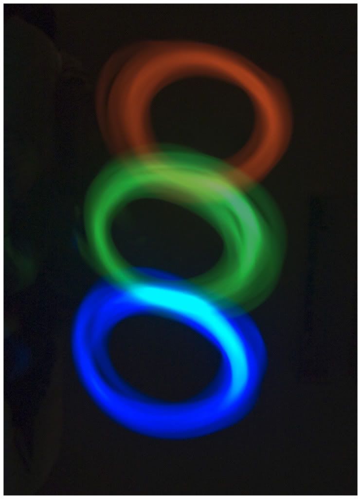
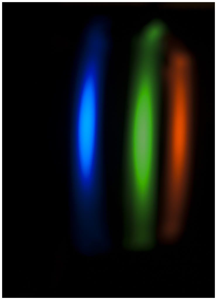
Some shots from a light writing session
dweezileast
Active member
I had to scroll all the way to the bottom only to find out the jerk behind the autoplay is the goddamn juiceman.
On the reals though joey, that was illl
On the reals though joey, that was illl


dweezileast
Active member
I'm not going to hate... but it could definitely use some work. I can tell you do a good bit of tagging because your letters have SOME extensions in the right place (not the arrow extensions). Most lettering thats not just a simple is all about creating a sprezzatura... something that looks intricate but conceals effort. When you're forming your letters, you should never just throw on an extension for no reason. Extensions help bring your eye through the piece, and therefore should be very carefully placed. I take it "skep" is short for skeptic or skeptical. Give your letters a skeptical personality. Give them a little attitude so that whoever sees them feels judged.
Another thing that can help is not judging your letters until they're completely finished. Tweak a little bit at a time, and make sure you have formulas for what you're doing. Don't bother worrying about if someone will understand what you did... the more complex you make your formulas, the more complex a mind it will take to understand it, and the less you'll have to settle for mediocrity.
As for the arrows, drop that shit. The only time I'll ever put arrows into a piece is if I create one by accident where two letters intersect. If you're heavily focused on the actual lines of your letters, you'll start to reveal arrows to yourself.
Above all, don't listen to the people that hate, they're only concerned with trying to lower the level of their competition instead of evolving their own style.
Toasty.
Active member
hence why i said i dont piece. but ya i totally get what your sayin, its hard to know what to put where and how it should look, im just sketchin everyday to try and make stuff look better. i am really bad with extensions also (obviously) i never know how to do them.
thanks for the critisim though
thanks for the critisim though


dweezileast
Active member
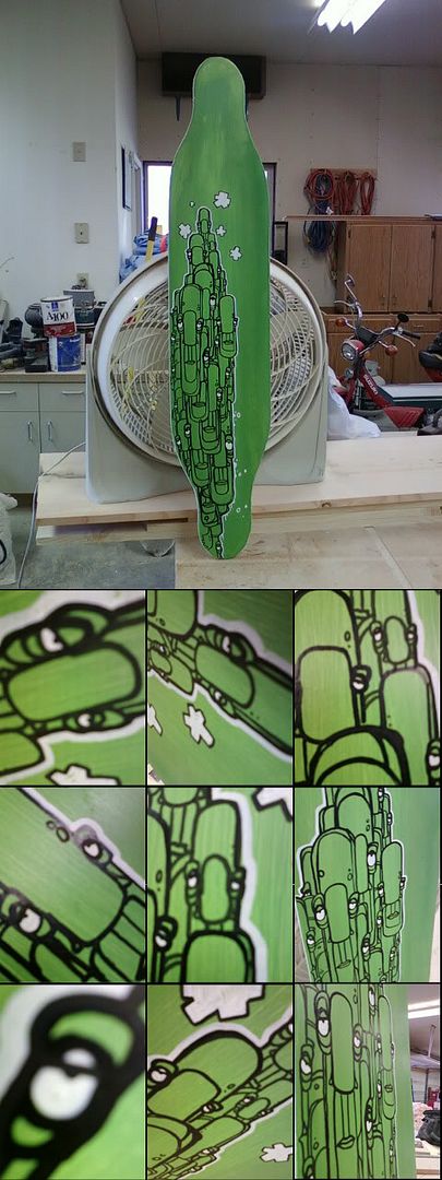
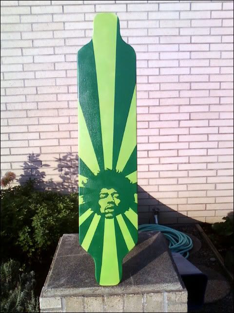
Postal sticker fun...

Cincher
Active member
Wow it's been a while since I've actually posted art in here.
I was bored and slightly aroused, so I drew my perfect woman. Yeah, I'm aware her hands are a little small for her body, I have difficulty drawing hands. Speaking of the hands, they're located over her...um...pants because I was trying to make it look like she was doing that squishing-my-boobs-together-with-my-arms thing. Otherwise, I'm pretty happy with it.


I was bored and slightly aroused, so I drew my perfect woman. Yeah, I'm aware her hands are a little small for her body, I have difficulty drawing hands. Speaking of the hands, they're located over her...um...pants because I was trying to make it look like she was doing that squishing-my-boobs-together-with-my-arms thing. Otherwise, I'm pretty happy with it.

kootenayklaus
Active member
Not a paper and pencil type of guy, but this turned out well...
Sharpness and shading in a couple of the spots could have been better. I love these half and half drawings.

Sharpness and shading in a couple of the spots could have been better. I love these half and half drawings.
disastertourism
Active member
i love this!

So much great stuff on this thread man.
So much great stuff on this thread man.

kootenayklaus
Active member
I'm working on another, I may post it when I'm done?

ryantheconnolly
Active member
i was bored so i just did this in illustrator, you can tell i got lazy towards the end

kootenayklaus
Active member
That's insane! I love Cole Drexler as well which adds to my love of that sketch.
ryantheconnolly
Active member
ok fuck that last one this is the real finished version

technique.
Active member
thats clearly vectored is sir. shit takes a long fucking time.
i did this for a stupid project. i spent a bunch of time vectoring wiz then blew off the rest of the graphic work. did it all on the trackpad of my macbook though haha

i did this for a stupid project. i spent a bunch of time vectoring wiz then blew off the rest of the graphic work. did it all on the trackpad of my macbook though haha
technique.
Active member
colors got butchered...
ryantheconnolly
Active member
i did it with a mouse. and to the other guy i changed a bunch of stuff from the original pic anyways but i guess thats almost a compliment if it looks close to the original

BeerWeed
Member
Here is some of my abstract art and graffiti drawings. Most of them I do in school/class when I'm bored and want to get lost. Unfortunately, the only way to get these on the internet was to use a scanner, which totally decreased the quality of them. =[


http://www.flickr.com/photos/62223888@N07/
http://www.flickr.com/photos/62223888@N07/

dweezileast
Active member
hell yeah with the metal face, thats sick!
disastertourism
Active member
Yay!
I felt I should contribute


I felt I should contribute

kootenayklaus
Active member
Very sick. Wish I could make pieces half that good.
k-rob
Active member

I was babysitting my neighbour recently (she’s 5), we were drawing, and I was having a hard time thinking of anything to draw. So i decided to start sketching myself sketching and it just became a sketch of me sketching their living room. Her parents got home a little while later and this was what I had done.