You are using an out of date browser. It may not display this or other websites correctly.
You should upgrade or use an alternative browser.
You should upgrade or use an alternative browser.
POST YOUR ARTWORK HERE!!!
- Thread starter _Ryan_
- Start date
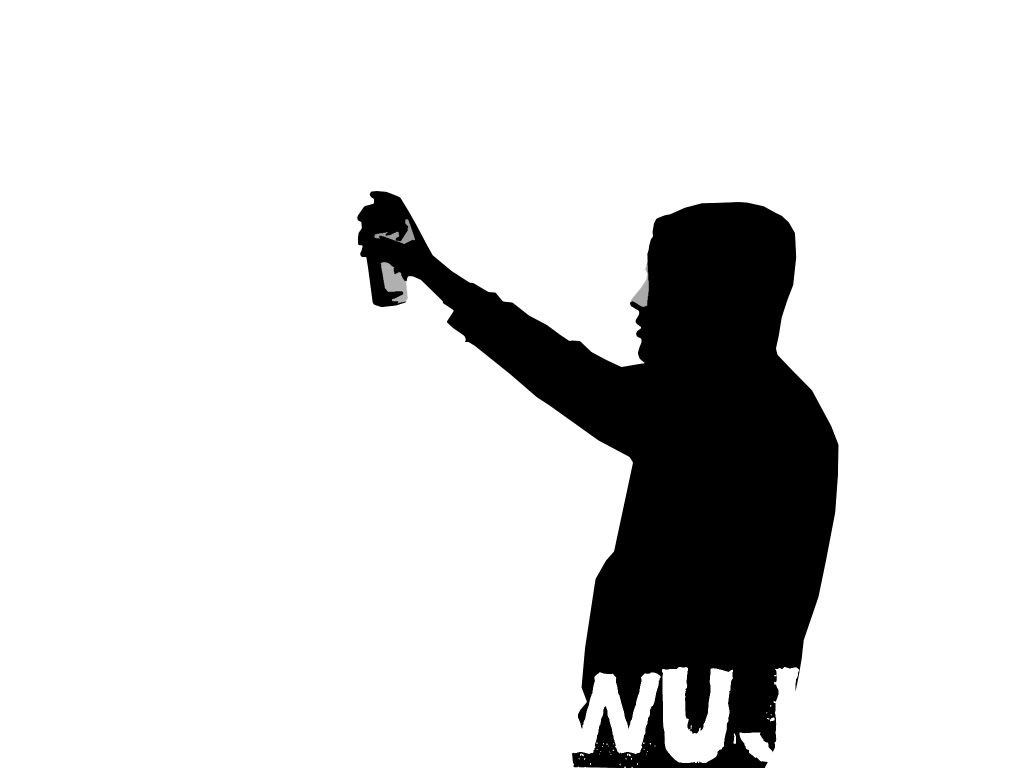
wuj.
Member
Thanks man !They're all done on photoshop. If I want a photo-realistic stencil like the one above this is the method I use:
1. Crop image and cut out all unnecessary elements via pen tool.2. Desaturate 3. Adjust brightness and contrast to get a good balanced composition4. Image > Adjustments > Posterize (choose amount of layers)5. Select > Color Range (Choose each individual color and copy them into separate layers6. Cut 'em up
They're extremely detailed and you obviously can't cut out every pixel, but with some practice, you'll find which elements are necessary. I takes awhile to know how to make sturdy stencils with proper bridges and there are also some short cuts. One short cut I use is cutting out the outline for the darkest layer and then I just stack all the other layers on top so you can't see the background at all.
Hope that helps!

wuj.
Member
Molotow has the most colors, but it's the most expensive. I've had really good results with clash spray paint. It's imported from Italy, sold in the US from http://www.004connec.com.


Schoellkopf
Active member
^Sick dude, looks dope.
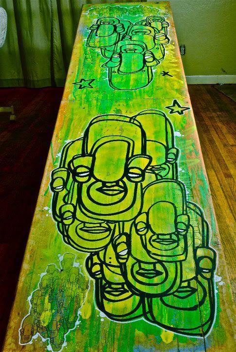
Here's my string cheese poster entry for winter carnival 2011.

Here's my string cheese poster entry for winter carnival 2011.
Shredability
Active member
So sick^
What is that made with?
What is that made with?
Shredability
Active member
solid^

skichicky3
Active member
Self portrait

skichicky3
Active member
another self portrait. I'm weird

Shredability
Active member
If were doin that


Typhoon_Media
New member
/static/images/flash_video_placeholder.png


neutralzombie
Active member
pretty sick dude!
Shredability
Active member
thanks


")


Raz.
Active member
^ for the tags, put the letters a lot closer together. And arrows generally look bad, especially when you are sort of new at graffiti. try too use complimentary color schemes throughout the fill (IE a blue fill, with a lighter blue/purple highlights. something of the sort). keep workin on it, and good luck getting up!
wuj.
Member
This is a must if you want to learn how to get better.http://www.bombingscience.com/graffitiforum/
technique.
Active member

technique.
Active member
sorry for dub post. this is a self portrait i did for a drawing class.
conte on illustration board.
conte on illustration board.
Schoellkopf
Active member
Wowawewa
disastertourism
Active member
dude your shirts are so dope.
you deliver to england?
you deliver to england?