You are using an out of date browser. It may not display this or other websites correctly.
You should upgrade or use an alternative browser.
You should upgrade or use an alternative browser.
Pollard's New Top Sheet
- Thread starter Gomer_GSX
- Start date

MrJesseHealy
Member
Interesting. Kinda looks like somethin he woulda put out a few years ago. Reminds me of the old prophets.
PeaceDivision
Member
Yeah, dukes for sure, and if you look close there are skis on the skis.
PeaceDivision
Member
^^^ SKINS. retarded sorry
chazz.
Active member
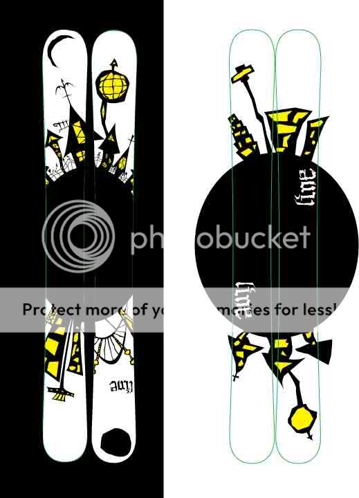
Looks like its based off some of his older designs found here... http://ericpollarddesign.com/design.html#
like this one maybe http://ericpollarddesign.com/gif/dpcityski.jpg
like this one maybe http://ericpollarddesign.com/gif/dpcityski.jpg
MrJesseHealy
Member
I get to meet him on Friday and Saturday he's comin to my shops big Sale maybe I'll ask him.
Claim.
Claim.
snarfsnarf44
Member
hmm, i like this years ep pros and bacons more, but this is still ok. those gfx like 5 posts up are amamzang. skis dont look good when the graphics are too cluttered. thats why i like this years ep's so much. nice n clean n fresh ")
Fish_Sandwich.
Active member
You don't really want to skin a rockered ski, that must be hell.
baseballski03
Member
so i saw this when checking out the EP pros the other day, just seeing if anyone else has noticed. on the front tip of one of the skis (can't remember if it's right or left) the branches spell out "give". anyone else see it? know if it was intentional in ep's design?
cobra_commander
Active member


baseballski03
Member
^by the way that is on the current ('08-'09) ep. not the new one. sorry this could have been the wrong thread for that comment due to that confusion but i figured a lot of people would look at this that were framiliar with the current ep pro
division.bell
Active member


DangerToes
Active member
dope, but he'll never top the first two elizabeths
*WonderBread*
Member
i wonder wat and how much he smokes before he paints this stuff.
joystickpimp
Member
What is this shit line is like the gayest company ever.
" dur new topsheet everyweek to get newbs to think they are buying limited edition skis, were infact this is the same ski ass 2 years ago with a new sweet pollard graphic"
Goddam pollard graphics are like 2 year old sketches the anthem by pollard has fuckin circles on it! wtf are u guys shitting ur pants about???? this shits way gay.
BTW have u heard about lines newest product its the reactor binding!!!!!! again, but now with a pollard graphic! Get em quick cuz theyre limited edition.
Mex_LineJib^a
Active member
hmmm not a huge fan, kinda liked this years better. they're still sick though
Fish_Sandwich.
Active member
Ya, I bet it will work for the JJ's due to them not being absolutely massive underfoot.
king.tubby
Active member
i really like the painting the graphics appear to be taken from. almost seuss-ian
MrJesseHealy
Member
***UPDATE***
This is NOT a graphic being used on any of the 2010 Pollard skis as of now.
When I met him a few weeks ago I got him to show me the 2010 graphics on his iPhone and this is NOT one of them. The graphics however, are incredible! In each of their diverse forms, the three pollard skis are somewhat of a mixture of last years Bacons and this years Beths, a collage sort of design. The bases however... are something special. I'll leave it at that. I don't wanna kill the mans work.
ryanwar6
Active member
didn't read the whole thread, so sorry if this is repeating something...
from what I know, these skis are just some of Pollard's prototype graphics that he has thrown on skis for different people. I saw these floating around last year at hood along with a pair of extremely burly rockered skis that were like 137 underfoot with the fist Sir Francis Bacon graphic. Wouldn't be surprised at all if these graphics don't end up making it into production.
from what I know, these skis are just some of Pollard's prototype graphics that he has thrown on skis for different people. I saw these floating around last year at hood along with a pair of extremely burly rockered skis that were like 137 underfoot with the fist Sir Francis Bacon graphic. Wouldn't be surprised at all if these graphics don't end up making it into production.
Cow_Jibber
Member
i still think the 06/07's lizzies were the best
MrJesseHealy
Member
I don't know any specs, only the graphics of the EPs and Beths, and there were a few pretty similar design options on the bacons.
boyd
Member
you're an idiot- pollard blatantly says that the ski is the original anthem, and it's said on the website. i'm getting tired of people making a fit over this. it doesn't matter. if people are going to buy the ski they are going to look into it at least as much to see what the actual ski is.
Literature
Active member
It's too early for next years skis..... too early.
coolhandluke
Active member
eric pollard > dr. suess