You are using an out of date browser. It may not display this or other websites correctly.
You should upgrade or use an alternative browser.
You should upgrade or use an alternative browser.
Our Create It design
- Thread starter III
- Start date


matthasaurusrex
Active member
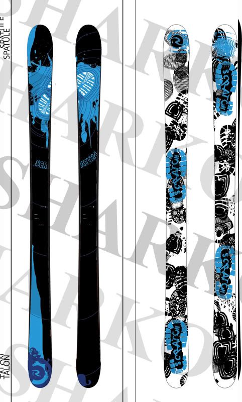
a lot of empty spaces
SteveStepp
Active member
both of them are sick as hell
SteveDorsey
Active member
wow thats so sick id buy them
hollygrove
Active member
I love that! Only thing I's suggest is like some other guy said, make the ROSSIGNOL front smaller on the base, or just do the R. Amazing job though.
ThePoopSock
Active member
wow wow wow amazing, but can they do the bases like that, with the ptex wouldnt it be kida hard
justanotherskier
Member
topsheets are dope as hell but the big rossignols on the bases are ugly


ISkiSwitch
Active member
isnt there a color limit? where u cant have too many different colors?

ISkiSwitch
Active member
I cant wait to see the final bases though. There's alot of sick designs.
BillyGoteMan
Active member
i dont like how they all have a design that like goes onto both skis
sacchettiadam
Active member
those are some real graphics. Scratch skis have shit grapics this year
almostaskier
Active member
now that... thats something i would buy.
JoeTheRipper
Active member
the first pair, that hand is a rip off of the fujatives.
Ahmets_Brother
Active member
the panda ones, footprint, and first ones are sick...id def ride all of them