You are using an out of date browser. It may not display this or other websites correctly.
You should upgrade or use an alternative browser.
You should upgrade or use an alternative browser.
Opinions
- Thread starter HaydenB
- Start date
BigdaddyPCMR
Member
Buy ful tilts and Vishnu’s and it’ll look cooler
tsingtaofanatic
Active member
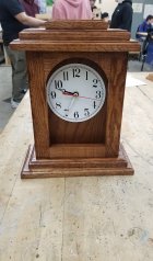
Super old school and nice woodwork!
HaydenB
Active member
14022698:iFlip said:Why is there a significant gap on the right of the clock face and none on the left? None of the grains of wood match in the framing. It looks nice upon first glance.
The face is centered, it's just the angle I took the picture at and you're definitly right about the mismatched wood
Ted_The_Sled
New member
The second hand isn't moving so I think it might be broken
DirtYStylE
Active member
You need harder wood G
SuspiciousFish
Active member
Honestly, it looks like a bomb.
