You are using an out of date browser. It may not display this or other websites correctly.
You should upgrade or use an alternative browser.
You should upgrade or use an alternative browser.
On3p X Jibberish ski
- Thread starter fillup
- Start date
I_liketobutter
Active member
its cool to see on3p become so successful over the years
coldcuts69
Active member
solid vid, skis looks dope
skinakedfast
Active member
dude thats so fucking stupid how is anyone going to be able to ski on skis that make them just continually come all over goshhhhh...........................................
snowfinder
Active member
I had that same camo on a 2 dollar shirt from wal mart.....
Granby_killdozer
Active member
damn... I waited for these all summer but didnt hear any news so i just went ahead and bought the normal frs. Now I'm bummed :,(
K-Thomas
Active member
those saying that the design sucks... at least show some appreciation for those that work hard at what they do. Although it may not be to your taste, it doesn't suck. It's actually really good from a technical aspect. How many skis have you designed... let alone to suit the needs of two separate companies. Props to TWoods and the rest of the ON3P and Jiberish crews. Collaboration is the best thing ever.
BlakeHeidinger
Member
They are jeffreys not filthy riches...
ForeverYung
Active member
@I.B, why don't you like the rocker?
I.B
Active member
I personally don't like rocker when i'm skiing park.
Everyone is different. A lot of people ride rocker'd park skis/mustache park skis. Which is cool, but i just don't like the way they look, the way they feel, the way they pop, the way my carve, the way they ride. I don't know.
I love rocker in the powder dont get me wrong.
Everyone is different. A lot of people ride rocker'd park skis/mustache park skis. Which is cool, but i just don't like the way they look, the way they feel, the way they pop, the way my carve, the way they ride. I don't know.
I love rocker in the powder dont get me wrong.
NinetyFour
Active member
If you like ON3P and haven't seen this thread yet, you need to. Absolutely amazing when you see how Scott started, and what he and the brand have become.
http://www.skibuilders.com/phpBB2/viewtopic.php?t=1288
I mean the original press and workshop... What we see now is beyond incredible.
Question for any one of the ON3P shop guys. The tooling we see in that thread, does any of it still exist at the current factory?
http://www.skibuilders.com/phpBB2/viewtopic.php?t=1288
I mean the original press and workshop... What we see now is beyond incredible.
Question for any one of the ON3P shop guys. The tooling we see in that thread, does any of it still exist at the current factory?
Thanks for the stoke! We've come a long way, but still have a long way to go.
Hopefully people like the skis. The camo pattern on there was hand drawn from scratch by Twoods and the whole collaboration has been awesome from start to finish.
As for the Tacoma garage tooling, we really don't have much left. A couple hand tools and tuning tools, but power tools wear out over time and the presses, grinders, etc have all been seriously upgraded from what we were using then. I still keep a few items for sentimantal value, but overall it is a whole new factory with all new tooling.
BigSteve69
Member
a few weekends ago i stayed at their factory with some friends and every single dude there was really nice. It was awesome staying there and seeing them work all day everyday making skis. so much respect to these guys from where they started to where they are now. ON3P is the best ski company in the game.
Granby_killdozer
Active member
no longer bummed haha
Literature
Active member
Probably a sample from the upcoming softgoods line.
Keep them ears peeled.
Keep them ears peeled.
Justo8484
Active member
rocker tip and tail, camber underfoot. been skiing on the jeffreys since last season and these skis absolutely kill it everywhere. the thing is honestly as close to a one ski quiver as i've ever been on, but it really doesn't sacrifice soft snow performance to achieve that at all. props to all involved on this one, it looks awesome.
The only similarity is that it's a camo, and has blues in it. Yea, Thomas showed me that, but not until after I had already completely the camo pattern. Those blobby shapes are ugly, definitely not a fan of BAPE as a brand or from a graphics standpoint.
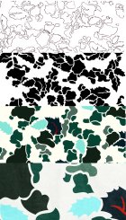
The Camo that we did for this ski is completely from scratch - Here's a rundown.
Pete and I started talking about this project over well over a year ago. When we came up with the idea to do a camo, I was hesitant - it's not my thing. I found some camo patterns that I did like, and looked at why they were appealing. Took those traits and attempted to translate them into a camo pattern that stuck to the characteristics of a traditional duck camo, and inject elements that made it applicable to the PNW - namely those cool greens, and the leaves, which are abstracted from the leaves of the Oregon Grape (The state flower)
1. Sketchbook - lots of pencil, lots of erasing, penned the outlines.
2. Illustrator - scanned in the sketch, traced it in illustrator
3. Color - colors taken from PNW foliage and my impressions of it.
4. Cordura application - Scanned a service issue canvas military tarp my from WWII and added the texture.

as you can see, the only similarities is that it's a little blue, and the shapes don't overlap and in fact sit on a background, unlike other combat camos and tiger camos.
The Camo that we did for this ski is completely from scratch - Here's a rundown.
Pete and I started talking about this project over well over a year ago. When we came up with the idea to do a camo, I was hesitant - it's not my thing. I found some camo patterns that I did like, and looked at why they were appealing. Took those traits and attempted to translate them into a camo pattern that stuck to the characteristics of a traditional duck camo, and inject elements that made it applicable to the PNW - namely those cool greens, and the leaves, which are abstracted from the leaves of the Oregon Grape (The state flower)
1. Sketchbook - lots of pencil, lots of erasing, penned the outlines.
2. Illustrator - scanned in the sketch, traced it in illustrator
3. Color - colors taken from PNW foliage and my impressions of it.
4. Cordura application - Scanned a service issue canvas military tarp my from WWII and added the texture.

as you can see, the only similarities is that it's a little blue, and the shapes don't overlap and in fact sit on a background, unlike other combat camos and tiger camos.
I can, in fact, deny the resemblance.
It's basically like saying that you can't deny the resemblance of one photographer's representation of a tree in a photo to a different photographer's representation of a different species of tree in a different season and time of day in a different photo, who have never seen each other's work. Then insisting the photographer who has a much more discerning eye and knowledge of his art and subject than you do is exhibiting some serious cognitive dissonance when he claims the only similarity is that they are both photos of trees.
If you would like to see a camo that is actually similar, Topo Designs has duck camo that is much closer.
CrotchKiller
Active member
how slow are you? jesus


