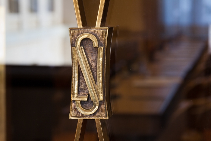
NS Logo

13147043:Mr.Bishop said:
I kind of feel like they just clash and don't work together. I don't think its what you're doing, its just that its two eras together and it isn't quite a fit.... I dunno am I crazy?

you're on the money. it doesn't work.

the current logo, or the one that was in previously, are the best and most modern.
 
13147655:LE.Skiing said:
This was another idea PM'd to me by dingosean

close to the last idea as proposed by blondie.

Here it is:

View attachment 729146

really good idea was to flip the curvy part around on one side(the left) so that it doesn't seem strange that it's just flat and straight edged. also still fits with the s and provides a solid line all the way down to not distract from the stacked logo too much.

I love it. Great idea Sean. +1 for this.
 
How about a hybridization of the old logo with the more recent logo?

ns_logo.jpg


1250181142logo_newschoolers.jpg


I feel like if you take the concept from the OG logo, and mix it with the more modern logo, there could definitely be something good there...
 
gpLQfqE.png


xbr8NQg.png


doesn't work. imo this logo was the best one. best for stickers too (the original rounded one that is)

for old time's sake:

MDbSoOQ.png
 
13147946:DingoSean said:
How about a hybridization of the old logo with the more recent logo?

ns_logo.jpg


1250181142logo_newschoolers.jpg


I feel like if you take the concept from the OG logo, and mix it with the more modern logo, there could definitely be something good there...

I'm almost tempted to say we should just do a retro run or something. That whole old thing worked well as a package - it was actually designed by the original guy that did all the Siver stuff.

I still don't know if I think the old logo and the stacked text will work together, but I'm all for keeping iterating. We won't be changing branding this year, but we could definitely look at it for next.
 
13148145:stucci said:

This is actually a lot better than I had expected it to be. I kinda like it.

13150677:Mr.Bishop said:
I'm almost tempted to say we should just do a retro run or something. That whole old thing worked well as a package - it was actually designed by the original guy that did all the Siver stuff.

I still don't know if I think the old logo and the stacked text will work together, but I'm all for keeping iterating. We won't be changing branding this year, but we could definitely look at it for next.

Yeah, I like bringing back the old logo and going retro for a bit. That would be rad.
 
I had a few other ideas I was kind of playing around with. all of it is purely rough(so that's just something to keep in mind when judging). I am aware of how much some of these do not go with the stacked text at all. I was purely just messing around with the letters N and S. Anyway here is what I have been up to the past few days.

729359.jpeg

Above: So I first started out with the one on the right I just thought it was kind of neat and sort of kind of fits the era when newschoolers had the scribble logo. The one of the left was me attempting to bring it closer to the stacked text feel. [keep in mind it was done with paint brush and is very, very rough. Also this design will be referenced to later as: Reference A]

729361.jpeg

Above: This was purely just me seeing how the (right image) rough copy would look white on grey. The left by stacked was just me playing around with the letters from the stacked logo. seeing how I could fit them together while trying out a different approach at the one letter being inverted.

729571.jpeg

Above: As I mentioned before I would be using Reference A later. Basically I showed Reference A to my GF she asked if it was supposed to be a snowboard and I was like "No, but you just gave me and idea" that's where this came from. I feel it can definitely still use some tweaking. It might work better if the lines where darker and the background was lighter.

Thoughts?

Just have to mention that I'm just trying out new ideas and I'm not looking to change the logo. I'm purely just throwing ideas up in the air, and if any of them catch on, that's great. If they don't I'm not at any loss.
 
Hahaha one of those looks a lot like the original League Of Nations logo:

2012_03_15_palais_des_nations_083.jpg


On mobile, forgive me if pic embed doesn't work.

**This post was edited on Oct 1st 2014 at 7:41:03pm
 
Back
Top