NEWSCHOOLERS DRAWBALL 2 !!!! (New logo) WE NEED EVERYONE!!!

Totes_Magotes

Active member
Ok, not to take away from the old thread. But we need to bring to attention in a clearer form THAT WERE STARTING A NEWER MUCH MORE ELABORATE AND PRESTEGIOUS LOGO. It's located in the Upper Left Quadrant of the whole ball next to the Sierra Skis . Com logo.

ndrawball.jpg


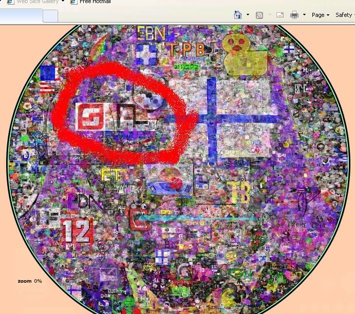
We need to Maintain a solid white rectangle around it along with finishing the logo in general.. This needs to be a 24/7 effort to build and maintain NS dominance.. GET OUT THERE

http://two.drawball.com/
 
the old thread was still good, but hey, this one's better, now everybody knows the new location !yay !!!!
maybe sticky this ?
i mean, the whole world is on this site, is there any better way to get NS advertised ?!
 
it'll reload to 100% soon enough...

JUST REMEMBER (EVERYONE) - USE INK WISELY.. no erradict line.. do smooth line and concentrate on getting as much in as possible

WE CAN WIN THE FIGHT
 
lettin this ink fill, but this ones startin to look gimped, the old one is more to proportionate
 
well my inks out..

For everyone out there.. We need to fix the location of the extention of the N.. What i'm saying is the part that pokes out in black which makes up the space in the S... it's TOO FAR DOWN.. let's do it
 
when its out of proportion, you just start making the letters fatter or thinner to make it right, its normal in the beginning...
 
hello blake i would enjoy being a part of dis thred!!!!!!!!!!!!i will start now it's gonna be sick everyone and not draw dicks on it
 
our old one is pretty fucked, but i dont see the use of making an even bigger one if we cant even maintain our old one.
 
i just used up my ink to whiten background. lookin good so far but the logo itself needs to be fatter and the background needs a bunch of whitening
 
Back
Top