You are using an out of date browser. It may not display this or other websites correctly.
You should upgrade or use an alternative browser.
You should upgrade or use an alternative browser.
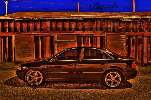
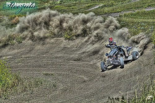
New Photo Method
- Thread starter Steezula
- Start date
Whoa, I like.
in the right application, IE advertising, illustration or similar things, I realllllly like the concept.
Being a photographer, I think that the essense of photography is capturing images with a camera and it's functions, (and if you shoot on film, printing processes).... So I don't think I would call that photogarphy, i would call it what you said, a "photo method" or a method of processing a digital image.
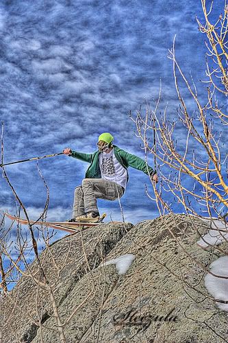
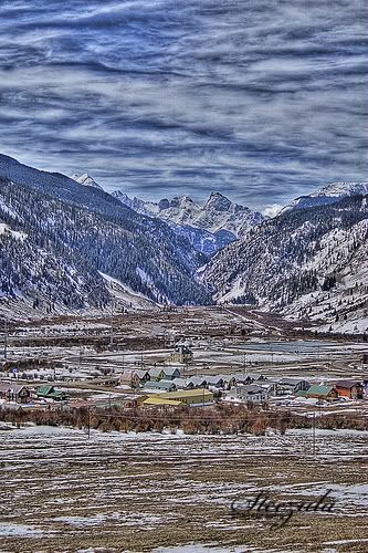
looks sick though, especially the clouds in the last image
Being a photographer, I think that the essense of photography is capturing images with a camera and it's functions, (and if you shoot on film, printing processes).... So I don't think I would call that photogarphy, i would call it what you said, a "photo method" or a method of processing a digital image.
looks sick though, especially the clouds in the last image
fourhundred
Active member
amazing, looks like a really good painting
hawaiiansteeze
Active member
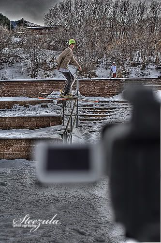
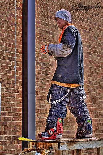
i hope everyone doesnt start making pictures into this. this will make some shots look sicker but it can kill others
Holdosteeze
Member
i think it lookes WAY to fake i dont care for it.
SteveStepp
Active member
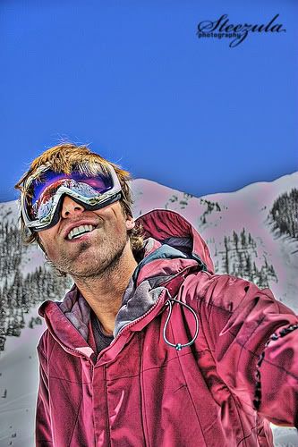
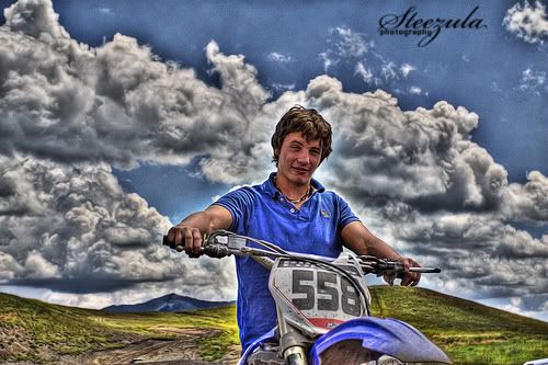
The shot of Jordan is fuckin sick
DinosaurRcool
Member
most positive thread i've seen on NS in a while
Bangor
Active member
I kinda like the look on the dude with the pink coat, just minus the background. Do it Avedon style, that look on a white background has possibilities.
Quite a cheezy effect though, I must say, so definately use with some restraint..... also keep playing with it. I feel like with a little more subtlety it could really be killer.
Quite a cheezy effect though, I must say, so definately use with some restraint..... also keep playing with it. I feel like with a little more subtlety it could really be killer.
flatspinner
Active member
I don't really like HDR (High Dynamic Range) photos all that much, they are too fake looking. Especially after you have tone-mapped them. Good effort though, I'm sure those pictures would be huge on Flickr. They love HDRs on that site.
mammothpunks
Active member
HDR is great in theory, but the haloing that automated processes gives it just makes my head hurt. Doing it manually in photoshop would take a shitload of time, but the result would be much more natural looking.
salomonskiier12
Active member
that looks sooo cool. how do you do that?
jimmychung
Active member
love it