You are using an out of date browser. It may not display this or other websites correctly.
You should upgrade or use an alternative browser.
You should upgrade or use an alternative browser.
New NS logo...
- Thread starter Franny
- Start date
VT_scratch
Active member
ya
i think i like the old one better
but im sure itll just take a bit of getting used to.
i think i like the old one better
but im sure itll just take a bit of getting used to.
ashamedkrew
Active member
i think it just looks a little more modern, which i'm down with

prontocuts.com
Active member
OMG DOES THIS MEAN MY ORIGINAL DIE CUTS WILL BE WORTH MORE?¿?¿?¿?
/caps
/caps
skinakedfast
Active member
Im saying old one ftw i just cant go under these changes
EastCoast315
Active member
the old one actually took me a minute to figure out, I like the new one better
jakepwilliams
Member
old logo is waaaaaaay cooler.

Steeze-On-Toast
Member
the more i look at it the more i like it.
the new site layout looks shweet aswell.......
the new site layout looks shweet aswell.......
Powdered_Donuts
Active member
i like it but dont do away with the old one its just to epic
maybe even bring back the old old one it was dope too and have 3!
maybe even bring back the old old one it was dope too and have 3!
dave44
Active member
well that's the best part about it. those who don't know about NS won't know what it is, but those who know and have already figured it will be able to recognize it instantly. not to mention, it's actually unique... i agree it looks kinda old, but a lil touch up coulda done the trick
the new one is just NS in curly letters... great
the new one is just NS in curly letters... great
IanAvery-Leaf
Active member
trouble__maker
New member
the new logo is crazy. We can read the S
the_moderaper
Active member
think we should update the drawball to the new ns?
summersover
Active member
I didn't like it at all when the guys first showed me it but after seeing it daily and making stickers I realized its pretty awesome and though I love both the current logo and the old school logo I think this one is equally worthy to represent us
I like how its more flowy, like a cold winter breeze?
AND YOU CAN READ THE "S" OMGZ
I like how its more flowy, like a cold winter breeze?
AND YOU CAN READ THE "S" OMGZ
*steeze_is_good
Active member
Yeah i always think that we are really lucky because someone made that logo, the new one is cool and all but it just doesnt really look creative
*TURBONERD*
Active member
sames, can we vote on this?
*steeze_is_good
Active member
Yeah lets take a vote
summersover
Active member
hahahahahaha
DrZoidberg
Active member
This one has a cleaner feel, but i like the old one better. I agree that this one is to obvious, while the old/current one is rather ambiguous and therefore cooler.
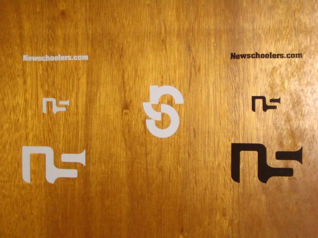
You know, the new one is completely based off of the old one.
If you put the two right side by side, you can see that we basically took the N from the original one, and just made the S more flowy pronounced.
The classic logo is dope, but we wanted a fresh look. There's a fresh look for the site, and fresh new features coming too.
It is Newschoolers 10 year birthday this year, and we thought it was important to shine it up and give it some love. This site has become a staple in the ski industry... bigger than all the magazines... bigger than all the other sites...
We're a force in the ski industry now. Switching things up once in a while just keeps it fresh while we grow.
Besides, the classic logo will always be dope, and its not like we're going to throw it out and delete the illustrator files.