You are using an out of date browser. It may not display this or other websites correctly.
You should upgrade or use an alternative browser.
You should upgrade or use an alternative browser.
Need a logo
- Thread starter Balto
- Start date
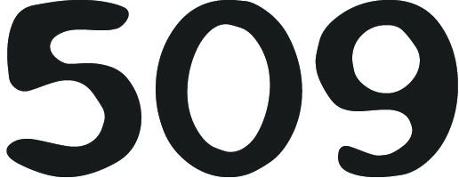

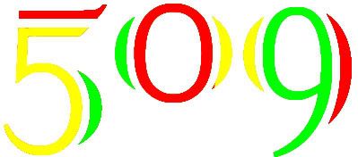
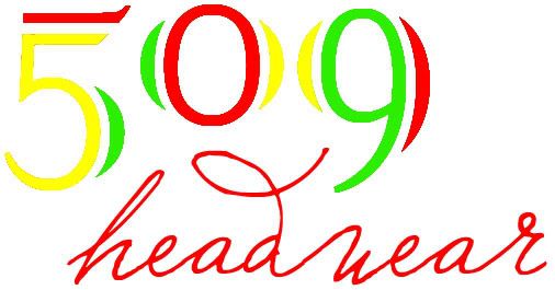
5's and 9s both have kind of a curvy 0 shape in them, so what if you
put the 9 below/on top of the 5 where the curves could meet to form a 0
in the center then wrote headwear using the down part of the 9 as the
down part of the h in the word. it might sound kind of confusing but
the image in my head is sick, im jsut a terrible artist so i can only
put the idea out there, the rasta big 509 thing is sick though props
 if someone is good at art, fuck around with it
put the 9 below/on top of the 5 where the curves could meet to form a 0
in the center then wrote headwear using the down part of the 9 as the
down part of the h in the word. it might sound kind of confusing but
the image in my head is sick, im jsut a terrible artist so i can only
put the idea out there, the rasta big 509 thing is sick though props


396222687862
New member
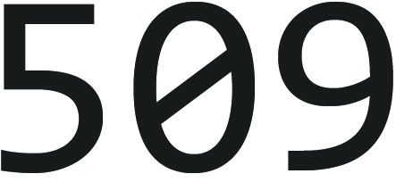
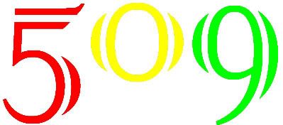
those are all dope as fuck, i'd take one of em man... if i needed a logo still for my old crew, i'd take one of them asap
~Manlenium~
Member
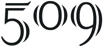
First one is the best for sure.
