You are using an out of date browser. It may not display this or other websites correctly.
You should upgrade or use an alternative browser.
You should upgrade or use an alternative browser.
My Goggle Design
- Thread starter schlopy
- Start date
FreestyleSkier89
Member
weak
ScratchFS91
Member
cant see it good. throw in some detail
steezyjibber
Active member
nahh. but it could be good

akerbacker
Active member
i think its decent, but keep on working and make it better
KillerMonkey
Active member
lame myspace, lame design, not to be a hater but highly doubt that has a chance of winning. But you never know.
erb-herder
Member
Yeah fuck coughing
dont do dugs
dont do dugs

steezeninja
Active member
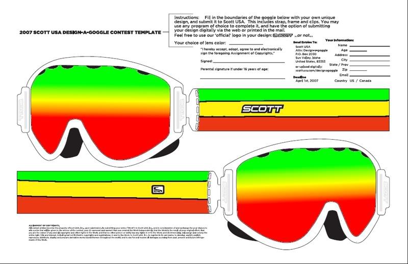
I did a rasta design too. I thought I was being original. I guess not.
steezeninja
Active member
Those are more like Retro.
PatVigorito
Member
is this contest still goin on?
t_rob
Active member
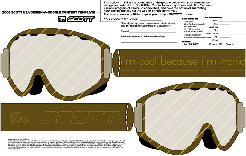
i don't know what i think of multi colored lenses? wouldn't you be seeing differn't shades of tint when your riding (ex. when you got 2 differnt colored tints like a blue silver lense and a clear on its totally differnt) So even if it looks cool if you want proformence you won't find it with multicolored lenses. Sounds like a gaper statement to me.
396222687862
New member
ahve you ever seen multi colored lenses before? or worn them? no
kickflip303
New member
Sick Design. I would buy those.

Rez4frederick
Active member
shut the fuck up, rasta will never be overplayed
SlickRick.
Active member
i dont think that lens is possible
bobtheskier05
Member
man thats weak
juanborlando
Active member
wait people are still into the whole rasta thing?