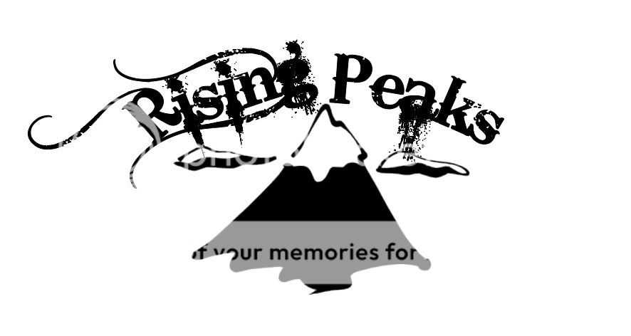
heres my final logo, i cant use the first one cause i used it from clip art just for reference but i have one more also that ima post up later this week also going to be dope, so heres my final logo, still pretty sick i think.
You should make a tall aqua colored pullover hoodie with the logo supersized on the bottom left side of it in matte gray. also make the cuffs gray. then put like R.O.B across the chest in large letters. that'd be dope. Dont have it say rising of peaks on the logo on the bottom left though
rising peaks drop the of!!!! i am telling you lose the of!!!!
the of is weakkkk just an idea so simply put together.
i literally did that in 30s on microsoft word. rising peaks is a much stronger name. lose the o because then anytime you do it as an acronym it looks like rope
not a fan of the circle one, but the blue mountains were sweet, and you should try and incorporate elements from the first one from clip art... that was solid
and to the OP, we went to a local printing company talked about what we wanted brought some designs etc and talked it out with them, they screen print them after doing samples and making sure we like how everything comes out. definitely takes a load of cash to get the first run out, but if you can sell that first load of tees you can keep producing from there. good luck and stay fresh!
I really like that, great job. You comming to the CVU rail jam this year? It's gonna be so much better than the last one, more features, and more time because we aren't doing the movie after so it's not going to stop until the snow's gone.