Logo Design

chris.G

Member
What's up M&A,

I've been doing freelance work on and off for two years or so, but am starting to get organized and get a brand/identity established for myself. I've been sketching and prototyping different logos for a few months (designing for yourself is so much harder lol) but I finally have a possible winner. What are your thoughts?

Any feedback would be awesome, thanks!
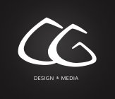
663895.jpeg

I sketched the type and then used Illustrator to create the vector
 
I'll be harsh.

The shapes of the letters are strange. It isn't easy to distinguish them as "CG", especially if you don't know that it stands for Chris G. The ampersand looks good but I would increase its size and remove the underline, because it just clutters the logo more.

I'm sure you've played around with the letters plenty, and seen enough other peoples' logos before, but I would just suggest to try and keep it simple. Maybe try to fill out the logo with the most important stuff, and leave less blank space in the background.
 
Thanks for the feedback, that really wasn't harsh either haha pretty constructive - I appreciate that.

What I was going for with the shapes were mountains.

Maybe if it were smaller and inside a circle? I should put my full name in there too. Most people that use initials in their logos do.
 
Yeah I kind of noticed that in the beginning, but is that really something you should be considering in your logo? Are you a mountain/skiing orientated designer? If not then I'd leave it out.

If you want to keep the mountains, I'd just suggest that you try to refine the shapes of the letters and cut any unnecessary features they have, and make sure their shape is well defined so they're easy to read.

Full name wouldn't be a bad idea although I don't think it's necessary. Maybe make some changes and post up the results. I'm sure that way people will be able to tell you which looks best.
 
I'm not necessarily a mountain/skiing oriented designer, but its a huge part of my personality - if it wasn't for skiing, I would have never gotten into design and media. I'd probably be in dental school right now resenting the world haha.

I really appreciate your feedback tho, it really helped me re-iterate on this. I think this one is a lot better than the last one, it needs a little more work, but I think it looks a lot more developed. I took out a bunch of anchor points and smoothed the other ones. I think the last one was too thick and the edges were too round, making it look more like a permanent marker. It also didn't have enough contrast between widths, it had contrast, but it was weak. So with this one, I thinned it a little, and made the thin sections really thin and the thicker sections relatively thicker.

I still doubt that the "CG" is really recognizable, but I think the logo itself is recognizable and gives the feel that I'm looking for (creative but professional - that's probably how all designers classify themselves haha). When people read my name they'll be like "Ohh CG," at least that's how I am when I look other designers who use their initials.

You were 100% right about the ampersand, it looks a lot less cluttered without the line.

Here's the newer:

663924.jpeg

 
The new one definitely looks better and reads more as"CG"

However, I don't find that logo aesthetically pleasing. I think this is because the shapes you used to spell CG feel very awkward. I like the text on the right though.

I would suggest taking a radically different approach and see what you get.
 
I gotta say, I really appreciate the honesty. I think it has some redeeming qualities but it definitely wouldn't stand up to the test of time.

I also tried applying to a new website design, and it scaled horribly. So I'll definitely be grabbing the sketchbook again, and post up a fresh design.
 
Take 2 -

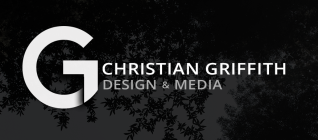
Very different approach, but keeping it real simple. I stuck just with the "G", because it lends to a simpler logo. I really like how the one on the left looks, but I worry about relying on a shadow or gradient, no matter how subtle, for something like a logo that has be used all over.

I do like the simplicity though. I want to keep my own branding simple so the focus is on my work and content, rather than the logo/brand.

Any thoughts?

664145.jpeg

 
I think the left part is great. Looks better than before, although it should still include your full name and state what you do.
 
Awesome! Thanks for the feedback man, its helped me out so much.

I for sure will include my name and what I do. Probably something like this, but the layout will change depending on the media.

664147.png

 
Back
Top