You are using an out of date browser. It may not display this or other websites correctly.
You should upgrade or use an alternative browser.
You should upgrade or use an alternative browser.
K2 graphics?
- Thread starter veng_m
- Start date
.FRY.
Active member
topic:veng_m said:I think there badass
you think where?
13121814:.FRY. said:you think where?
the brain that I don't have
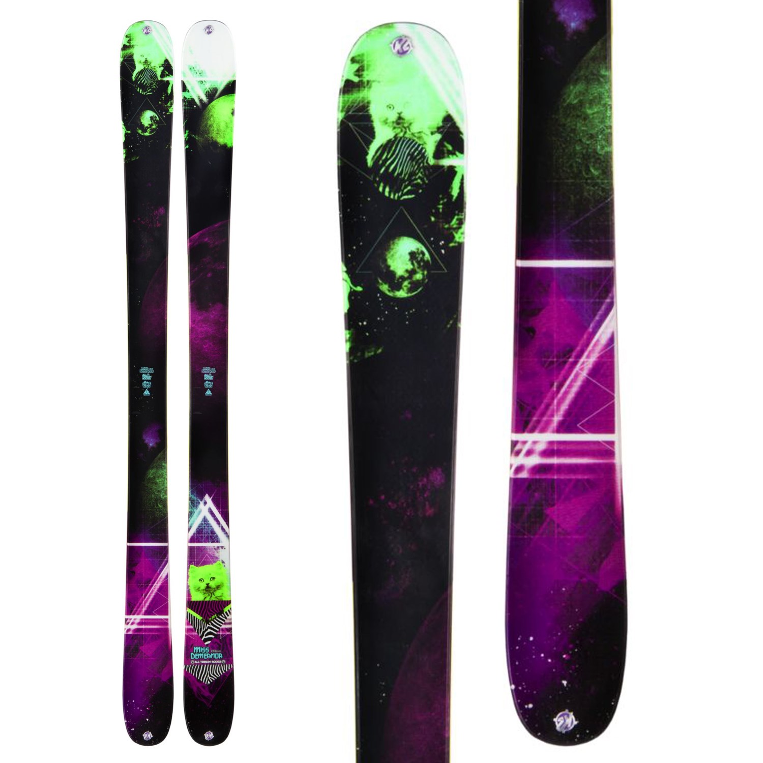
I don't know what happened to K2 but last few seasons the graphics are getting worse and worse. Iconic graphics like Hellbents, Obsethed, Kung Fujas are gone.
Upcoming season skis looks even worse and cheap as hell. Powabunga which is completely new Hellbentish kind of ski comes in plain green. They didn't even bothered to create some graphics....
Upcoming season skis looks even worse and cheap as hell. Powabunga which is completely new Hellbentish kind of ski comes in plain green. They didn't even bothered to create some graphics....
13121838:madcult said:I don't know what happened to K2 but last few seasons the graphics are getting worse and worse. Iconic graphics like Hellbents, Obsethed, Kung Fujas are gone.
Upcoming season skis looks even worse and cheap as hell. Powabunga which is completely new Hellbentish kind of ski comes in plain green. They didn't even bothered to create some graphics....
yea, I feel the same way
I checked out the powabungas and said, wow wheres the fuckin graphics K2???
IBAM
Active member
I mean, Line did that all-yellow Afterbang thing (which looked terrible), so I guess K2 is doing the same deal with the Powabungas? I mean, they look OK, just kinda lame. Most of the Annex and Shreditor series have weak top sheets, as well as their park lineup. The only ones I like are the Pettitor and Seth's Annex.
Bum.Life
Member
topic:veng_m said:I know, there pretty uh, risqué to say the least,
"Risqué"? Risqué would be a pair of titties or something, not fucking skulls
frickindarn
Active member
Caleb.E
Active member
13122321:cydwhit said:Bring back the OG Schmies drawings!
Sad thing its always been and stil is Schmies...=( hes loosing his touch to the grand world.