You are using an out of date browser. It may not display this or other websites correctly.
You should upgrade or use an alternative browser.
You should upgrade or use an alternative browser.
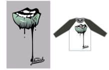
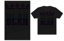
Jiberish Summer '12 Collection
- Thread starter amo
- Start date
Chief.Queef
Active member
Holy this! Little accessories.
Chief.Queef
Active member
Actually yes. No. Little things can make or break shit. Not gonna get into an argument on here about street wear but shit like that is key.
Balto
Active member
i think it needs to be a completely different kind of camo (not that standard ugly shit), and red does not go with that color camo even slightly, it clashes horribly. PLUS the tiny little box thing is stupid and way to small to even make it worth while
Ive said it before and ill say it again, why can't jiberish just have 1 or 2 logos that they use for everything. SOOOOOOO many things they have put out over the past 2 years would have been far better if it had the jcrown and not one of the million other ugly logos that is not easily recognizable. I realize this might not be the best example, but supreme has been using the same logo since 94, and just look at how they are doing.
Ive said it before and ill say it again, why can't jiberish just have 1 or 2 logos that they use for everything. SOOOOOOO many things they have put out over the past 2 years would have been far better if it had the jcrown and not one of the million other ugly logos that is not easily recognizable. I realize this might not be the best example, but supreme has been using the same logo since 94, and just look at how they are doing.
^^^^ Agreed fully. They should stick with the J-crown for most items. But I do happen to like the anchor logo that was on the summer stuff last year. I love this years LoHi logo more than last years though..
I wish they'd make more simple logo tees like they used to.. One or two every release would be great and still leave enough room for more creative/wild designs. Look at how the choppin' wood and other pieces similar to that got so hyped up, it was because they were simply, classy, elegant pieces that looked good anywhere from the mountain to the streets.
I wish they'd make a simple tee with the JIberish Cinema logo on it though.. Because I'd be all over that.
stupendous-man
Active member
BigBadWolf
Active member
repost
Chief.Queef
Active member
yesssss
KillaSeason
Active member
YES YES YES!!!!
Chief.Queef
Active member
Knowing jiberish and typical selvedge denim it will be on the skinnier side. but more of a slim fit.
I_liketobutter
Active member
psssh 514's ftw
Samstradamus
Member
thatsG
Active member
lukewalnuts
Active member
WANT DENIM SO FUCKING MUCH!
YoUnGinAYo
Member
Adam delorme Walk in the park droppin soon. it be sick


