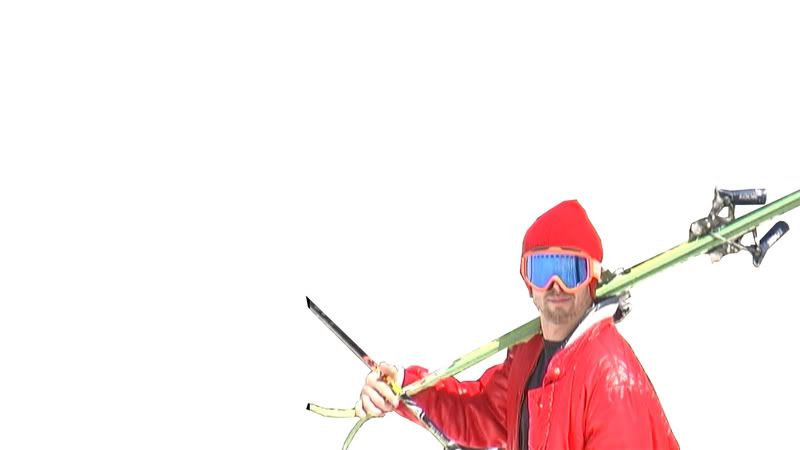
Images that define ski fashion today.

gregor

Active member
I'm designing some T-shirts for the coming season and am looking for images that are the pinnacle of whats happening in skiing at the moment. It could be a piece of artwork, the design on some skis, a cool item of clothing, a style of riding, a pattern or font that seems to be "in" at the moment. Or maybe just what you think will be cool in the next couple of years. Just brainstorm images at me.
 
As a starter, I definitely think squiggly ink lines are in as well as wide horizontal stripes and black and white checkers. Lime green and orange are the colours of this season and next season seem to be baby blue and brown. Gothic fonts seem to be the in thing but re starting to get a bit played. Old skool is on a comeback as well as steering away from gangsta. Also I've noticed trees are suddenly in everything...

Does anybody have good inspirational images that are at the forefront of snowsports fashion and culture at the moment?
 
hahaha that's exactly what was on my mind, nicely done.

Ski fashion is defined by the ugliest colours, XXXXXXXL outerwear and clothing, expensive, and overall dumb looking. Sorry to burst your bubble kids, you do look like idiots though.
 
purple is the color of next season. lay down some sick in your face graphics on the brighter colored shirts, and the tree theme or whatever on the earth tone shirts. make the shirts semi tall. not like xxxxxl tall tees, but shirts that are around 3 inches longer than your average tee. but the shirts can't be super fat either cause most skiers are scrawny. who knows though i could be way off.
 
I think ski fashion is very influenced by hip hop but also by a type of retro-pop art type thing. There are definitly influences punk too.

you can check out

www.jibij.com

www.d-structure.com

to see ski clothing but also look at digital art and art section of photo gallery

I think outlines of skiers doing grabs and vector type stuff looks cool. I don't really like the idea of bright color t-shirts tho

 
I think this image pretty much sums up ski fashion today:

1178231810-501917-600x635-1178231808late-april-002.jpg
 
i couldnt understand a freaking word taht was written in that thing. plus it was kind of homoerotic in a pedophilic kind of way
 
if you think you can compete with i8van, go for it. but i would say like urban lettering (graffiti) is the sickest font and as far as pictures, maybe not necessary. just write words only used in skiing in cool fonts in different places. like on the bottom of the shirt b the ass cheek not in the middle centerd.
 
These Ts aren't for general sale or anything, they're going to be souvenir Ts for different trips organised by us. For instance check out this parody of the Pull Up cover I've done for a summer trip to Tignes (sketch design).

1178712718-503351-600x622-1178712717T1-OLDSCHOOL.jpg


that webiste is amazing.

that being said, i agree with whoever said something about following. if you follow 'whatever's hot' at the time you start designing it's bad for two reasons. for one, it's not original, for two it won't matter, and for three it wont be 'hot' by the time it hits the market. the other thing is that there's not just one ski style. there's lots of stuff going on at the same time. make up your own designs and run with it, go outside of skiing, outside of sports for inspiration.
 
It wont be hitting any market, they're holiday souvenir T's. Just need to please the snowsports enthusiasts.
 
I say the (pre 9/11) NYC skyline, vector, black/white with the word 'urban' underneath in the roundy star-trek font or roundy '80s' font and you pretty much have an all-time best seller on your hands. Or a graffiti font for the kids.

Regards,
 
l_53add1a6e5dd00e6db666de491f550fe.jpg


Todd Walnuts, Tall Tees, Urban, LArge Jersies, Large cloths, claiming. All very popular in skiing today.
 
everyone in skiing looks like they are on the nasa astronaut space program with their bright colored and crazy matching suits
 
Back
Top