Idea for First Drop outerwear logo

Just a quickly sketched idea for First drop logo

tell me what you think

I am in no way affiliated with First Drop

1258601168FD.jpg

 
eh, its cool but I like the one they have now. your's kinda loks like the wutang W in the shape of a water droplet
 
I don't think they should change their logo, I think it's pretty legit the way it is now. Sick logo sketch though!
 
I really like it. It's creative and original, and it stands out. No offense to Lesh but I think this is way better than the current one.
 
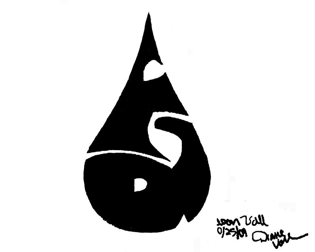
It looks pretty dope, i like the raindrop, but on the F i would see if you could fix the corners on them, i tend to think when im doing letters for a design that sharp acute corners on letters dont look that great, it kind of looks like you don't know what your doing, i understand you want to keep the shape of the drop but see if you can square out those corners a little bit
 
am i the only one who thinks that looks like absolute shit and couldnt tell that was an f or a d for like 20 seconds?
 
Thanks for the responses guys. just the idea I got down on paper it would obviously be more cleaned up.

I emailed David before I posted this and He said He'd take it under advisement. Do you think I should contact him again?

 
Back
Top