ToddlerBodyBag
Member
The new Royale looks like a Supreme ripoff. There is no way this wasn't done intentionally.

14294457:WoFlowz said:Idk man have you seen the new line graphics? Since EP left stuff went down hill fast


14294460:ToddlerBodyBag said:
14294457:WoFlowz said:Idk man have you seen the new line graphics? Since EP left stuff went down hill fast
14294799:BradFiAusNzCoCa said:2021 lines were god awful. I could have bought the 2021 Chronic for 20€ more but it was so bad, I went 2020.
Also, honey badgers have always been the worst graphics. Def meant for attracting the tween demographic
14294903:animator said:The first year it was out w that green topsheet was kinda dope but other than that I completely agree, HB is 100% a tween ski
14294457:WoFlowz said:Idk man have you seen the new line graphics? Since EP left stuff went down hill fast
14294938:ToddlerBodyBag said:If there are any Surface execs here I’ll delete the post for a free pair.
14295097:SavageBiff said:I’d say line took a big shit on their own designs, I don’t even wanna look at their skis anymore. Still I’d say Gilson has the most abundance of shitty graphics.
14295916:TRVP_ANGEL said:No one show him the new edollos...
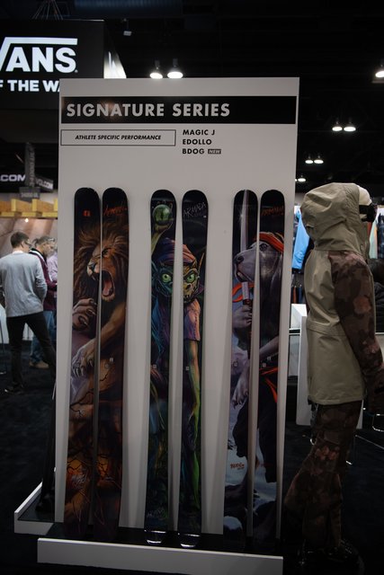
14306188:*SURFACE said:Figured we might as well post em’ all. fuck me up
View attachment 1007234
View attachment 1007228
View attachment 1007229
View attachment 1007230
View attachment 1007231
View attachment 1007232
View attachment 1007233
14306188:*SURFACE said:Figured we might as well post em’ all. fuck me up
14306188:*SURFACE said:Figured we might as well post em’ all. fuck me up
View attachment 1007234
View attachment 1007228
View attachment 1007229
View attachment 1007230
View attachment 1007231
View attachment 1007232
View attachment 1007233
14306346:BigPurpleSkiSuit said:I liked every surface topsheet except for the first one.
14306376:BrandoComando said:I'm a big fan of the Sniper, the Upper, and the Attila. Really cool looks. It's a little reminiscent of ON3P imo with the bold colors and blocky text. I also think the Royale looks good with those roses. When this thread was made, the photo made it look like a solid maroon color, and I thought it was a little plain at first. But with better lighting, I think it looks great. Nice job Surface! Kudos to your artists
14306344:No.Quarter said:You will never be forgiven for killing the Outsider/One Life

14295354:BrightFrog said:Preach. Gilson Skis continuously impresses me with how they can get customers. Must be too core for me to understand.

14306188:*SURFACE said:Figured we might as well post em’ all. fuck me up
View attachment 1007234
View attachment 1007228
View attachment 1007229
View attachment 1007230
View attachment 1007231
View attachment 1007232
View attachment 1007233
14326750:lil.Boye said:think these look pretty hard. would rock all of them.
have you even seen volkl skis dude? the graphics make me hurt
14306646:*SURFACE said:People stopped buying em’ or else we would have kept it going. might re-visit the three-stage design in the future though…
14306344:No.Quarter said:You will never be forgiven for killing the Outsider/One Life
14306188:*SURFACE said:Figured we might as well post em’ all. fuck me up
View attachment 1007234
View attachment 1007228
View attachment 1007229
View attachment 1007230
View attachment 1007231
View attachment 1007232
View attachment 1007233
14387243:FruitBootPro said:I'm praying for an improved successor to the Outsider & Odyssey next year, or the year after that
14387703:DomRichard said:I think the odyssey is no more… love mine so kinda bummed

14294457:WoFlowz said:Idk man have you seen the new line graphics? Since EP left stuff went down hill fast


