Hand Drawn Skiing Sequences Thread

Thats not good enough.... more detailed:

bigonewx4.jpg

 
Screw it, I dont know why it clips off when you click it. Just download it and open it from your desktop if you want the whole thing in minute detail.
 
Bump, please post some of yours! Here are some to get you guys thinking and being creative:

Idea I was messing with, someone will probably do this this year: Uphill urban rail to 450 Tail.

uphillurbanbw3.jpg


An old school new school trick - back when, this would assure you a win at a comp. 900 True Tail.

900tailub0.jpg


Another attempt on some perspective shots, Switch 7 Nose Mute, with the PK Hunder truckdriver tweak in the middle.

forwardtc5.jpg


C'mon, this isnt a thread just for my stuff, scan your sketches, no matter how good/bad you think they are and post them!
 
What the hell? Someone made a funny about B-hill, and I get called a flamer for responding to that?

I've done nothing you so claim, and in fact have tried to keep this thread very friendly and supportive of other peoples artwork. Everybody has something to offer and something cool in thier style. If I appear to be flaming people... I'm sorry, but I dont see where you get that.
 
Alright, I saw this thread earlier today and thought it was sweet so I whiped out the Powder magazine and found a cool sequence to base my first drawing off of. Here's what I came up with. In the picture that was a mountain in clouds in the background, but I decided that that would be too hard and left it out. There are some smudges up there from making an attempt at it.

Anyways, the trick is a switch 540 with a mute grab...BC.

firstsequence.jpg
 
Thanks guys. Any tips for improving the powder splash at the end? That's something I need work on. Like for you guys, do you draw the skier first or the powder?
 
draw the skier sinking into the snow more than the powder spraying up. so more sinking and less spray if that makes sense.
 
Here are some more recent ones:

Rodeo 7 off a natural roller in the BC:

rodeo720fb1.jpg


And a cork 7 opposite mute off of a BC kicker:

cork7oppmutelc3.jpg

 
What I do on landings is make a faint outline of what the skier will look like on the 'impact' frame. Then I usually make a lot of spray around the skis, using kind of < shaped things look pretty good when they're arranged in 'jets' from out under the skis and into the air. After I have all the spray I want, I go back and trace on areas of the outline that arent covered by spray to make the skier look like he's in the middle of it. It takes a little time I guess, but I kinda have just done a lot of trial and error to find out what looks good.

 
Yeah, I remember ATLskier's park from another thread, its so sick, who wouldnt want to have that park? Dude, you should start drawing a mythical parks series or something, they're really good.

I dont have much new to post, just one this time. Switch Misty 9 ala Jon Olsson.

switchmisty9mf3.jpg

 
yeah man, post what you have. take a look through the thread, me, rekker, and anyone else who has posted havent flamed anyone for posting anything, and anyone who has done any hating has gotten flamed themselves
 
Sideburns McGee does a switch something!

armadamuteee7.jpg


Sorry Rowen, but i have no patience when it comes to sequences... once i get going on a bigger picture (oooh movie company ref!) i can tell if it's gonna turn out the way i want; with a sequence i often screw up a frame and i get pissed... :P
 
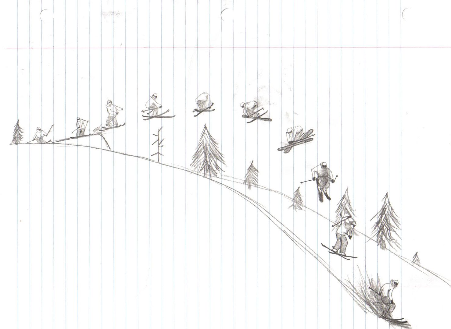
Haha, I have no patience when it comes to drawing good figures, mine are small and blurry. Those are nice though, I really like the dudes you can draw, and your artwork is so much better than mine that you dont need some crappily drawn sequence to make your art look good. Keep it up, they look great!

Also, I'm going to be on a plane for the entire day tomorrow, so I'll probably have a few dozen more to post when I get back in September.
 
here is my first. did it durint anthropology class today. its kinda a pyramid style gap, but i didnt really get the proportions right so its just kinda similar. i tried to make it look like sammy carlson doing one of his famous corked double grabs.

1156830970web.jpg


this is my art final from last year. i like it but i wish i hadnt put the stands in the background. it takes away from the skier, and the skiers red coat would have stood out so nicely against the green trees. oh well

Eddie%20Stevens%202.JPG


Back
Top