You are using an out of date browser. It may not display this or other websites correctly.
You should upgrade or use an alternative browser.
You should upgrade or use an alternative browser.
Graffiti Artists
- Thread starter SPECK
- Start date

emilyiscool
Active member
hi, so im not very good but heres some stuffs, mostly experimenting in this pic but some of the better ones i actually use.


emilyiscool
Active member
from what ive seen in this thread he has some pretty sick stuff why would you hate on that?
emilyiscool
Active member
its art, its about expression and if he wants to express that someone should fuck there face i think he did that pretty effectively, however blunt that may be.
emilyiscool
Active member
i hate people like that, :/ the guy aboves right they arent really your friends you deserve better then that shit
artfullydodged
Active member
Good vid ace

B-runge
Active member
aaron your making me want to make stickers
i have no artistic ability at all but im sure if i just got real high i could do em up sweet, probably wouldnt even put them up either
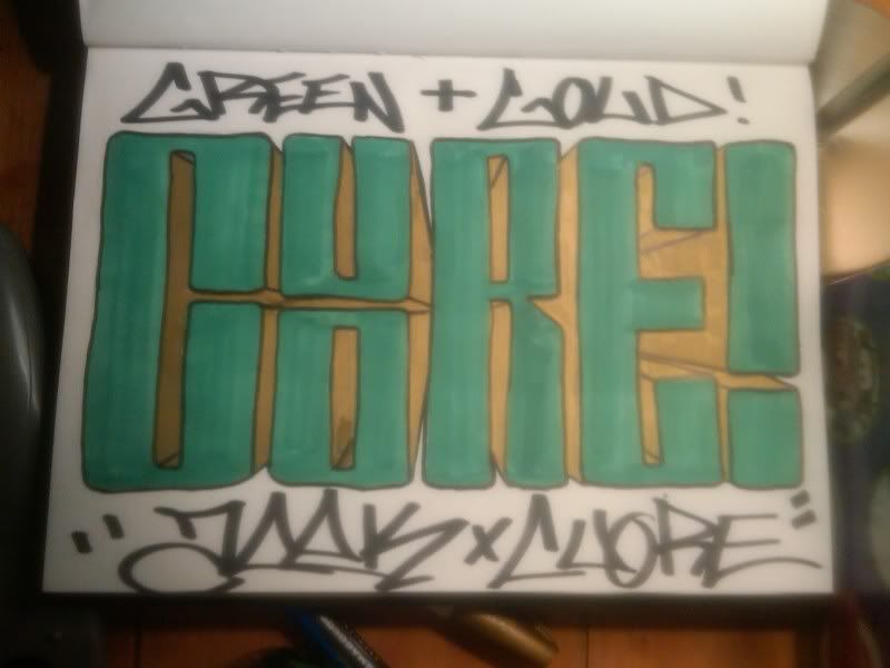
but to the above man, those neg spaces look really awkward to me like long slits through the letters, id beef em up a little more, especially the bar under the neg space on the C. also not really a fan of the double stacked letters
i have no artistic ability at all but im sure if i just got real high i could do em up sweet, probably wouldnt even put them up either
but to the above man, those neg spaces look really awkward to me like long slits through the letters, id beef em up a little more, especially the bar under the neg space on the C. also not really a fan of the double stacked letters
MN_Nice
Active member
Those are more of just personal preferences but I appreciate it none the less. And I kind of like the double stacked U and O. It wouldn't work in my book with the letter fonts like that. Plus it makes it less boring.
What do you think for a fill? I don't want to do that metallic look Speck talked about earlier, but I can't think of shit right now.
What do you think for a fill? I don't want to do that metallic look Speck talked about earlier, but I can't think of shit right now.
B-runge
Active member
idk, do whatever your feeling for a fill, thats a pretty simple piece so i would keep it simple
but
take a look at these (kids just staring who dont know how to make a letter)
this is how to make letters with bars
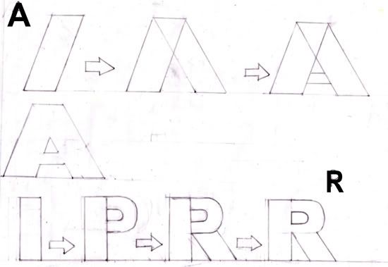
this is how style and flow is added to them by altering them

look at pretty much most graff and you can pick out the bars (imagine them in your head, just flat rectangles) and then see in which ways the writer altered them this way and that to make a sick looking flowing piece
but
take a look at these (kids just staring who dont know how to make a letter)
this is how to make letters with bars
this is how style and flow is added to them by altering them
look at pretty much most graff and you can pick out the bars (imagine them in your head, just flat rectangles) and then see in which ways the writer altered them this way and that to make a sick looking flowing piece


*Pow2ThePeople
Member
finally the hate in this thread cooled down a little bit...
so i kinda embarrassed myself with my post a few pages back... so id like some feedback on this one:

the two words have nothing to do with each other, they are just on the same page.
also, ive said this before but i dont write my "name" or anything, its mostly just random words. i do need a name at some point tho...
so i kinda embarrassed myself with my post a few pages back... so id like some feedback on this one:
the two words have nothing to do with each other, they are just on the same page.
also, ive said this before but i dont write my "name" or anything, its mostly just random words. i do need a name at some point tho...
*Pow2ThePeople
Member
haha nice, i wasnt expecting good feedback but I'll definitely take it, thanks man!
rareison
Active member
Bought some Ironlak cans today, but they were frickin $10 each. And I bought some permanent markers at the dollar store lol. I found this one huge one there and the tip is 3/8th's of an inch, it's pretty cool. Got some tags in today. Gonna make a mural and do some throwies I think.
Wood_Wizard
Member
Why did you buy $10 paint, that much money on paint is a wast of money especially considering its ironlak which normally goes for $5 tops.

rugmuncher
Member
I found montana gold in a shop today, it was the cheapest paint in the shop 0_0 I bought 2 cans for £6.50 each... I'ma have to get cheaper paint in the future...
