You are using an out of date browser. It may not display this or other websites correctly.
You should upgrade or use an alternative browser.
You should upgrade or use an alternative browser.
Graffiti Artists
- Thread starter SPECK
- Start date
")
dweezileast
Active member

dweezileast
Active member
ha yeah this week was nuts, i had a lot of free time and a few big nights at work so i rewarded myself. Its not officially a legal place, but it's in a pretty bohemian part of town so no one gets too worked up about it. at one point a guy rode by on a bike and tell me to keep painting no matter what anyone said.
BASEDRILEY
Active member
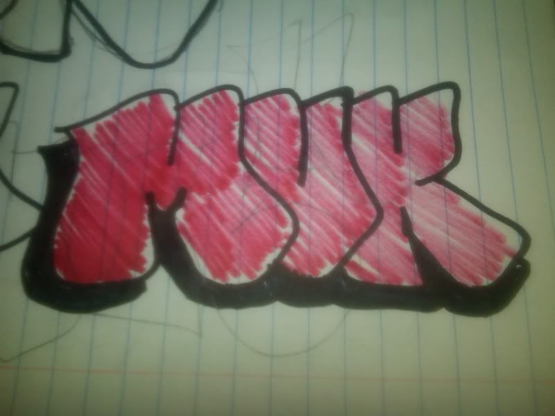
let me hop in on this too. once agian i write muk.
dweezileast
Active member
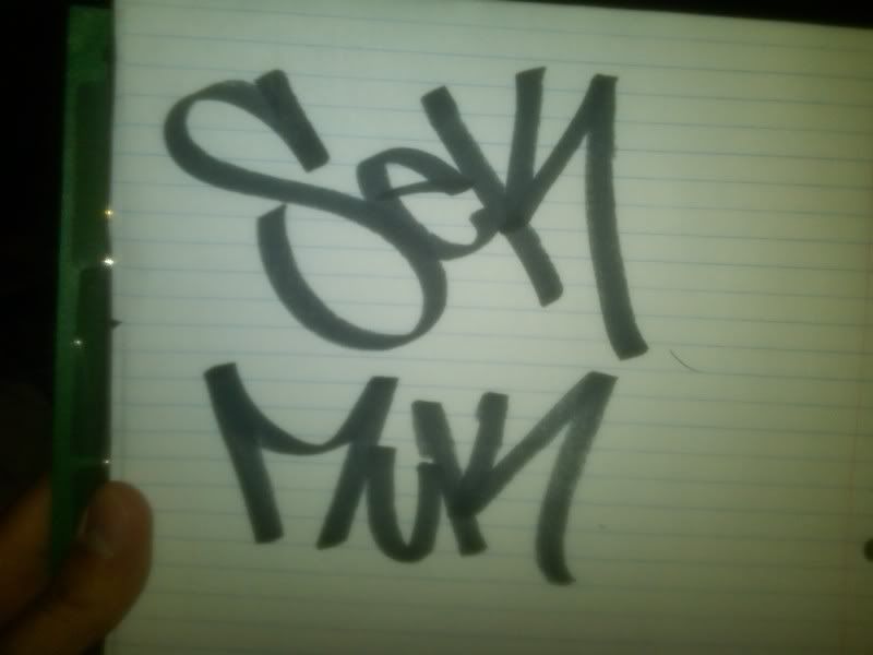
yeah i'm for that. You have a few options... I write either fate one, sekos... or if you're feeling ambitious: uomo senza nome
BASEDRILEY
Active member
doing all of them.
BASEDRILEY
Active member
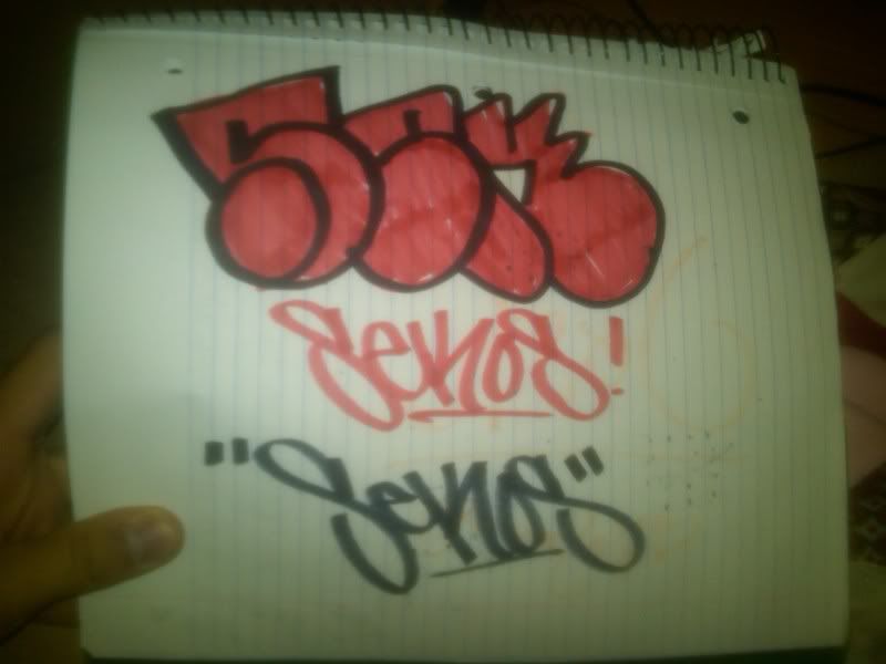
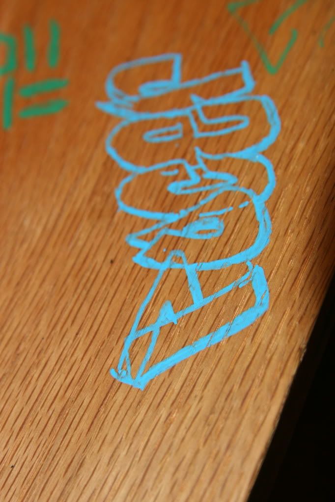
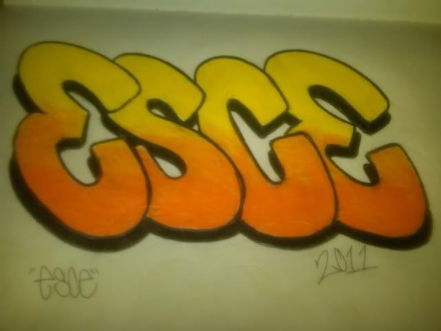
I cant write seckos for shit so im not doing that one. heres the esce throwie though.
also dump of all my shit!!
 lets see if this picture works.
also dump of all my shit!!
BASEDRILEY
Active member
here we go:1 Fire Extinguisher 2 tag done with it. 3 flare with coversall and astrofat 4 silver deco trash can 5 split streaker 6 ESCE


JStrathern
Active member
THIS IS NOT MY WORK, this is a friend of mine who's pretty good at drawing so I thought I'd share.


dweezileast
Active member
Dope! Are you still writing poker?
BASEDRILEY
Active member
Pick a word and find a hand style you like, Get some comp boooks and fill them with the handstyle over and over. Then move to throwies. So on
dweezileast
Active member
-try different names out
-don't fall in love with just one name
-I find that the things i keep writing over and over are usually words I don't take terribly seriously
-once you have a name, get creative and switch around the letters in the word, or switch how you spell the word
-don't fall in love with just one name
-I find that the things i keep writing over and over are usually words I don't take terribly seriously
-once you have a name, get creative and switch around the letters in the word, or switch how you spell the word
dweezileast
Active member
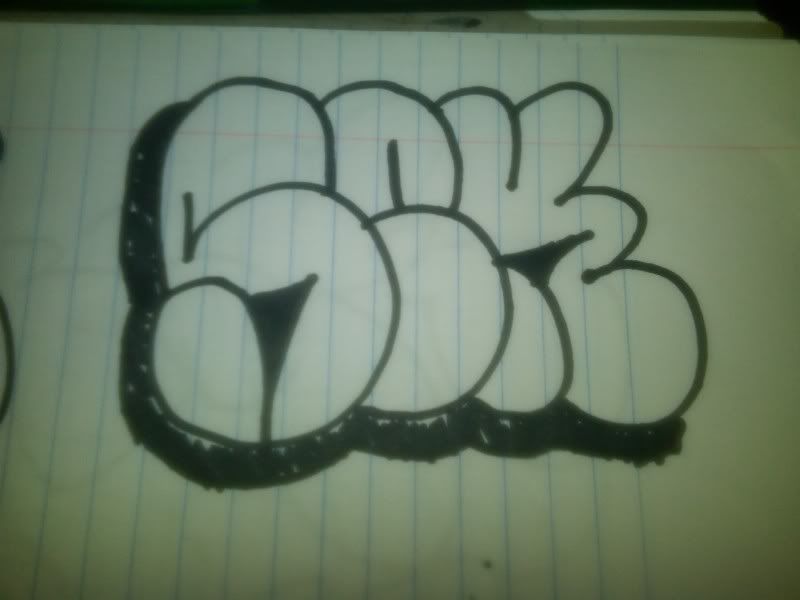
that SEK throw is dope, i'm going to start fucking with that.
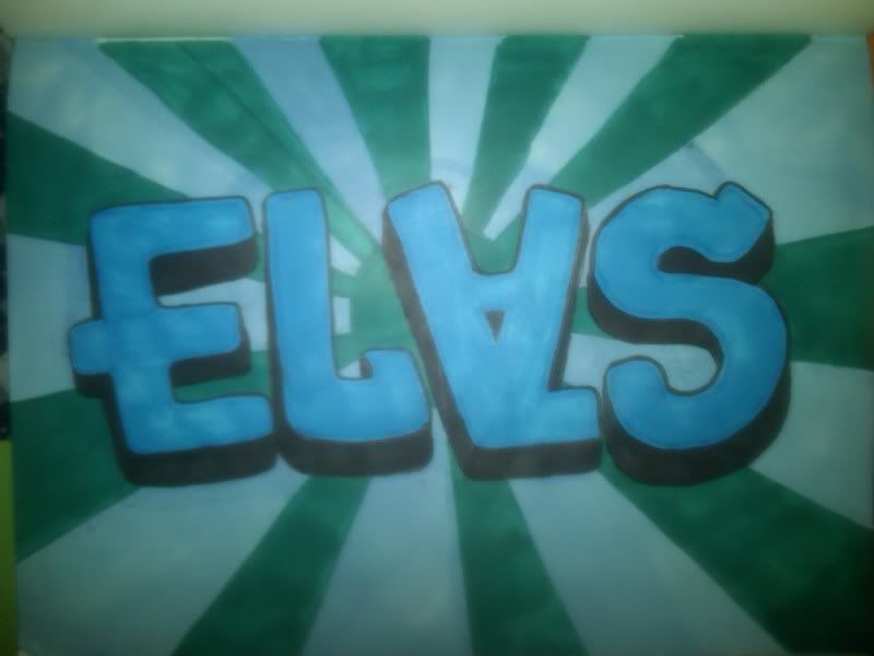
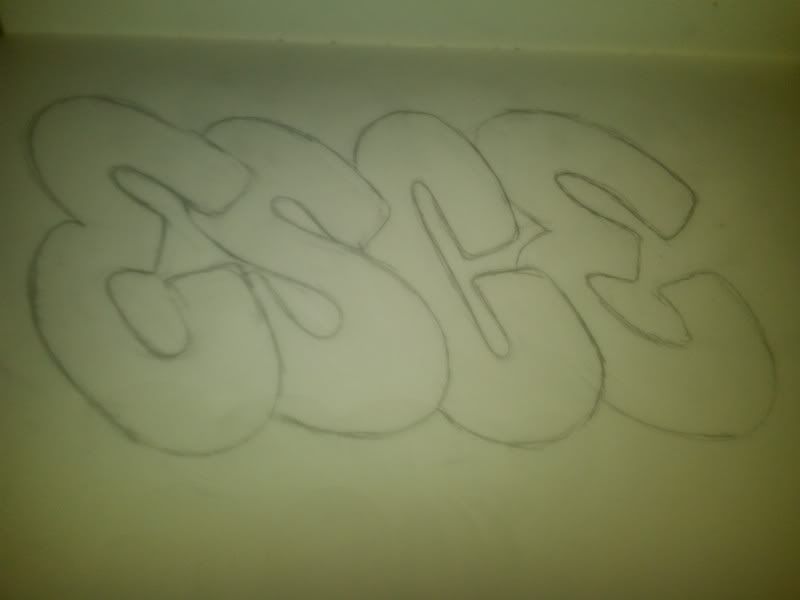
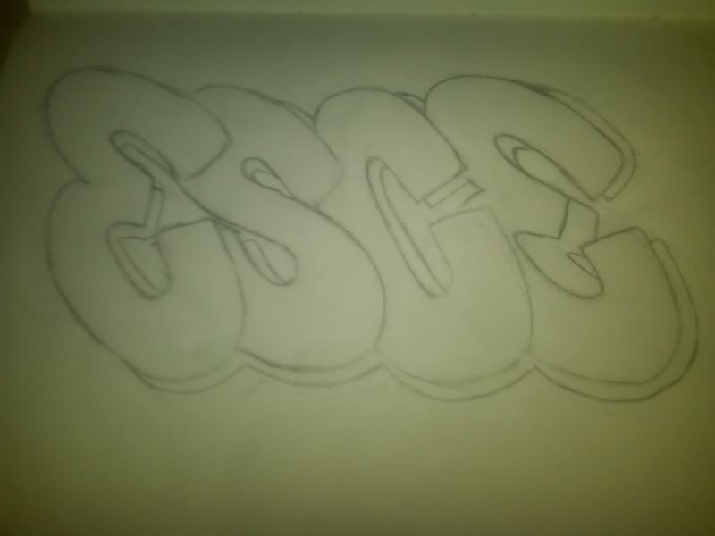
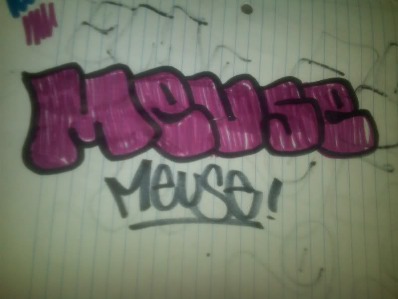
I skimped out on the background because it's late. I also started this last night when it was late so I ended up writing ELAS instead of ESCE. Hope you enjoy it either way. Poker you're next...

I skimped out on the background because it's late. I also started this last night when it was late so I ended up writing ELAS instead of ESCE. Hope you enjoy it either way. Poker you're next...
dweezileast
Active member
I had to put the exchange business on hold for the night due to some other inspiration...

dweezileast
Active member
today's fun

dweezileast
Active member
thats lookin good, I'd say bow out the C a little bit more so it matches the rest of the letters. With that italic style a drop shadow instead of 3d could look dope
dweezileast
Active member
that looks ill!
dweezileast
Active member
I've been really into smash 137 lately and his open letter styles. This is a freestyle that was my first attempt at can cracking and open letters. It reads "fatal". The quas character was going to be part of a piece that said loop digga but i said fuck it.
dweezileast
Active member

NickSki.
Active member
Heres a couple of Flickr's from my city. If you're bored or something check em out.
www.flickr.com/photos/tinny-peete/
www.flickr.com/photos/53690879@N06/
www.flickr.com/photos/ecosystem/
www.flickr.com/photos/tinny-peete/
www.flickr.com/photos/53690879@N06/
www.flickr.com/photos/ecosystem/
bluegavin269
Active member
I just saw 30 of jace's (I think that's his name) tags on one train (full train, not one car) that I just got stopped by
dweezileast
Active member
That was my first attempt, i need to get a better cracking tool than the jagged piece of metal I was using. The L is tough because of the metal box that comes out of the wall on the right side, but I admit it's definitely plain compared to the other letters.
Heres the link to the oink art paint, 2.95 a can! http://www.oinkartltd.com/ez-catalog/X380376/314
anyone have any experience with the stuff?
Heres the link to the oink art paint, 2.95 a can! http://www.oinkartltd.com/ez-catalog/X380376/314
anyone have any experience with the stuff?
BASEDRILEY
Active member
Dude just get some belton off AP for like 3.95 its worth it for the high pressure awsomeness.
dweezileast
Active member
the L is still fucked but it's late so i'm over it

Goosefiends
Active member
where do i get it? i cant find it on their website
Goosefiends
Active member
thats pretty tight, im not sure if i like it better than the old one though, hard decision imo
could you guys shoot me some feedback on a canvas im workin on, im debating on wether i should add 3D and a one-shot and stuff or just leave it, or if there is anything i should change/improve on
could you guys shoot me some feedback on a canvas im workin on, im debating on wether i should add 3D and a one-shot and stuff or just leave it, or if there is anything i should change/improve on