You are using an out of date browser. It may not display this or other websites correctly.
You should upgrade or use an alternative browser.
You should upgrade or use an alternative browser.
Critique My Logo
- Thread starter NickVentura
- Start date
.jr
Active member
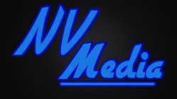
Poor color choice, they clash and not in a good way. Your V is skinnier than the N which is odd. Not so sure about the D & A in media, were you trying to make a face? You also shouldnt mix a script face with a sans serif that has similar visual language. Too complex, not sure why you have a light drop shadow on the left side of everything. Didnt even notice it until I clicked on the picture.You should also consider cleaning up the outlines, they are jagged, not smooth. Also I dont know about the lockup that you have right now works best.
NickVentura
Member
Im just playing around with the colors but what colors would you suggest? Also I am very new to photoshop, what 2 fonts would you think look better? Ill take out the left drop shadow and ill clean the outlines up but whats the best way of doing it? Sory im asking a lot of questions but i am really interested in getting better at photoshop.
Thanks for the critique! +K
Thanks for the critique! +K
HWW
Active member
It really depends on how you want your logo to come across. I would suggest two tones of one colour, maybe a light & dark blue, you probably get what I mean.
Things I noticed:
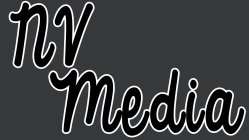
• outlines slightly too thick
• nv was not capital, e & d were capital
• d looks like an o
• writing isn't very original & doesn't stand out (keep it simple or get something really super-sick)
• do you only want text? another element could add something positive
Things I noticed:
• outlines slightly too thick
• nv was not capital, e & d were capital
• d looks like an o
• writing isn't very original & doesn't stand out (keep it simple or get something really super-sick)
• do you only want text? another element could add something positive
NickVentura
Member
I know what you mean haha. Ill reduce the thickness, and switch the capitals. Im trying to find a new font for "media" that will look better, do you know any sick fonts? I want to add another element but im not sure what to add, any suggestions? Thanks and +k
NickVentura
Member
Thanks, I was trying to go for something like eheath's logo where he connects 2 letters but my initials are NV and I tried to connect them but it didn't look great haha
norgeanders
Active member
I agree with the b&w cause when im lookin at it my eyes like start trippin like the logo starts moving towards me i dont if anyone else gets this but its pretty crazy and kinda givin me a headache
NickVentura
Member
sorry dude i was just playing with colors and I wanted something that would stand out
NickVentura
Member
Haha thanks dude Im thinking about making my logo into vinyl stickers for my friends
NickVentura
Member
Bump
Official_Recap
Active member
This might be of some help for inspiration. Another company using 'NV' . I don't recommend mimicking their design, but just another idea on the table:
http://nvconcert.com/wordpress/
http://nvconcert.com/wordpress/
NickVentura
Member
CrotchKiller
Active member
Ew
blackoutbill
Active member
Needs more filters
blackoutbill
Active member
Hahaha the lens flare is a nice touch


