So, if you haven't already checked this shit out--do it!
http://bluehouseskis.com/TShirtDesignContest
People make some dope stuff, and photoshopping for an hour or so is a sweet way to procrastinate doing your homework, nadadameann?
here's my entry. i'm just learning photoshop, so feedback is appreciated! (oh yeah, and you can vote for me! how sweet would that be to get your own t-shirt printed?!)
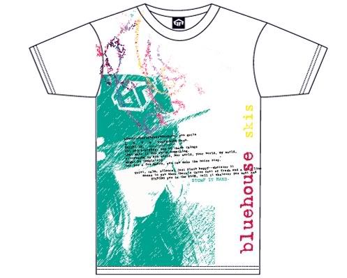
FRONT:
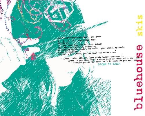
DETAIL:
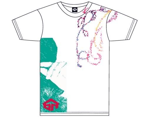
BACK:
http://bluehouseskis.com/TShirtDesignContest
People make some dope stuff, and photoshopping for an hour or so is a sweet way to procrastinate doing your homework, nadadameann?
here's my entry. i'm just learning photoshop, so feedback is appreciated! (oh yeah, and you can vote for me! how sweet would that be to get your own t-shirt printed?!)
FRONT:
DETAIL:
BACK:

