Base Graphics

cow.

Member
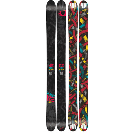
I feel strongly that bases are underutilized, design-wise.

line is the only company doing a pretty good job, with bright, obvious designs.

just having a drab colour and the company name just doesn't quite do it for me, especially when it would be so easy to change the pattern a little.

even the sir francis bacons from a few years back with the big white-black-white-black bands looked super rad.

thoughts?
 
for some reason I like these

slmn_suspect_skis_09.jpg


PHOTO_2472835_75233_4616325_ap.jpg
 
I wish Lib/Gnu wasn't the only company with sublimated base graphics (snowboards, I know, but I have to sell them, too). On the topic of terrible bases, I saw these today and instantly hated them.

How not to do it (on so many levels)

XX90-JAMES-K%C3%A4stle-Twintip-Ski-2013.jpg
 
really like how armada has the same basic base graphic every year while changing it up with really cool designs
 
These where the first twins I wanted!! Never got around to getting them as I like 11 and my parents were tight!! Loved the graphics!!
 
As long as they don't do a split base graphic I'm fine. When they do that it really ruins the speed and the integrity of the base. I think the coolest one I have seen though is probably the YLE

ONECOL.jpg
 
I love the bases of the Bacon's, but overall I know that after a few weeks of ownership, they would be marred with battle wounds.
 
I love the old Head bases, I was so pissed off when they changed them. Luckily the skis are still awesome.

head-johnolson-pro-ski-10.jpg

 
K2 needs to make more of these, my dad has a pair of the original K2 Comps and they look awesome

That being said it makes base repairs annoying but I agree more companies should do this.
 
See why I don't understand is like snowboard brands have boards with naked bitches on the, swear, weed leaves and all kinds of badass shit.... Why don't any ski brands have that I want to b riding some badass pair of skis
 
I remember being 11-12 and seeing PK hunder rocking those in a K2 sequence add in a ski mag my bro had. Made me want them soo much. Haha! And leave it to Harlaut/Armada to start making the badass weed and naked bitches skis. There were some THalls or someone like that's skis that had chick on them. Might be the heads above(?)
 
I want to see a ski named the Grumpy Cats, and the topsheet graphic would be plastered with Tartar Sauce "Tard the Grumpy Cat," and then have colour swap bases on them that just say MAD PUSSY
 
Came here to post this. Also why aren't there any bentchetlers posted? Most of the skis posted so far are drab and boring besides the halos
 
k2 makes really dope bases, they all look the same in a way, yet they are all so unique...

i love the bases on my revivals

k2-revival-1011-174-54016be81bc229cca05bfe5fd404b0d6.jpg
 
personal favorite base is the one on my old EP pros, i love how the fluo orange reflects on the snow :)

line-ep-pro-sir-francis-bacon-tip-tail.JPG


(on the left)

it also looked so goddamn sick in the old nimbus webisodes when eric was riding them :)

illustration -> 3:22http://vimeo.com/14398220

^^Also honorable mention of the og bentchetler with tie-dye graphics
 
I don't mind undesigned bases, because in many cases they are more durable. In Line's case, the designs on the bases arent just a design, they're built INTO the ski. This means there are weak spots on the base where the color changes that make the ski less durable. Line Masterminds are a perfect example:
images


I had masterminds and they snapped right along the a line in the base.
 
Back
Top