Apparel Co. logo ideas, appreciate feedback

slc_utahboiii

Active member
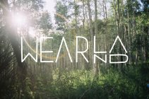
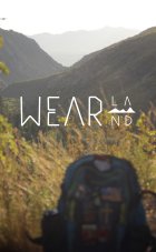
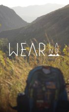
Wearland, a small idea a buddy and I had to create some t-shirts we wanted to wear, thinking about hats and other apparel as well. I know a lot of people do this type of thing but we wanted too also. But before I can take it any further I need to lock down a solid logo, please give them your thoughts and opinions on these two! Don't hold back, all critiques are good critiques. The BG images are just to help the idea, not part of the logo. Much appreciated NS!

Wearland with MTN graphic

789859.jpeg

Wearland without MTN graphic

789860.jpeg
 
IMO the mountain graphic looks the best. Maybe close the vertical gap a little bit above/below the mountain? I'm a fan none the less.
 
I like the one with the mountain. I also agree about the gap between the mountain and letters. Maybe try making that whole part the same height as the rest, just like the second design is, but with the mountain in there somewhere.
 
I like the type of the first one. IMO it's weird to divide land by the mountains. And would be cooler if you swapped the la with the mountains. So the mountains were on top of land. Does that make sense?
 
13531157:ROBOT said:
I like the one with the mountain. I also agree about the gap between the mountain and letters. Maybe try making that whole part the same height as the rest, just like the second design is, but with the mountain in there somewhere.

789963.jpeg
 
Yea, keep the original WEAR lettering. Personally I thought the rounded letters looked nicer. But layout is more appealing with that change to 'land'. maybe just try with the mountain on top instead of inbetween?
 
Back
Top