You are using an out of date browser. It may not display this or other websites correctly.
You should upgrade or use an alternative browser.
You should upgrade or use an alternative browser.
2020-21 Ski Graphic Discussion
- Thread starter cydwhit
- Start date
cydwhit
Active member
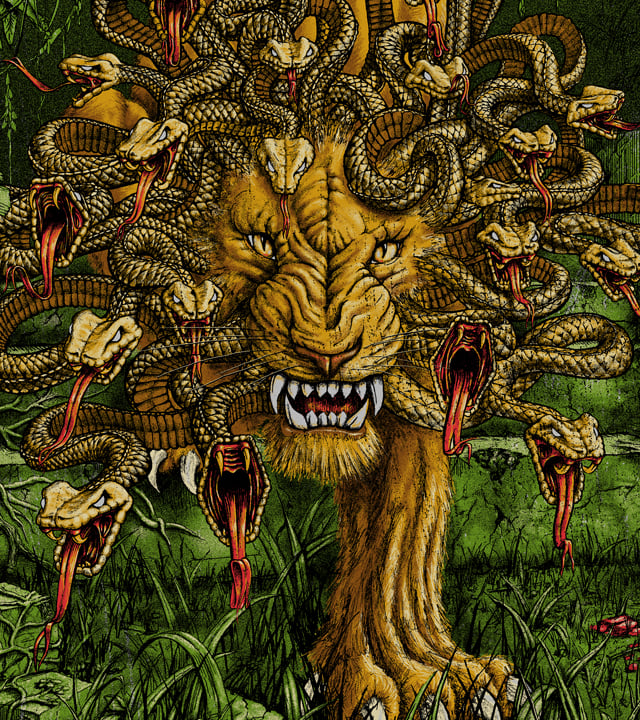
14162626:JLev said:Quick question on the "Hotshot" we just added this model and super curious which graphic direction you'd prefer for a ski that's 106 waist, intended for charging hard, shaped to surf pow, but still hold it's own on groomed.
We almost scrapped this "Trutta" fish design thinking it was too niche, but sooo many have asked for trout art over the years and working with Dan Burr, the artist in the vid was too good a fit so we went with it.
However on the totally other side of graphic vibe spectrum (same ski) with "Noctornal Daydream" graphic by legend Ryan Schmies, OG creator of the Public Enemy and Seth graphics, wondering... vs the trout which speaks to YOU more?
View attachment 969572
View attachment 969573
The fly fishing one really doesn't speak to me, but I totally get it, and think it's a fine way to execute that concept. And the venn diagram of "skiers" and "people who are into fly fishing recreationally, or at least want to be" is basically a circle, at least around where I live haha. So I'd be shocked if that thing wasn't popular. Many of my skiing friends don't know who Schmies is but 100% want fishy stuff like that on their feet.
Meanwhile, there's an old Schmies quote, I think from the clown hellbent days?... that's like "I ate some bad cheese, went into my basement and spent a night fighting my wildest nightmares, these skis came out." That's a paraphrase obviously, but I think that was the general idea. And for me, that's when I love Schmies art the most, when it's wild, psychedelic, and scarry. Like these. And I fricking LOVE those bases, they make me want to pretend to be a photographer again. So, while they're probably not in my top five favorite Schmies top sheets (with a career like his, there's an awful lot of winners...) I think they absolutely hit the mark, and the folks that buy them will be SO stoked to own them.
Also, this is arbitrary, but I think we should standardize a couple of tests for artistic ski graphics. Let's call 'em the "Wall Art Test" and the "Phone Background Test." So, while we can talk good vs. bad design all day, and I love to, especially in the case of the big brands that are trying to appeal to everyone and their mom, when it comes to more artistic designs, or artist collabs, or any indy brand that is trying to make something beautiful, you can apply those two tests: Would I put an unbranded version of this graphic on my wall? And similarly, would I be into having this as my phone wallpaper? Fast and easy way to judge how much they appeal to any one person subjectively.
For me, Schmies passes both with flying colors. And I literally have one of your Stickfort graphics on my wall. Trutta base passes the wall art test for me, but maybe more in a dentist office than my house, 'cause I sorta don't love fish (subjective obvs.). So, what are your subjective takes on those two tests NS? Worth using? Or stupid ideas?
BigPurpleSkiSuit
Active member
I'd say that's a very good example for graphics. The color scheme (I love purple, blue, green) hits perfectly for me, and same for what you said about schmies. That said, I'd agree there's something nice about some of the minimalist graphics, like the RMUs for this year, and then the Armada Zero series. I wouldn't put any of those things as art on my wall, but I would definitely ski them.
Edit: my poor reading comprehension strikes again and I see you're talking about artistic ski topsheets
**This post was edited on Aug 9th 2020 at 9:11:53pm
Edit: my poor reading comprehension strikes again and I see you're talking about artistic ski topsheets
14162635:cydwhit said:The fly fishing one really doesn't speak to me, but I totally get it, and think it's a fine way to execute that concept. And the venn diagram of "skiers" and "people who are into fly fishing recreationally, or at least want to be" is basically a circle, at least around where I live haha. So I'd be shocked if that thing wasn't popular. Many of my skiing friends don't know who Schmies is but 100% want fishy stuff like that on their feet.
Meanwhile, there's an old Schmies quote, I think from the clown hellbent days?... that's like "I ate some bad cheese, went into my basement and spent a night fighting my wildest nightmares, these skis came out." That's a paraphrase obviously, but I think that was the general idea. And for me, that's when I love Schmies art the most, when it's wild, psychedelic, and scarry. Like these. And I fricking LOVE those bases, they make me want to pretend to be a photographer again. So, while they're probably not in my top five favorite Schmies top sheets (with a career like his, there's an awful lot of winners...) I think they absolutely hit the mark, and the folks that buy them will be SO stoked to own them.
Also, this is arbitrary, but I think we should standardize a couple of tests for artistic ski graphics. Let's call 'em the "Wall Art Test" and the "Phone Background Test." So, while we can talk good vs. bad design all day, and I love to, especially in the case of the big brands that are trying to appeal to everyone and their mom, when it comes to more artistic designs, or artist collabs, or any indy brand that is trying to make something beautiful, you can apply those two tests: Would I put an unbranded version of this graphic on my wall? And similarly, would I be into having this as my phone wallpaper? Fast and easy way to judge how much they appeal to any one person subjectively.
For me, Schmies passes both with flying colors. And I literally have one of your Stickfort graphics on my wall. Trutta base passes the wall art test for me, but maybe more in a dentist office than my house, 'cause I sorta don't love fish (subjective obvs.). So, what are your subjective takes on those two tests NS? Worth using? Or stupid ideas?
**This post was edited on Aug 9th 2020 at 9:11:53pm
AngryGramps
Member
I feel like what this thread is missing about the j lineup is that controversial graphics are meant to not hit with some, and hit with others. If everyone liked them they would be boring.
I love the fact that I can have the Schmies graphics (favorite graphic of the last 10 years btw) on the same ski that my trendy ass brother can have his fly fishing graphic on. We like the same skis but do not have the same graphic preference 99% of the time.
the metal was one of my favorite rides I’ve ever owned. Was bummed to see them go but I’ll be psyched to try the hotshot when I can get my hands on a pair. Especially if I can find a set with that graphic, reminds me of a time when free skiing was less watery than it seems to be nowadays.
I honestly feel like the days of the rockstar pros are over and that kind of makes me sad. Trendy Instagram skiing is great and has a lot of cool stuff to offer but damn do I wish the days of skiers being punks were still around. We dressed like morons back in the day but it was different at least. Mick D, Seth, Tanner and others are huge characters to this day for me. Controversial graphics and people are what the scene thrives on. Plain graphics are just that- vanilla and boring. I love the fact that moms in the lift line hated the hellbent graphics. I loved that Jon could put his girlfriend on some skis. That shit was cool man, and the schmies graphic brings that back for me a little bit. The era im talking about is unquestionably over but a good graphic for me brings up that edginess and reminds me of really feeling ownership over freeskiing, before everyone and their mom got those “backwards” skis. When the jerrys were too scared to rock the horse shitting blood graphic on the hellbent. I understand that we have to sell skis but I appreciate you throwing me and others like me a bone on that graphic
14162626:JLev said:Quick question on the "Hotshot" we just added this model and super curious which graphic direction you'd prefer for a ski that's 106 waist, intended for charging hard, shaped to surf pow, but still hold it's own on groomed.
We almost scrapped this "Trutta" fish design thinking it was too niche, but sooo many have asked for trout art over the years and working with Dan Burr, the artist in the vid was too good a fit so we went with it.
However on the totally other side of graphic vibe spectrum (same ski) with "Noctornal Daydream" graphic by legend Ryan Schmies, OG creator of the Public Enemy and Seth graphics, wondering... vs the trout which speaks to YOU more?
View attachment 969572
View attachment 969573
JLev
Member
14162635:cydwhit said:For me, Schmies passes both with flying colors. And I literally have one of your Stickfort graphics on my wall. Trutta base passes the wall art test for me, but maybe more in a dentist office than my house, 'cause I sorta don't love fish (subjective obvs.). So, what are your subjective takes on those two tests NS? Worth using? Or stupid ideas?
Good stuff! stoked you snagged that J x Stickfort print, Adam is legend! Wish he wasn't so busy so we could do another collab this year.
For years, back to the early Line days I've always created surveys and recently used some IG stories A or B to get quick idea too for getting real skier's feedback. Last time I got over 800 responses... waaaay better than staring into our monitor thinking we know best what our customers actually want. haha
Whenever we've shown pure art like you describe for hanging on the wall not in ski shape vs in a ski shape more times than not get different answers like you're predicting... and since ultimately I need to know the answer in the ski shape that matters most to us... we've more recently mockup in ski shape for most accurate feedback.
Also we always use a rank 1-5, with 5 being best, and when you total up survey #s it becomes super obvious the winners and loosers. Although honestly when it comes to actually putting your $600 where your mouth is, it's never exactly as the survey says which is why I'm even more curious this time of year when people are actually shopping.
Would be ridiculous amount of work but would be nutz to create a ski graphic bracket competition...

**This post was edited on Aug 9th 2020 at 9:36:12pm
animator
Active member
Here’s my $0.02.
Good ski graphics have always been polarizing, and the, “in,” style of graphic changes every season. As someone who started skiing around 12 years ago (and many of you guys have been skiing for WAY longer), I’ve seen graphics change a shit ton.
Early on, K2 was winning the graphics game for me hands down. The old Shreditors, the Domains, the Iron Maiden (??? SO sick). The obSETHed from 2012 (which I just copped, could not be more excited), every single iteration of the Pettitor? Their skis were insane, and it was dope how the color schemes changed slightly with each length (like the 14-15 Pettitor). This is a time where most ski graphics are super busy, with bright colors and lots going on.
Graphics now are a lot more diverse I think. Since I vibed real hard with the busy graphics, the new Devastator is INSANE. Easily the best looking ski I’ve seen in a long time (just my opinion). I’ve been a huge Faction fan for a long time too, and I really appreciate the move from busier graphics (like the Royale and the earlier Prodigy’s) to really clean and simple lines (Candide series, new Prodigy’s). Like I said, I like the busy stuff, but the simple colors and minimal design that they’re moving towards is really nice. J Skis also are polarizing, but what good graphics aren’t? I think the basis of JLevs idea (skis with limited graphics) is really cool, and it’s very different from the industry standard. The collaborations are awesome (@Schmies, you’re my favorite ever) and it gives a different insight to the industry, where people who aren’t necessarily used to using a ski as their canvas have the chance to showcase their style to a new demographic. That being said, [tag=195966]@cydwhit[/tag] does bring up a good point that while instantly recognizable, sometimes the skis do look of lower quality (again, just my opinion. The skis themselves are great, and graphics are obviously not everything). All in all, [tag=17763]@JLev[/tag], keep doing your thing man! Being someone who more recently discovered ON3P (not like this year recent, but the last few years), I love their stuff. At first the skis seem simple and low key, but closer up there’s a lot of detail and heritage (especially to those who know the history of the brand). Overall, ON3P, J Skis, Faction are at the top of the game in my opinion (4Frnt keeps up with skis like the Devastator and they’ll be up there too).
Graphics are tough, and it’s the first way for brands to make their skis stick out in the flooded market today, especially since not everyone has the opportunity to test the ski itself. [tag=3025]@iggyskier[/tag] [tag=17763]@JLev[/tag] you guys do things your way and it’s awesome to see. This is all just the humble opinion of your average college student who loves to geek out over gear. Cheers!
JLev
Member
14162647:animator said:Here’s my $0.02.
Good ski graphics have always been polarizing, and the, “in,” style of graphic changes every season. As someone who started skiing around 12 years ago (and many of you guys have been skiing for WAY longer), I’ve seen graphics change a shit ton.
Early on, K2 was winning the graphics game for me hands down. The old Shreditors, the Domains, the Iron Maiden (??? SO sick). The obSETHed from 2012 (which I just copped, could not be more excited), every single iteration of the Pettitor? Their skis were insane, and it was dope how the color schemes changed slightly with each length (like the 14-15 Pettitor). This is a time where most ski graphics are super busy, with bright colors and lots going on.
Graphics now are a lot more diverse I think. Since I vibed real hard with the busy graphics, the new Devastator is INSANE. Easily the best looking ski I’ve seen in a long time (just my opinion). I’ve been a huge Faction fan for a long time too, and I really appreciate the move from busier graphics (like the Royale and the earlier Prodigy’s) to really clean and simple lines (Candide series, new Prodigy’s). Like I said, I like the busy stuff, but the simple colors and minimal design that they’re moving towards is really nice. J Skis also are polarizing, but what good graphics aren’t? I think the basis of JLevs idea (skis with limited graphics) is really cool, and it’s very different from the industry standard. The collaborations are awesome (@Schmies, you’re my favorite ever) and it gives a different insight to the industry, where people who aren’t necessarily used to using a ski as their canvas have the chance to showcase their style to a new demographic. That being said, [tag=195966]@cydwhit[/tag] does bring up a good point that while instantly recognizable, sometimes the skis do look of lower quality (again, just my opinion. The skis themselves are great, and graphics are obviously not everything). All in all, [tag=17763]@JLev[/tag] , keep doing your thing man! Being someone who more recently discovered ON3P (not like this year recent, but the last few years), I love their stuff. At first the skis seem simple and low key, but closer up there’s a lot of detail and heritage (especially to those who know the history of the brand). Overall, ON3P, J Skis, Faction are at the top of the game in my opinion (4Frnt keeps up with skis like the Devastator and they’ll be up there too).
Graphics are tough, and it’s the first way for brands to make their skis stick out in the flooded market today, especially since not everyone has the opportunity to test the ski itself. [tag=3025]@iggyskier[/tag] [tag=17763]@JLev[/tag] you guys do things your way and it’s awesome to see. This is all just the humble opinion of your average college student who loves to geek out over gear. Cheers!
Animator,
Well said! Stoked to see skiers like you putting as much value in the heritage graphics as new, really rad. Congrats on the Obsethed... LEGEND!!! Very cool to hear your ski graphic discovery adventures old and new!
Graphics are the added dimension I've always worked relentlessly to add beyond of course the all important performance but.... once the ski rides solid, why not drop in on some lift line heads turning art or connect with the skier emotionally beyond just a big ass black ski with a giant bright logo haha
Post a pic of you rockin that Seth some time! I found some old 1080's last winter and was like going back in time haha
JLev
Member
14162644:AngryGramps said:I feel like what this thread is missing about the j lineup is that controversial graphics are meant to not hit with some, and hit with others. If everyone liked them they would be boring.
I love the fact that I can have the Schmies graphics (favorite graphic of the last 10 years btw) on the same ski that my trendy ass brother can have his fly fishing graphic on. We like the same skis but do not have the same graphic preference 99% of the time.
the metal was one of my favorite rides I’ve ever owned. Was bummed to see them go but I’ll be psyched to try the hotshot when I can get my hands on a pair. Especially if I can find a set with that graphic, reminds me of a time when free skiing was less watery than it seems to be nowadays.
I honestly feel like the days of the rockstar pros are over and that kind of makes me sad. Trendy Instagram skiing is great and has a lot of cool stuff to offer but damn do I wish the days of skiers being punks were still around. We dressed like morons back in the day but it was different at least. Mick D, Seth, Tanner and others are huge characters to this day for me. Controversial graphics and people are what the scene thrives on. Plain graphics are just that- vanilla and boring. I love the fact that moms in the lift line hated the hellbent graphics. I loved that Jon could put his girlfriend on some skis. That shit was cool man, and the schmies graphic brings that back for me a little bit. The era im talking about is unquestionably over but a good graphic for me brings up that edginess and reminds me of really feeling ownership over freeskiing, before everyone and their mom got those “backwards” skis. When the jerrys were too scared to rock the horse shitting blood graphic on the hellbent. I understand that we have to sell skis but I appreciate you throwing me and others like me a bone on that graphic
YUP! Dressed like morons but OH MAN...I MISS THAT oversize style, tricked every fan into thinking you were waaaay smoother than you were cause can't see rolling down windows in size 8XL haha!
Rockstars aren't over, every decade has its heros, to people that are in the spot you were back then and they bring new styles, thank god!... cause skiing will die if we don't keep it fresh. Seeing everyone today working as hard as others did decades before them toward change is always mind blowing and a real relief because each are truly responsibility for carrying skiing's toward forward for the next... RESPECT for those that pioneered the foundation we each all continue to build on...
jca
Active member
14162626:JLev said:Quick question on the "Hotshot" we just added this model and super curious which graphic direction you'd prefer for a ski that's 106 waist, intended for charging hard, shaped to surf pow, but still hold it's own on groomed.
We almost scrapped this "Trutta" fish design thinking it was too niche, but sooo many have asked for trout art over the years and working with Dan Burr, the artist in the vid was too good a fit so we went with it.
However on the totally other side of graphic vibe spectrum (same ski) with "Noctornal Daydream" graphic by legend Ryan Schmies, OG creator of the Public Enemy and Seth graphics, wondering... vs the trout which speaks to YOU more?
View attachment 969572
View attachment 969573
I don't really give a single fuck about graphics when buying a ski but that trout base makes me want to puke. I'm down with the Schmies tops though.
hi_vis360
Active member
14162629:cydwhit said:Is it bad to totally dig this graphic, while also 100% agreeing with your assessment? Asking for a friend...
as long an you're self aware and not one of those wooks who thinks that they're changing the world by doing drugs and listening to shitty edm, we're cool hahahaha
animator
Active member
14162675:jca said:I don't really give a single fuck about graphics when buying a ski but that trout base makes me want to puke. I'm down with the Schmies tops though.
That’s 100% cap the flies on top and the brown trout down low is dope af
14162422:dogfartstaint said:This year as expected there’s been a lot of positive feedback ON3Ps graphics. One bit of creativity that I think has gone unnoticed has been their new touring ski graphics, specifically the Woodsman and Jeffrey. Following the mountain theme and bomber theme of the two respective lines, ON3P also fit touring into the theme. Both feature an overhead map of what the regular ski graphic displayed bringing back the roots of land navigation in backcountry and touring. While this definitely wasn’t the most revolutionary or cool thing ON3P did this year it shows how much thought they put into the relationship of their graphics across and even inside the same year.
Put all the 108’s side by side and your mind will be blown.
cydwhit
Active member
14161609:SuspiciousFish said:The new Devastator Graphics look like they were inspired by the old 2009 VCTs.
[tag=21244]@4FRNT[/tag] Was this intentional or coincidence?

**This post was edited on Aug 5th 2020 at 3:52:18pm
I know nobody cares, but I finally figured out where I'd seen this piece before. Was originally a Jack Johnson concert poster from 2014. Love that artist's style!
SuspiciousFish
Active member
14163153:cydwhit said:I know nobody cares, but I finally figured out where I'd seen this piece before. Was originally a Jack Johnson concert poster from 2014. Love that artist's style!
Honestly, that is kind of lame its literally a rip from an old concert poster. I think the topsheet art should be made for the skis and drawn for that model as a single work of art. I dont know if it was intentional or the artist just recycled the art but its far too similar to be a coincidence.
bigcat.
Member
14163153:cydwhit said:I know nobody cares, but I finally figured out where I'd seen this piece before. Was originally a Jack Johnson concert poster from 2014. Love that artist's style!
14163165:SuspiciousFish said:Honestly, that is kind of lame its literally a rip from an old concert poster. I think the topsheet art should be made for the skis and drawn for that model as a single work of art. I dont know if it was intentional or the artist just recycled the art but its far too similar to be a coincidence.
I mean, it literally is a rip. All they did was brighten the lighthouse light beams, the clouds, and some of the waves. Overlay of the OG art and the graphic. Hopefully they paid the artist for the work otherwise that's pretty wack.

cydwhit
Active member
14163173:bigcat. said:I mean, it literally is a rip. All they did was brighten the lighthouse light beams, the clouds, and some of the waves. Overlay of the OG art and the graphic. Hopefully they paid the artist for the work otherwise that's pretty wack.
View attachment 969688
I mean, yeah, I'd assume they licensed it...right?
Without knowing where it came from, this was my favorite 4frnt graphic in a while. Now, not so much. Still pretty, but not as cool.
IDK, I've pissed off enough industry OG's for a lifetime in the last week, so all I'll say is: skis are a cool canvas. The coolest canvas. There are hundreds of hungry artists out there who live and breathe skiing and would give their all to make a wonderful graphic. It would be cool if when we used art for topsheets we commissioned specific pieces for the skis that maybe carried more weight....
SuspiciousFish
Active member
14163173:bigcat. said:I mean, it literally is a rip. All they did was brighten the lighthouse light beams, the clouds, and some of the waves. Overlay of the OG art and the graphic. Hopefully they paid the artist for the work otherwise that's pretty wack.
View attachment 969688
Maybe its the same artist and they were given a brief and just pulled from a previous work?
[tag=21244]@4FRNT[/tag] Do you guys have any insight on this? Hopefully we didnt just open a copyright shitstorm but better here and now than down the road if its an issue.
That being said, this art style is so sick and this would look dope AF on the Armada Magic J:
BigPurpleSkiSuit
Active member
Oh boy, this is officially juiciest thread of August
14163173:bigcat. said:I mean, it literally is a rip. All they did was brighten the lighthouse light beams, the clouds, and some of the waves. Overlay of the OG art and the graphic. Hopefully they paid the artist for the work otherwise that's pretty wack.
View attachment 969688
SuspiciousFish
Active member
14163179:cydwhit said:I mean, yeah, I'd assume they licensed it...right?
Without knowing where it came from, this was my favorite 4frnt graphic in a while. Now, not so much. Still pretty, but not as cool.
IDK, I've pissed off enough industry OG's for a lifetime in the last week, so all I'll say is: skis are a cool canvas. The coolest canvas. There are hundreds of hungry artists out there who live and breathe skiing and would give their all to make a wonderful graphic. It would be cool if when we used art for topsheets we commissioned specific pieces for the skis that maybe carried more weight....
I agree wholeheartedly. I think its something you understand more as you get older but the art style represents more than just something cool on top of the skis. It literally marks a generation in the progression of our sport. Its something immediately recognizable watching old ski movies that kind of defines that era of skiing. Just like how everyone who was around will always know what skiing was like during the Rossi "Freddy Kruger" era, or the Robot Topsheets on the 1080 and Pocket Rockets, or the OG Public Enemies or Seth Pistols, or Eric Pollards work, or Line's old bamboo sheets on the Prophet, or the K2 Pontoons. Art is literally the foundation of culture and that is what defines a community, in this case the community is skiing and its something many of us have based a large part of our lives or identities around.
To have an OG brand like 4FRNT make a comeback after so many years of defining our sport and rip a topsheet from an old Jack Johnson poster just doesnt sit right with me. I love 4FRNT but I got to call it for what it is.
4FRNT
Member
Let's clear things up here, we didn't rip anything from anyone. We found this art, contacted Dig my Chili and paid to license existing work that we thought would make a kick ass graphic. Licensing existing work isn't something new to the ski and snowboard industry and is still supporting artists who make a living from their work.
Skis, as discussed constantly throughout this thread, are an incredibly hard canvas to work with for most artists. It doesn't resemble any sort of canvas that artists paint on and is very hard to transfer and make look good. When we find a piece like this that translates directly to skis we are stoked.
Our focus is making rad graphics to go with rad products in a sustainable way that makes sense for an extremely small company. Creating 11 graphics with 1 graphic designer is no small feat. 7 out of the 11 were all original pieces that took months to develop. The way we see it is there are 3 options- We do original art in house, hire out for original art (extremely expensive for quality work and a long process) or license existing art (in which case it may or may not have been used). We've done all of these methods every season for years.
Thanks for the support, stoke and concern. Happy to field any other questions ya got
cultrara
Active member
14163190:4FRNT said:hire out for original art (extremely expensive for quality work and a long process)
I don't think people fully realize how hard it is to work with artists who have never designed a ski before. I've contracted some VERY talented artists/designers only to have their ski designs be mediocre or bad.
It takes years of working on skis to figure out how to make a good one.
SuspiciousFish
Active member
14163190:4FRNT said:Let's clear things up here, we didn't rip anything from anyone. We found this art, contacted Dig my Chili and paid to license existing work that we thought would make a kick ass graphic. Licensing existing work isn't something new to the ski and snowboard industry and is still supporting artists who make a living from their work.
Skis, as discussed constantly throughout this thread, are an incredibly hard canvas to work with for most artists. It doesn't resemble any sort of canvas that artists paint on and is very hard to transfer and make look good. When we find a piece like this that translates directly to skis we are stoked.
Our focus is making rad graphics to go with rad products in a sustainable way that makes sense for an extremely small company. Creating 11 graphics with 1 graphic designer is no small feat. 7 out of the 11 were all original pieces that took months to develop. The way we see it is there are 3 options- We do original art in house, hire out for original art (extremely expensive for quality work and a long process) or license existing art (in which case it may or may not have been used). We've done all of these methods every season for years.
Thanks for the support, stoke and concern. Happy to field any other questions ya got
I already put in my .02 on topsheets overall but you gotta do what you gotta do given budget etc. Im just happy you guys are not going to have to spray paint the remaining 200 Devs before they go out the door lol.
BigPurpleSkiSuit
Active member
I had no clue about the process of getting ski art, and the graphic is absolutely rad!
14163190:4FRNT said:Let's clear things up here, we didn't rip anything from anyone. We found this art, contacted Dig my Chili and paid to license existing work that we thought would make a kick ass graphic. Licensing existing work isn't something new to the ski and snowboard industry and is still supporting artists who make a living from their work.
Skis, as discussed constantly throughout this thread, are an incredibly hard canvas to work with for most artists. It doesn't resemble any sort of canvas that artists paint on and is very hard to transfer and make look good. When we find a piece like this that translates directly to skis we are stoked.
Our focus is making rad graphics to go with rad products in a sustainable way that makes sense for an extremely small company. Creating 11 graphics with 1 graphic designer is no small feat. 7 out of the 11 were all original pieces that took months to develop. The way we see it is there are 3 options- We do original art in house, hire out for original art (extremely expensive for quality work and a long process) or license existing art (in which case it may or may not have been used). We've done all of these methods every season for years.
Thanks for the support, stoke and concern. Happy to field any other questions ya got
skiP.E.I.
Active member
14162631:Cade2 said:Someone legit use some old world industry board graphics, mark McKee or Sean cliver art would look tight. Todd Francis too
There's a few groms at my local hill who still rock these lol. I think they were sold at sportchek like 12 years ago and just continually get handed down because anyone small enough to use them is to light to seriously damage a ski.
Cade2
Active member
Woe those are sick!
14163202:skiP.E.I. said:There's a few groms at my local hill who still rock these lol. I think they were sold at sportchek like 12 years ago and just continually get handed down because anyone small enough to use them is to light to seriously damage a ski.
bradwalters
Member
While I'm not here to critique any other brands artwork because I think that it's not my place as a working designer for a ski brand and art/design are subjective, I will comment on the badass-ness of what you just wrote here.
The Hellbent is my favorite ski of all time and not necessarily from a single ski standpoint but more from a collection standpoint. It broke all the rules. It was huge, burly, and fully jaw dropping by design. It was exactly what it needed to be.
I remember when the clown skis showed up at my house and my mom, god bless her, said "Those are the ugliest skis I have ever seen!" That was the most perfect thing she could have said! These weren't the K2s my mom had, these weren't for the norms, these weren't for the lames.
But they were for me. They hit everything I wanted skiing to be at that point in my life. I still have them. I still ski them. Shit, they were one of the reason's I took my job at K2 in some weird, twisted way.
Also...and in true K2 form...The Reckoner 122's for Winter21 were definitely drawn while I was on psychedelics.")
The Hellbent is my favorite ski of all time and not necessarily from a single ski standpoint but more from a collection standpoint. It broke all the rules. It was huge, burly, and fully jaw dropping by design. It was exactly what it needed to be.
I remember when the clown skis showed up at my house and my mom, god bless her, said "Those are the ugliest skis I have ever seen!" That was the most perfect thing she could have said! These weren't the K2s my mom had, these weren't for the norms, these weren't for the lames.
But they were for me. They hit everything I wanted skiing to be at that point in my life. I still have them. I still ski them. Shit, they were one of the reason's I took my job at K2 in some weird, twisted way.
Also...and in true K2 form...The Reckoner 122's for Winter21 were definitely drawn while I was on psychedelics.
14162635:cydwhit said:The fly fishing one really doesn't speak to me, but I totally get it, and think it's a fine way to execute that concept. And the venn diagram of "skiers" and "people who are into fly fishing recreationally, or at least want to be" is basically a circle, at least around where I live haha. So I'd be shocked if that thing wasn't popular. Many of my skiing friends don't know who Schmies is but 100% want fishy stuff like that on their feet.
Meanwhile, there's an old Schmies quote, I think from the clown hellbent days?... that's like "I ate some bad cheese, went into my basement and spent a night fighting my wildest nightmares, these skis came out." That's a paraphrase obviously, but I think that was the general idea. And for me, that's when I love Schmies art the most, when it's wild, psychedelic, and scarry. Like these. And I fricking LOVE those bases, they make me want to pretend to be a photographer again. So, while they're probably not in my top five favorite Schmies top sheets (with a career like his, there's an awful lot of winners...) I think they absolutely hit the mark, and the folks that buy them will be SO stoked to own them.
Also, this is arbitrary, but I think we should standardize a couple of tests for artistic ski graphics. Let's call 'em the "Wall Art Test" and the "Phone Background Test." So, while we can talk good vs. bad design all day, and I love to, especially in the case of the big brands that are trying to appeal to everyone and their mom, when it comes to more artistic designs, or artist collabs, or any indy brand that is trying to make something beautiful, you can apply those two tests: Would I put an unbranded version of this graphic on my wall? And similarly, would I be into having this as my phone wallpaper? Fast and easy way to judge how much they appeal to any one person subjectively.
For me, Schmies passes both with flying colors. And I literally have one of your Stickfort graphics on my wall. Trutta base passes the wall art test for me, but maybe more in a dentist office than my house, 'cause I sorta don't love fish (subjective obvs.). So, what are your subjective takes on those two tests NS? Worth using? Or stupid ideas?
bradwalters
Member
Shit...now that I think about it I was on something for the design of the entire F21 collection...
We may be fucked.
We may be fucked.
14163394:bradwalters said:While I'm not here to critique any other brands artwork because I think that it's not my place as a working designer for a ski brand and art/design are subjective, I will comment on the badass-ness of what you just wrote here.
The Hellbent is my favorite ski of all time and not necessarily from a single ski standpoint but more from a collection standpoint. It broke all the rules. It was huge, burly, and fully jaw dropping by design. It was exactly what it needed to be.
I remember when the clown skis showed up at my house and my mom, god bless her, said "Those are the ugliest skis I have ever seen!" That was the most perfect thing she could have said! These weren't the K2s my mom had, these weren't for the norms, these weren't for the lames.
But they were for me. They hit everything I wanted skiing to be at that point in my life. I still have them. I still ski them. Shit, they were one of the reason's I took my job at K2 in some weird, twisted way.
Also...and in true K2 form...The Reckoner 122's for Winter21 were definitely drawn while I was on psychedelics.
yhprum1720
Member
14163001:RudyGarmisch said:Put all the 108’s side by side and your mind will be blown.
Do any photos of this exist?

sickjukes87
Member
14163514:r00kie said:Giving my local builder a shoutout for this one. Typically not huge on Shaggy's graphics but the Sarge for this year is amazing. Love seeing the wood under the graphic.
View attachment 969759
I think the blue and gray sarge 95 is so rad but the new graphic reminds me of like a log cabin
GrandThings
Active member
As long as there are no 1) tape-decks/stereos 2) graffiti 3) phrases with more than 5 words - I pretty much like all ski designs.
This thread is fun as fuck tho...
This thread is fun as fuck tho...
skiP.E.I.
Active member
14163536:anders_a said:prodigy series from faction 2020?
I have the 1.0s and I like the graphic. I think the aesthetic is well executed. The bright pink and yellow on black pops!
SkiClub
Member
@J_skis I personally really wanna see some more beer themed skis, as they are extremely hard to come by imo and look super sexy. Just a personal dream idea of mine would be topsheet of like beer company's stickers slapped all over, and a base of a full glass. Working on tuning my MS Paint skills so might post a design in the future. Inspiration from the K2 Coors Light ski....
lol also dead set on doing a custom hamms ski sometime before I get put in the ground.. (for the college culture)
**This post was edited on Sep 22nd 2020 at 2:18:46pm
lol also dead set on doing a custom hamms ski sometime before I get put in the ground.. (for the college culture)
**This post was edited on Sep 22nd 2020 at 2:18:46pm