14161624:J_skis said:
Ha, can't win 'em all Cy!
Would love to get some more concrete feedback on what you're digging / not digging aside from just being really bummed. Obviously can't please everyone and we've actually been kinda surprised with which skis are selling well so far, but as an industry/art guy your perspective is always valued.
**This post was edited on Aug 5th 2020 at 4:34:55pm
Ha. I was worried somebody actually in the industry would read this!
Disclaimer, I think you've released some of the prettiest skis on the market too, and I've really enjoyed riding a bunch of 'em, but here's how this current lineup makes me feel. And it's not related to what I think would sell or whatever, just on aesthetics.
Obviously this is subjective and different stokes for different folks, but here's a more articulated take, and I guess I won't pull any punches, 'cause it's the internet haha:
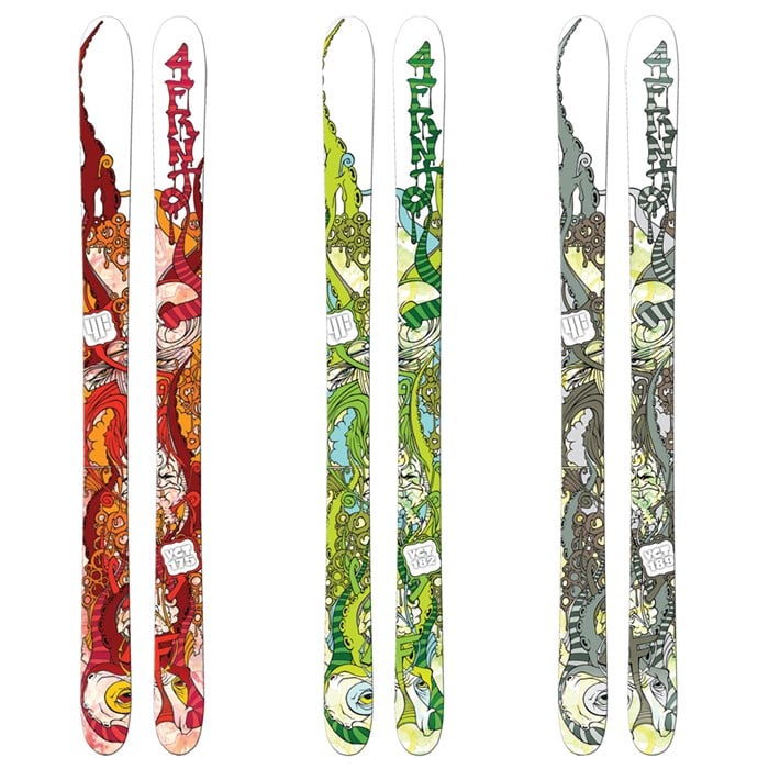
1) I get it that part of J is not having a cohesive look for the brand, there's a zillion different graphics with something for almost everyone, and all they have in common is who is making the skis. But I would almost argue that there is starting to be a cohesive look for "J Skis" and it's hastily done, low-quality graphics. Yes, there are a bunch of exceptions, but my friend group, and myself have all seen J's in the wild, not known who made them, but gone "that looks like somebody photoshopped some random crap on a ski, it's probably a J." Does that make sense? If I see a bunch of random crap on a ski, that doesn't necessarily look "crafted", I can assume pretty accurately who made it.
2) So many of these graphics don't look like they were made by skiers for skiers. I LOVE that you're doing artist collabs. But a bunch of those artists don't seem to have much experience working at the weird aspect ratio that skis have. So it looks like you're just taking their art and figuring out a crop that works on skis. Which adds to the "photoshopped" vibe. Again, stoked you're working with a bunch of artists, and I think they do great work. But much of it doesn't look like it's meant to go on a topsheet or a base. And that's a bummer. And yes, pot calling the kettle black, I'm not claiming to be a better artist or designer, just speaking from my seat as a critic/customer.
3) Graphics don't affect how a ski rides. They don't matter. And if you've got somebody out there who just wants a washed-out tie-die graphic with some peace signs, cool for them. But I don't think I'm alone in saying that great ski graphics are more than just art on a topsheet. They carry the legacy of a ski and a time in skiing on them. And yes, maybe skiing is moving away from that, maybe cool topsheets are going the way of full-length ski films. But man, every time I see a Pollard tree graphic out in the wild, it makes me nostalgic for a special time in skiing. I see a Hellbent at a yardsale and I remember the Pettit poster on my wall growing up. Hell, even old Salomo Czars, or Afterbangs, or whatever, they carry more weight than just the ski or just the graphic? Make sense?
And, harking back to point #1, good graphics tell me what brand made the ski. I don't have an encyclopedic knowledge of every Moment graphic out there, but I instantly recognize old Moments on the hill. Same goes for ON3P and Line, and a bunch of other brands. It's not because of the branding, it's because it's a ski that obviously came from the same visual family.
It feels like so many of the graphics I see on your site right now were designed to sell a few skis fast, and then not really be thought about ever again. Which is fine. But also makes me sad.
So yeah, stoked the brand exists, keep doing what you're doing. I love to talk ski graphics, and hear what other people like, and discuss why we don't like some stuff. So there ya go.


")


