You are using an out of date browser. It may not display this or other websites correctly.
You should upgrade or use an alternative browser.
You should upgrade or use an alternative browser.
2 New Photos
- Thread starter davedinuzzo
- Start date

Jordan
Active member
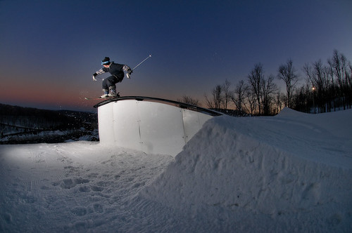
I like them, good use of lighting, thirds, coloring. you know the basics. The only problem I have with them as a viewer is the fact that I feel very distant towards the people in them. There's no connection for the viewer in them. On that first one, maybe have it where you are further down the rail and can see more of his face focused. Same with the second one, they just seem quite a bit distant. Maybe experiment getting closer to the riders and bringing the viewer into the picture more.
I checked out your flicker this photo is dope:

If you cropped that a bit and had less negative space up above him so the rider would be further top right I think it would be more powerful. Also, just a note. A lot of your shots have the rider facing away from the camera. Maybe try the image I posted but shoot it angled up hill. You'll get the same effect of the snow leaving the jump, and the harsh outlined light will be the same, just behind him.
Just my 2 cents.
I checked out your flicker this photo is dope:
If you cropped that a bit and had less negative space up above him so the rider would be further top right I think it would be more powerful. Also, just a note. A lot of your shots have the rider facing away from the camera. Maybe try the image I posted but shoot it angled up hill. You'll get the same effect of the snow leaving the jump, and the harsh outlined light will be the same, just behind him.
Just my 2 cents.
davedinuzzo
Member
Hey dude thanks for the feedback. I find that I personally end up disliking shooting uphill at things because you end up not being able to capture the takeoff and landing in the shot. IMO it ruins an action shot when the rider appears in the middle of an object but you have no sense for how large it is, what the landing is like or what the takeoff consisted of. I'm constantly playing with different feels in my photos and usually I try to have the riders face in the shot, whether or not it is directly facing the camera and in these I decided to try and be less concerned with it.
davedinuzzo
Member
i have to say skating is WAY easier to shoot in terms of angles because you don't have a steeply graded hill to deal with along with all the other variables of the spot
generally speaking at least
generally speaking at least
Where-am-I
Active member
i like the first one the best because it uses the color of the rail to the picture's advantage. the second one is sick but the white rainbow rail makes the majority of the picture flat and white
Where-am-I
Active member
^^^ i think that's what really makes a great park shot. high contrast and bright colors