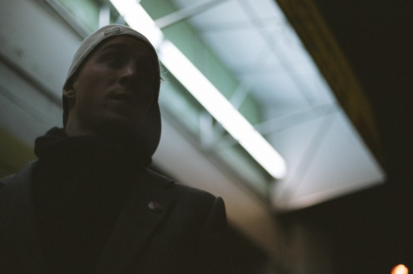
one thing i've noticed is that monitors make a big difference when looking at this photo. i've gotten a rather large range of contrasts when looking at the photo on different monitors. my thought was sort of that people have a tendency to accept the images put in magazines. putting this photo on the title page of the article and just having minimal print accompanying it, would really support that whole mysterious thing that r5tommy mentioned - and that was basically the point. and yeah jack i did all the photos used in the anthony article.