alpinecowboy84

C.R.E.A.M. reject

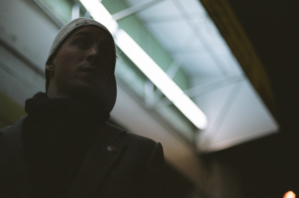
so i was lucky enough to do the interview photos with anthony for the CREAM article. off and on i wanted dave to use this one, the postive and negative features of the photo are the same: you cant see anthony's face. i thought it was cool, but in the end it didn't make the cut and got dropped. since then i've wanted to know what people would have thought if he had used it.
 
It's simply too dark my friend. But it's still a cool photo. Did any of your others make it in...
 
too dark. but cool composition. did you use photoshop spray paint tool on whatever he is wearing? looks like it.
 
if this wasnt the ONLY photo?

i dont know waht that guy was thinking.

its definately a winner buddy.
 
It's cool, but I'd like to see the same shot exposed by about a stop more or so...
 
i think the other was better. its a cool effect... but i think, at least for the purposes of the article, the other did a much better job.... i guess it just wasnt a dark interview?
 

Media information

Category
People
Added by
alpinecowboy84
Date added
View count
1,122
Comment count
13
Rating
0.00 star(s) 0 ratings

Share this media

Back
Top