You are using an out of date browser. It may not display this or other websites correctly.
You should upgrade or use an alternative browser.
You should upgrade or use an alternative browser.
Ugliest Topsheets
- Thread starter elm.
- Start date

Been thinking about this thread.. I'd buy a ski like the j skis cat one simply because of how ugly it is. it's gone a full loop from cool to ugly bacj to cool again just cos it's so damn ugly. I think companies need to just put more creativity into their topsheets and bases thrn it won't matterhow ugly they are, they can pass it off as art anyway!
FUUUCK
Active member
13127571:Bumblesteeze said: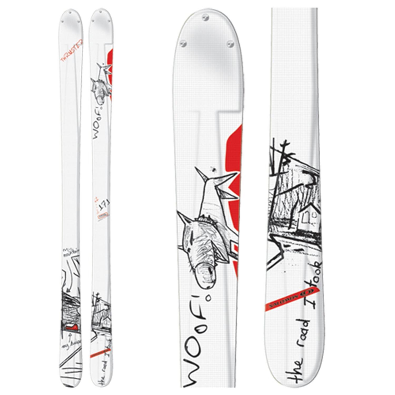
No idea why they went with that graphic, especially when they probably had one of the nicest topsheets of all time the year before.
YUP, worst of all time ever, I even had a pair and they weren't awful skis. But HOLY SHIT was that ever the worst graffic. What the fuck were they thinking? How far did that graphic go through in the chain of command at Salomon to get approved? DID SOMEONE ACTUALLY GET PAID REAL MONEY TO DRAW THAT!?!?! WOOF! WOOF!!!!! GET IT?!?! I'M A DOG WITH MOTHERFUCKING SHARK FINS FOR LIMBS!!!!!!
fresh_prince
Member
13427029:hot_ham said:Been thinking about this thread.. I'd buy a ski like the j skis cat one simply because of how ugly it is. it's gone a full loop from cool to ugly bacj to cool again just cos it's so damn ugly. I think companies need to just put more creativity into their topsheets and bases thrn it won't matterhow ugly they are, they can pass it off as art anyway!
your name tho

000000000000
Member
13127165:Bum.Life said:Honestly, K2 could have done way better on the Powabunga top sheet
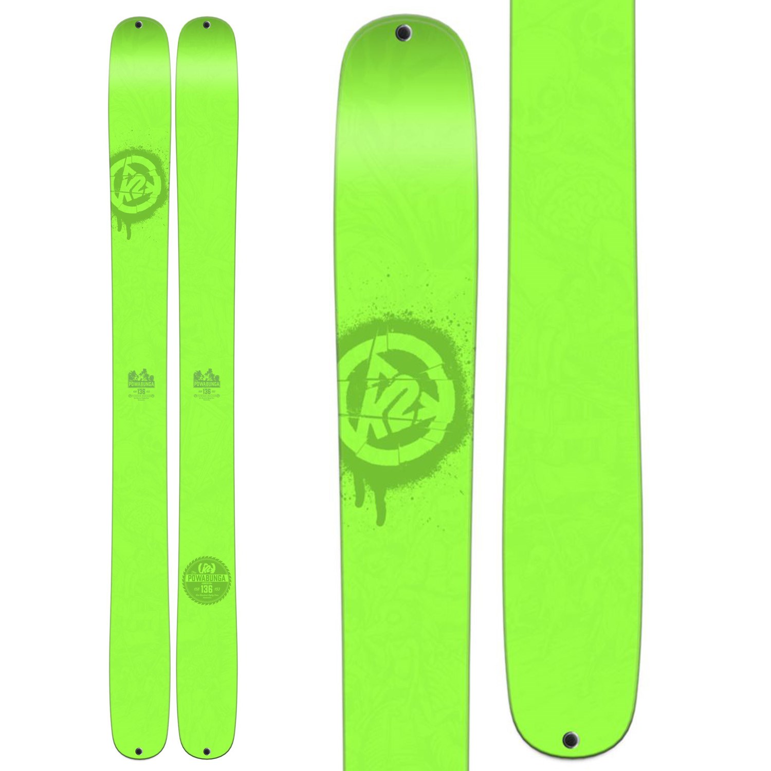
like not get rid of the hellbent series
Zurg
Active member
13428007:notorious_slug said:Not a single on3p ski on this thread, that's sayin something

Sorry
")
caucasian_chad
Active member
Any race ski ever.
perryhunter
Member
13126694:ObeseBunny said:Anything J-skis makes.
Yeah! Most, not all of it though.
Heart
Active member
13126694:ObeseBunny said:Anything J-skis makes.
-64 downvotes. I think that's a personal record, and I still stand by what I said.
13126872:JAHpow said:I wish ON3P would do another ugliest top sheet competition
lol yeah my homie jake won that one year it was a super harry guy with his hands down his pants, I might have a picture
TheBooleanBandit
New member
ON3P Tranny Slammers are just vulgar, good skis though
13428007:notorious_slug said:Not a single on3p ski on this thread, that's sayin something
We have an ugliest topsheet contest winner on page 1, you are wrong sir.
J_skis
Active member
13126694:ObeseBunny said:Anything J-skis makes.
Roasted
mattymagoo757
Member
13430649:ghosthop said:so subjective, I like half of the topsheets posted, especially those ^^jmos


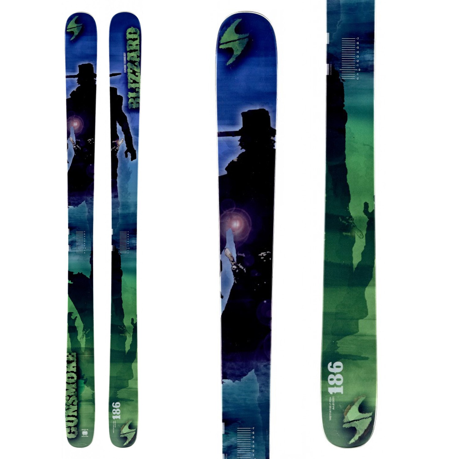
I only hate the cowboy on the bottom. The others are just ok. At least they look clean.
Deforestation
Active member
13573709:williamelliott1 said:if you ski at Jay Peak, then you know what these mean
I ski at Jay and have 0 fucking clue
13574562:Isis_rocks said:I ski at Jay and have 0 fucking clue
its the rental ski that jay offers. if u see someone skiing on them, u dip, bc theyre a gaper
Deforestation
Active member
13574780:williamelliott1 said:its the rental ski that jay offers. if u see someone skiing on them, u dip, bc theyre a gaper
That makes sense, guess I never noticed
supersquid
Active member
13126858:.lencon said:Well yes I would, but I still find the twisters to be very unappealing.
Price point ski? They are almost $600. ON3P sells skis for $600 I would call them pricepoint. I think a true pricepoint skis would be line skis.
or surface park blanks
supersquid
Active member
13127219:BrennenM said:i really liked the moment vice graphics from two years ago and i ski last years, but I'm really not a fan of the graphics on this years. . . .it just looks too cluttered

im riding them right now with fks
addie.
Member
13127180:saskskier said:Dynastar Trouble Makers (these are the worst, but really any generation)

this looks like a nickleback album cover
Jesse.White
Member

jellomellow
Member
13575241:.otto. said:almost every single ski... honestly skiers suck at making good graphics
then make your own
skidemon22
Active member
13575592:addie. said:this looks like a nickleback album cover
nearly sprayed my mac in beer when i laughed at this.... well done haha
saskskier
Active member
13575592:addie. said:this looks like a nickleback album cover
Amazing... Hats off to you for the best possible response.
.otto.
Active member
13575625:jellomellow said:then make your own
I Do..
Bumblesteeze
Active member
13427059:FUUUCK said:YUP, worst of all time ever, I even had a pair and they weren't awful skis. But HOLY SHIT was that ever the worst graffic. What the fuck were they thinking? How far did that graphic go through in the chain of command at Salomon to get approved? DID SOMEONE ACTUALLY GET PAID REAL MONEY TO DRAW THAT!?!?! WOOF! WOOF!!!!! GET IT?!?! I'M A DOG WITH MOTHERFUCKING SHARK FINS FOR LIMBS!!!!!!
They're laughably bad. What is with the "This is the road I took?" Do you have any insight? You probably have an interesting thing to say, after hours of having them in your face while going up the lift.
HuckNorris44
Active member

HuckNorris44
Active member

Looks like a child shit all over the skis.

lickmyballs
Member
Yea I just don't like these at all. haha
grilled_steeze
Member
2014 Icelantic Shaman SKNY

Deepskier
Active member
13128428:hippy.killer said:
Upload didn't work last time but these skis could definitely use some love
http://thumbs.newschoolers.com/index.php?src=http%3A%2F%2F24.media.tumblr.com%2Fff2cc9dadeac1dbf250438c9baeda8d2%2Ftumblr_n471ftSPMS1rbc9h1o1_400.gif&size=400x1000
fries
Active member
13575176:dcoop said:I have them and let me tell you they look 100 times better in person. Still not in love with the bases tho
This. I own a pair of jskis whip it cats and space and love them and they look great in person
Pac2
Member
13127480:SkiJKhaled said:I wish these came in a park ski.
They basically do, look at this years pipe cleaner then are all black with hims of white.
I like the new 4frmt graphics but man do I not like these.

s-hand
Active member
13426351:SteezOnSkis12 said:I think I just threw up in my mouth
You think thats bad?? This is the '09 graphic of that ski. I went through 2 pairs of them back in the day.
s-hand
Active member
13625122:s-hand said:You think thats bad?? This is the '09 graphic of that ski. I went through 2 pairs of them back in the day.
oops