Suggestion for the new logo

[Adam]

Active member
Alright. i know there is a lot of mixed reviews for the new logo and i do have to say I personally don't like the new logo but i was thinking that if the "S" in the new logo went over the "N", rather then under it, i would be happier with it.
Does that make sense?Could someone create this and post it up?Anyone agree at all?
Thought if it could be done it would be a nice compromise between the old and the new logo.

 
nslogov.jpg


Just a quick vector that I made up. Still needs a lot of cleanup...I still think it looks like an elephant though.
 
they got rid of the old one because it was too ambiguous so I've heard....

Anyway you can see the new logos on the store and alot of people, myself included, do not like them. He asked for a slight change to it so I posted one but I don't think it is much of an improvement.
 
thank you! thats exactly what i was thinking of, except maybe it would look better if we didnt outline the "S" part in black. So i just flows over.
 
I think I still like the new logo better. We won't get them to change. I wouldn't really bother. Good idea though. I think at a quick glance or without close examination it looks a lot like RS, I'm sure they considered doing it that way though. They put a ton of time into making the new logo.
 
i knew when i made this thread that it wouldnt change anything. just wanted to put my thoughts out there.
 
I can change the outlining on the S, will have to take some work though. Anyways, even if they spent a lot of time on the new logo it sucks that almost everyone I talk to doesn't like it. Makes it so it is a logo that the people don't want to rally behind if they hate the logo.
 
When you say old one looks better, what one do you mean? Also, color isn't really a problem...easy to change.

NSlogo1.jpg


NSlogo2.jpg


NSlogo3.jpg


NSlogo4.jpg


I like the 3rd one personally haha but thats just me. jk
 
i think it looks like RS too, but maybe if the outline was thinner so that the n isnt completely dismembered, it might be better.
 
Looks good, but the left side of the N looks too long. Very weird to me. Kind of a mind fuck. Can't tell.
 
We aren't really trying to come up with new ideas. He just asked if someone could redo it with the S in front to see how it looked.
 
Haha, ya there are some oddities about it. The S is actually lower/longer than the N though! I stole the logo exactly from the black shirt in the tall tee section and just re-vectored it.
 
Hi,
My name is JP Fortier and I'm the new graphic designer of Newschoolers. This summer I've worked on the branding of IF3 and on the new NS logo. It's not my style to answer to those kind of post, but this time I will.
Yes, I'm a fucking french guys hehe and I try to improve my English skill every day. I studied Graphic Design at University at Hull. I currently studying it in Paris... I will finish school this year. I think I'm in a good position to improve NS graphics. It's the first time that NS have a real Graphic Designer & there is a lot of work to do. I've worked all the summer to repair some of the graphical «mess» on NS & some new stuff are coming soon. Just be patient....I'm a member since 2004, and I really want to put my effort to improve NS this year. I hope you will like my works.
For the logo....The year, Doug asked me to re-design it with one of my friend that is also a graphic Designer. We redesign it because it's the 10 years of Newschoolers and we wanted to add a fresher-super-cooler-dooper vibe to Newschoolers. It was a huge risk, but we received a good vibe about the logo.
You can now read the brand very well & it's very important for a brand to be readable. The Newschoolers typography is also placed on three lines to be readable when you resize it to a very small size. If you look at the new logo at the bottom of a poster, you can now read the name of the brand. We also kept somes of the caracteristics of the old logo, like the Shape of the N.
It was not made in 2 minutes in photoshop... It's a result of hours and hours of sketches. Proportion of the logos are well proportion and the shape are perfects.

It's a minority that doesn't like the logo. Changes are scary, I know, but you need to realize that it will be the new logo. With the this new logo, I will try my best to make sick stuff for the store with the budget we have.
Best,
JPJust be cool, we working very hard out there, you have no idea how.
 
Look man I understand that you may not think so highly of how NS is run but look at the facts. We don't have the money or the means to get money to make NS some sort of multi million dollar business. In fact we are pumped that two hard workers in Jim and Doug and a few committed interns are able to secure the advertising and keep the store running to enable all NSers to: enjoy a growing site, provide them with a few cool products and stay alive all at the same time. As JP said we have qualified graphic designers and in spite of who you think might be better I think they are doing a great job, working hard and taking a lot of unwarranted criticism. If you think for one second that Doug or anyone at Newschoolers is not taking this site and our brand seriously you are horribly mistaken. We work very hard to improve the site, the products, the running of the store, pretty much everything, sorry if you don't like the changes but they are made in the interests of everyone.

Talk is cheap man, and its very easy to criticize a few hard working guys when you're stuck behind your computer screen and not seeing how hard we work. Maybe you should put your money where your mouth is and do it better if you think what we do is so "subpar."

I'm not trying to argue for the sake of arguing or trying to pick a fight but fuck it irritates me when people don't appreciate what they have.

If you have a problem or an idea talk to us; BigJim, Mr.Bishop, Myself, MatRich, Malcolm, chapz, DaveM we're all around the office and love to hear new suggestions. Instead of just putting us down why not try to help us do it better since you seem to be full of ideas.

-Steve
 
dear flying spoon & co,
if their salaries were painfully high i would agree. but i don't think many of you juvenile minded individuals completely understand the costs of running not only a business but an online business. yes, newschoolers will do all they can to make a buck, but with their merited reasons. paying their personal bills; let's not forget that that amount is filtered through a major company and then pays the ns bill and replenishes stock, and whatever is left over will feed doug and jimmy, jp, and whoemever else, and help schmuck travel and write his awesomeness articles. the "shit" newschoolers sells, may be shit to like 10% of you, but judging by most of the out of stock situations they face, a lot of people love their gear and will sport it til they die.
the ns office crew works their balls off for you all to be happy. and as expected, not all of you will be satisfied.
industries are about what's hot and how fast you can feed your client. yeah some people don't like capitalism, but you can't argue with supply and demand. people will walk, and you'll be hungry. ns has room to grow and there is absolutely nothing wrong with that. 10 years is absolutely not a long time to be alive and thriving and a lot of companies see their downfall within less time. every move newschoolers has made has been meticulous and maybe has had draw backs, but that's the name of the game.
the new logo is sick, modern, and more professional. there is a lot of volunteer work involved as well, and shitting all over these hard workers is a bit arrogant, so stop being such a wanker and appreciate the utter dedication that's going into your enjoyment of this particular extracurricular activity.
 
i dont like it...if we HAVE to make a new logo, then id say the one with the S on top is much better then the one you have proposed.

 
No offense but dont you get it?

THAT IS THE NEW LOGO IT IS NOT GOING TO CHANGE

once you see it everywhere you'll learn to love it
 
well macmahooon was saying that the people who don't like the new logo are a lot noisier opposed to the people that do like it, which is true. But honestly, i'd like to see one person(that doesn't work in the office) actually speak out on how much they like it. I have not seen one person do this yet. And nobody can deny that if this logo was truely dope, a lot of people would be talking about how much they love it. But, nothing.
 
I agree, I haven't really seen anyone say they like it. A couple people here and there, but the majority like the old logo or want something different.

I mean, even if the people that do like it are being quite it doesn't make sense. I have literally asked most of my friends who have NO IDEA what NS is to look at the two logos, and every one of them liked the old one more.
 
At the risk of sounding redundant, I liked the old one better. I'm not opposed to change but only when it's better.

And to address the business aspect. NS has huge potential. We have the potential to make or break a business. Only problem is, we haven't turned that power inward. I have alot of ideas but I'm not on the payroll so I can't disclose them.
 
haha weird because everyone i asked liked the new one since they had no idea there was in fact an S in there

not hating just an observation
 
I love the new logo. It's a good derivative of the previous one. I haven't said anything because I come here to read interesting things. This thread is turning into hate, so I skip it.
 
It's hardly hate...this is not hate by NS standards or many others. I think we have a decent discussion going, and to me it seems like they need to have some more user input. Sure some of like it, but a lot of us really don't and we just want a voice of input.
 
the new one doesnt look like the old one at allidk where people are coming from with that
the only similarity is they both have n's
 
it seems like you just found something that is coincidentally similarbut it looks nothing alikesuch asthey both depict an n and an s
 
Listen - I absolutely have to weigh in here.
First off to everyone - I think its time to take a deep breath and relax. Both our loyal users, staff and interns alike - we're arguing ourselves in a circle here and need to take a time out. Summer is ending, but winter is too far away... everyone is grumpy and picking apart absolutely everything they possibly can.
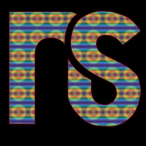
The new logo is good. I know that there are people that don't like it as much as the classic one, but as the new designs roll out and you begin to see it on posters I think you'll understand why we did it.
Maybe not - maybe those who hate will always hate. Hah... I still hate 1080s and double flips... I wish style would have caught on but I gave up on that argument a long time ago. :)
Here's what I would love - lets calm down on the hate of the new logo for a couple of months. We're keeping the old logo around as "classic" so those of you who like it can keep on liking it. Once we've got all instances of the new logo implemented we'll do some polling and see what everyone says.
Now to address the post quoted here -
"Get some balls and start doing work" is a comment I take quite a dear bit of offense to. However, I do understand why you say it so I will fairly address it.
Basically the largest problem is the difference between the public's understanding of our business and the bigger picture happening behind the scenes. Believe me, what you're looking at from your computer is much different than what is happening in the long term plans. Think of it like a ski company... the stuff that you saw in the photos from SIA last year (which you can't even get your hands on until this season) was in the works for close to 2 years before last years SIA.
NS is absolutely like that - we've got plans that extend way past our current situation. There are things in the works on NS that are way bigger than having a T-shirt brand. I mean thats cool, but in absolutely no way our core business. Its a tiny fraction of what we do here... currently the revenue from the T-shirts makes up less than 10% of the total revenue of the site. Not tiny, but its by no means a good idea for us to waste our time turning it into a global clothing brand. We want entrepreneurs out there to start their own clothing brands, and make Newschoolers clothes just something that gives people a chance to rock the site's logo.
In terms of the idea of getting the "balls" to get a bank loan - dude... Our parent company is the exclusive provider of action sports content to Yahoo. Bank loans are for small-time entrepreneurs looking to get started. We're WAY past that.
Sure sometimes we pass on certain opportunities, but never think that its because we don't have balls, or don't know real work. Its that there is as larger plan in action, and not everything that seems like a good plan to the general public fits with what we're doing.
In terms of your suggestion of "hire out a few SOLID professional digital art grad students" well we've done that. The new logo is just one part of it - there is a ton more coming down the pipe from us taking that action last year. We're trying to do it right this time, instead of other years where NS has been thrown together and pushed out the door before its ready.
"I feel like Bishop is a money hungry individual looking to make this website and the huge number of people subscribed and part of it, into a profitable entity. So far the merchandise put out by this company has been sub par in my opinion."
Believe me, if I was a money hungry individual I wouldn't be working here. What I am is someone who wants to see the future of Newschoolers being bright and Solid. Remember Freeze magazine? Well... they sure aren't around anymore. I'm making sure to build this site into something that will never go away, and something like that requires stable business behind it. I want to make a living along the way sure - I want to have a family and a life. I can't just ski forever and be broke all the time... life don't work like that.
As for the merchandise quality - you're absolutely right that its not the best stuff in the world. By no means does it compare to Voleurz, Jibberish or any high-end company like that. The idea with that stuff is to be solid quality simple shirts (remember we use all Pro-Club tall T's) with ultra simple logos on them. Our shirts are extremely cheap to buy... when was the last time you could go out and get a logo shirt for under $20? There's not a lot of them.
Also remember that focusing on the clothing takes away major amounts of time from our core business, which is that of the website, its features, the community and the advertisers that support it all. So the clothing is simple because that is what the business needs at this juncture. When it grows, we will grow with it at a slow methodical and controlled pace.
All in all - I can totally understand why some of the stuff we do seems like its off base. However, always know that no matter what its part of a larger plan. I also ALWAYS want you guys to give your feedback on what it is that we're doing here. We listen to all of it and integrate every single thing you say into our plans.
Just do your best to trust us - and above all trust me. I have nothing but love for this site, and have been doing everything I can for years to grow it into what it needs to be.
I've taken massive personal sacrifices just to make sure that this site stays in a strong position, and continues to grow and flourish... just like it has been and will continue to do for years to come.

 
Thanks for the excellent post Bishop, really gives some good insight in to the minds of the higher ups that we don't always get to see. I do feel that a lot of us fear change. Not only do some of us older members have to deal with the change we see with the Site, but also the change we see with the user base (which at time can be Very disconcerting, though outside of your control, I understand that.).

All I ask, and I think a lot of us agree, is to see our voices heard. We have heard time and time again that you guys take all of our feedback to heart and discuss how we feel, but for many things I think we don't ever see that transition from our voice to product/results. I think that polling as you mentioned would be one way that would make a lot of people, and perhaps we were too quick to jump on the bandwagon of hating the new logo. As long as the old one will stay as a "Classic" that is more than fine for me. I was mostly just disappointed in potentially losing the old logo entirely.

It seems that perhaps the site is in a transition period. Things have been changing very fast for a while now and I think that is part of the reason some users feel disconnected. However, we will trust you and bear with you guys and are excited to see where things head to!
 
wow that post was perfectly put doug. i feel bad for jp ahha. i think the majority of members think everyone at the office is slackers and they half ass everything. thats a common misconception and it really pisses me off. everytime i go work there, nobody is slacking. theyre all working hard and its always business time. so i just wanted to clear that up.

no matter what you guys say, the logo isnt going to change. youll learn to like it, even though you should have by now.
 
...or else? I think we can accept the logo but we don't "have" to like it as you say. We still have a choice, I don't think that was what Doug was getting at.
 
i wasnt trying to build on what doug said though...

and sure, you dont have to like the logo, but i just find it annoying how people let everyone know how much they hate it. like ok, maybe its not your favorite, that doesnt mean you have to be a claimasarus and bitch about how you feel. im just shocked, yet amused, at the fact that people continue to hate on it and think its going to change. it wont. so, thought they would realize that and accept it obviously, but by now, i though they would maybe like it, not be forced to like it.
 
Back
Top