You are using an out of date browser. It may not display this or other websites correctly.
You should upgrade or use an alternative browser.
You should upgrade or use an alternative browser.
ON3P, I see what you did there...
- Thread starter ski.the.yeast
- Start date
PopsicleStand
Active member
binturong-qwerty
Active member
and they both never break!
/conspiracy
/conspiracy
Flying~Squirrel
Active member
do one with three diagonal stripes right next to each other
ThaLetterM.
Active member
blame twoods
ski.the.yeast
Active member
Ok, ruin the fun
ryantheconnolly
Active member
as many hidden penises as you can fit in
Davy.Crockett
Active member
get this font
http://www.dafont.com/cocksure.font
also anyone recognize this?
http://www.dafont.com/alpha-silouettes.font
fuck yeah graphic arts class
http://www.dafont.com/cocksure.font
also anyone recognize this?
http://www.dafont.com/alpha-silouettes.font
fuck yeah graphic arts class
Actually, that's not what we did there.
The old logo was simply a typeface called "freshbot", a free online font that was chosen when scott was figuring out how to make skis in his garage. after two years of production, it was obvious that ON3P needed a new logo, so we started working on a big rebranding project.
The orignial logo:
http://1.bp.blogspot.com/_73QGQ7xHN5I/TUe0CFfb1CI/AAAAAAAAABs/b85GDB86nxA/s1600/Logo.png[/IMG[
notice the three.
that was identified as a valuable element that people recognized, especially on the base of the original billy goat:
[IMG]http://www.independentgeartest.com/wp-content/uploads/2010/01/phpThumb1.jpg
The logo needed to have similar characteristics. So, I took the shape and the concept of making it a literal "3" and went from there. After a lot of time, this is the construction that I worked up:

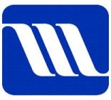
It's not derivative of the Maytag logo, it's not derivitive of the Surface logo. There's a lot of reasons that things come in threes in design, the only reason things came in threes in this design is because it's O - N - 3 - P
The old logo was simply a typeface called "freshbot", a free online font that was chosen when scott was figuring out how to make skis in his garage. after two years of production, it was obvious that ON3P needed a new logo, so we started working on a big rebranding project.
The orignial logo:
http://1.bp.blogspot.com/_73QGQ7xHN5I/TUe0CFfb1CI/AAAAAAAAABs/b85GDB86nxA/s1600/Logo.png[/IMG[
notice the three.
that was identified as a valuable element that people recognized, especially on the base of the original billy goat:
[IMG]http://www.independentgeartest.com/wp-content/uploads/2010/01/phpThumb1.jpg
The logo needed to have similar characteristics. So, I took the shape and the concept of making it a literal "3" and went from there. After a lot of time, this is the construction that I worked up:

It's not derivative of the Maytag logo, it's not derivitive of the Surface logo. There's a lot of reasons that things come in threes in design, the only reason things came in threes in this design is because it's O - N - 3 - P
GreenStezz
Active member
Nice Trever, saw that coming...................


