god damn everyone in poland has NO life...
You are using an out of date browser. It may not display this or other websites correctly.
You should upgrade or use an alternative browser.
You should upgrade or use an alternative browser.
NEWSCHOOLERS DRAWBALL 2 !!!! (New logo) WE NEED EVERYONE!!!
- Thread starter Totes_Magotes
- Start date
bradcoffey
Member
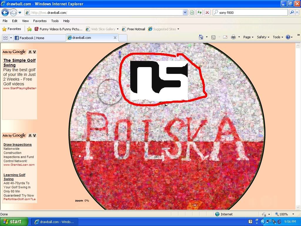
started up a new logo, its in a mint spot
http://two.drawball.com/5zoa694
http://two.drawball.com/5zoa694
carbon.pulse
Active member
Ive tried to start a new one right in the middle. Anyone wanna help?
bradcoffey
Member
or a bigger one herehttp://two.drawball.com/5zoa694
Totes_Magotes
Active member
ATTENTION ALL>!>!>!>! IT'S TIME FOR BIGGER AND BETTER THINGS. BELIEVE IT OR NOT BUT THIS ATTACK WAS A BLESSING. WE CAN NOW START OUR MOST EPIC LOGO EVER!!!
WHO'S WITH ME!!!!
WHO'S WITH ME!!!!
LETS DOMINATE!!!!!
OscarTheGrouch
Member
Lets do it!
Get some.
Get some.
HOLD UP...
we are currently working on 2 different NS logos. EVERYONE DO THE TOP ONE. THE N IS BIGGER!!
we are currently working on 2 different NS logos. EVERYONE DO THE TOP ONE. THE N IS BIGGER!!
Totes_Magotes
Active member
^
i hate having no ink.. lol.
Eh.. well.. might as well destroy swastika BS while i can... maybe we can get those polish guys to help us build a legit ass NS logo if we destroy what they hate? haha
Especially being a buuuunch of polish guys ski.
Especially being a buuuunch of polish guys ski.
Keep up the good work NS! we are rebuilding our logo HUGE this time!!!
SHHHH i'm secretly a pro at drawball.
I say tomorrow we should all just unload on this drawball with an epic NS logo for real... all day... it will be sunday, it will be summer. we will allll be bored. Lets straight up attack this clean slate given to us by the polaks and establish utter dominance.
") ?
?Freeskim@n
Member
cool
Freeskim@n
Member
hey come helping doing the outline. make it about 6 big lines thick. don't start blacking until the outline is completed
Freeskim@n
Member

 and... big.
The_Future
Active member
I just spent 100% ink on it too... starting to be able to see it zoomed out... someone should overlay a ns logo over it so we can see if it's proportional
Kevski
Active member
Perhaps, but we can do adjustments later as well. What matters is that we get it started and slightly distinguishable. Once we are defined and obvious on there we can make it all accurate and nice. But for now all that matters is that we get black ink down and secure our spot I think.
i.am.a.skier.
Active member
thank you
VT_scratch
Active member
just pitched in, keep it goin ns!
the takeover.
the takeover.
the_moderaper
Active member
i darkened the I
dylansiggers
Active member
SO epic!!