New pescado graphics are lame...

I'm prepared for hate but this is genuinely the worst topsheet I've seen in a while. Something about that overlapping font is so annoying, plus the random white cutout in the o and the mismatched tails.

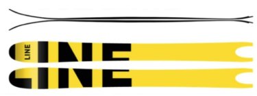
991120.jpeg

991121.jpeg

Bases aren't that much better. Maybe what I'm actually experiencing is Eric Pollard withdrawal (unless he worked on these too, which I doubt). I mean just look at the last two years of pescado...
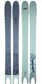
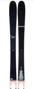
991122.jpeg

991123.jpeg

So beautiful. Is this really what happens when Eric pollard leaves your ski company?
 
I agree. They are much more graphic design oriented and less artistic with the absence of Pollards hand and mind in the design process
 
Theyre not great, and not terrible. It's tough to live up to the long running goat for ski graphics among other things.

Not sure if there was copyright or contract issues but it would have been funny if Line just renamed the Pescado to the Goldfish and had pictures of Goldfish on them as a wink wink nudge nudge or something else silly.
 
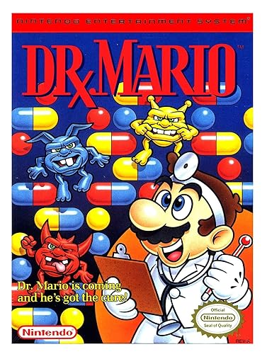
That's cool, they dropped Pollard and picked up Dr. Mario for their graphics design.

814KKHpfrRL._SY500_.jpg
 
Too funny, I had a pair of wood grain topsheet pescados that I took to Japan and I just asked the guy on TGR I sold em too if I could buy them back from him. More for sentimental value but that graphic was awesome.

I think our expectations for the graphic may have been high with the pollard graphics, but let's just be glad it's still being made. Still one of my favorite pow skis ever
 
It's just hard to have a ski that screams Pollard, with boring graphics. I don't think anyone would care if those graphics were on the Visions or any other non-Pollard ski.

I really hope they do a better job on the rest of his skis.
 
Appreciate the feedback here! We knew we had to make some changes in line with Pollard's departure, specifically the skis he worked so hard on. We aren't going to change the Pescado performance-wise, but it wouldn't be right to keep the same Pollard graphic theme going throughout the collection when Pollard is no longer with us. His artwork was and always will be legendary, but we're not going to try to imitate his work, as that simply wouldn't be the right thing to do. We're putting our own flair on this collection going forward.

We're stoked to get some more athletes on the Pescado this season, with Rob Heule, LSM, and Daniel Loosli, among others, that will be helping us with new inspiration and direction for the future.
 
14234903:Line_Skis said:
Appreciate the feedback here! We knew we had to make some changes in line with Pollard's departure, specifically the skis he worked so hard on. We aren't going to change the Pescado performance-wise, but it wouldn't be right to keep the same Pollard graphic theme going throughout the collection when Pollard is no longer with us. His artwork was and always will be legendary, but we're not going to try to imitate his work, as that simply wouldn't be the right thing to do. We're putting our own flair on this collection going forward.

We're stoked to get some more athletes on the Pescado this season, with Rob Heule, LSM, and Daniel Loosli, among others, that will be helping us with new inspiration and direction for the future.

I get that you didn't want to rip off his artwork but did you really have to steal his 4-year-old's crayon art off their fridge for the new design?
 
I commend Line for stepping into new graphic territory. Speaking personally - I am happy to see a change here. I view it to be best practice that if a main person or in this case persons (Pollard and Josh) depart from the brand you have the responsibility as the people who are now working on the brand to change it up. These guys brought a certain esthetic to the company for years and it was great but it is ALWAYS in best interest of the people pushing it to the next to do just that...push it to the next!

You know what would have been lame...for the crew who worked on this to just try and copy what the people did before them.

Cheers Line - You guys killed it. The collection looks solid and I'm really looking forward to seeing what is next.
 
14234922:bradwalters said:
I commend Line for stepping into new graphic territory. Speaking personally - I am happy to see a change here. I view it to be best practice that if a main person or in this case persons (Pollard and Josh) depart from the brand you have the responsibility as the people who are now working on the brand to change it up. These guys brought a certain esthetic to the company for years and it was great but it is ALWAYS in best interest of the people pushing it to the next to do just that...push it to the next!

You know what would have been lame...for the crew who worked on this to just try and copy what the people did before them.

Cheers Line - You guys killed it. The collection looks solid and I'm really looking forward to seeing what is next.

I’m curious as to know how it works when a skier designs a ski, and then leaves the company? I assume under contract, anything that Pollard came up with was Lines property and not his, right? Never really learned a whole lot about this side of the industry, would be interesting to hear
 
14235055:animator said:
I’m curious as to know how it works when a skier designs a ski, and then leaves the company? I assume under contract, anything that Pollard came up with was Lines property and not his, right? Never really learned a whole lot about this side of the industry, would be interesting to hear

In this case, Line's property for sure. Anything that an artist does, or an athlete does in contract becomes the property of the company unless they negotiate otherwise. Which is possible but we don't need to get into that. It's long winded and I think too much info for this.

Saying personally, anything that I do as an internal employee is then property of K2. Same with anyone that I have do freelance art, within reason, unless they negotiate as I mentioned.

Plus, these skis aren't just made by an athlete, an artist, or any one person. Countless people from engineers, internal artists, factory workers, and everyone in between are a HUUUUGE part of the process if not more of the process than the athlete themselves.
 
14235116:Dan-Man said:
What happened too Eric Pollard doing this art for the graphics?

Is Pollard not on LINE anymore?

How's life under the rock your living in?

Yeah EP left LINE and started season eqpt. a little while ago
 
I really like the new graphics, and the pescado lettering on the front. Not as much a fan of the new sakana
 
14234903:Line_Skis said:
Appreciate the feedback here! We knew we had to make some changes in line with Pollard's departure, specifically the skis he worked so hard on. We aren't going to change the Pescado performance-wise, but it wouldn't be right to keep the same Pollard graphic theme going throughout the collection when Pollard is no longer with us. His artwork was and always will be legendary, but we're not going to try to imitate his work, as that simply wouldn't be the right thing to do. We're putting our own flair on this collection going forward.

We're stoked to get some more athletes on the Pescado this season, with Rob Heule, LSM, and Daniel Loosli, among others, that will be helping us with new inspiration and direction for the future.

Thanks for the response! I know y’all are trying hard over there, but I’ve gotta agree with this thread. The last two years graphics on the pescado have pretty much prevented me from buying this ski. Totally get that you’ve gotta part ways with Pollard’s artwork, but just please slap a pretty top sheet on the peacado next season! I really want to buy a pair and sadly i just can’t drop the cash if I hate the graphic. (The colors are the true problem. The light green/blue and bright yellow are unfortunate looking.)

Thank you for making the funniest skis tho!!!
 
I have 2020 and 2021 pescados if anyone local wants a pair :p I like the 2020 more, but the 2021 deal with binders was just too good... just need to figure out skins on them,

2020 looks WAY better than 2021 though.
 
It makes me kinda sad that he left line and started his own company, just to not make any graphics for them. Now theres 2 brands with shit graphics
 
14283833:Piss_Boy said:
It makes me kinda sad that he left line and started his own company, just to not make any graphics for them. Now theres 2 brands with shit graphics

Did you read the reasoning behind the basic graphics on the Season Eqpt and you’re just hating or did you not read it? If you didn’t, here’s the lowdown.

EP founded Season Eqpt with a massive focus on sustainability. The reason that the graphics are basic are essentially to counter the terrible 1 year rotation that the ski industry goes through. For example, when K2 changes the Reckoner 102 from this years orange/black/grey to the 21/22 purple/blue graphic, that means that the 20/21 graphic becomes, “last years ski.” This forces retailers to cut the prices in order to sell the skis, because consumers would most likely rather purchase the ski with the new graphic if they are both the same price.

Aside from offering lifetime service on Season skis and boards, keeping the graphics simple offers a clean, timeless look that will not change year to year and therefore can remain at the MAP price without retailers (and Season themselves) needing to worry about cutting prices and making less money just because of changing graphics.

Hope this helps anyone else wondering.
 
14284442:animator said:
Did you read the reasoning behind the basic graphics on the Season Eqpt and you’re just hating or did you not read it? If you didn’t, here’s the lowdown.

EP founded Season Eqpt with a massive focus on sustainability. The reason that the graphics are basic are essentially to counter the terrible 1 year rotation that the ski industry goes through. For example, when K2 changes the Reckoner 102 from this years orange/black/grey to the 21/22 purple/blue graphic, that means that the 20/21 graphic becomes, “last years ski.” This forces retailers to cut the prices in order to sell the skis, because consumers would most likely rather purchase the ski with the new graphic if they are both the same price.

Aside from offering lifetime service on Season skis and boards, keeping the graphics simple offers a clean, timeless look that will not change year to year and therefore can remain at the MAP price without retailers (and Season themselves) needing to worry about cutting prices and making less money just because of changing graphics.

Hope this helps anyone else wondering.

I guess i wasnt trying to hate super much but like, I dont see why the same effect couldnt be had with an actual graphic, why does it have to be pretty much all black?
 
14284513:Piss_Boy said:
I guess i wasnt trying to hate super much but like, I dont see why the same effect couldnt be had with an actual graphic, why does it have to be pretty much all black?

If it was a typical pollard piece (like we used to see on the Sakana Pescado Bacon etc) people would expect different art and colors every season because they have adapted to the one year model
 
Back
Top