MX photo Critique? +k

BolderPro

Member
Hey guys, So I just got back from a day trip to my local track did a lil ridin' myself and then got my camera out and took pictures of people that wanted them. I will give them to them for free because I am relatively new to photography and am not all together confident in my abilities. But ill throw a water mark on em and might use some of them for advertisement on my own crew.

So I'm thinking these pictures are decent but after looking at them for hours I am hesitant on the editing as well as composition of some of them... So if you guys could give me some critiscm on them and hook me up with some advice that would be great!!!

Some of them go for more of an artsy style, and others are meant just to show the riders style, line, etc.

so with all that here they are: http://www.flickr.com/photos/77138322@N05/sets/72157630054253262/

I also resized a couple to put on here but decided that i could easily throw all of em up onto flickr so please check them out there but here are a couple...
480543.jpeg

480542.jpeg

480544.jpeg

 
i dont know why you think you could have done much better. i love them all. the only thing that could have made some better was if they were zoomed in or out a little more but other than that the were amazing i thought

 
Thanks!! Yea don't get me wrong I'm sure i couldn't do any better and i love the way they turned out but when I spend too much time looking at them, editing, etc i over think the pictures themselves ya Knoand on the zooming, I cropped a lot of them but did not always like the way they looked cropped so i had to sometimes leave them in the full size
 
i liked a lot of them, some good shots in there. try to stay away from cropping them and not keeping the same aspect ratio though.
 
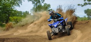
I think the best one is the cropped in atv picture it did a great job of showing motion with the quad out sideways and the big spray coming out the back
 
Thanks guys!also i hear a lot of people saying to stay away from cropping out of the original aspect range and i usually follow this, but what does it really do? I know when you go to print it will be off but why can't you print it onto the full size image paper and then cut the image out?
 
i hate how kind this forum is, M/A needs to be more like skateperception.

here is an honest critique.

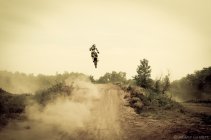
the first one has a weird tint and is too centered. the straight behind angle isn't doing much for me, there is no context as to how big the jump is.

the others two have some flaws as well. way too tight of a comp. and not having the original aspect ratio always bugs me. they have good colours and the focus is on point, your post work is killing them though.

 
i agree with #1, sort of

i'm sort of okay with the colors, the comp does nothing for me

If you are shooting wide, ask yourself if shooting that way adds anything, in this case it isn't adding much context. So shoot it tighter. Also, it being shot from behind doesn't work very well; you can get away with this sometimes, but it would have been a much stronger image if it was shot from the fron and tighter.

I agree with the processing of #2, a little bit over done. The crop is a little bit too tight, give it a bit more room on the top and bottom. Changing the aspect ratio doesn't bug me that much.

I wish this one had more movement like #3

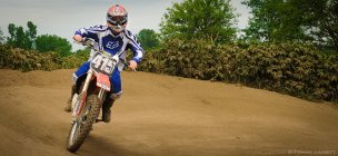
#3 is a nice shot, definitely the best of the set, it shows the movement well. The processing on this one is the best of the 3.

Maybe try and lighten up the face a little bit in post.
 
This is the stuff I've been waiting for!!! Thanks I totally know there are a lot of flaws some avoidable some not, i said that in the op so with that in mind i was looking for pretty rough critiques

I totally agree that shooting from the back does not always work, but this was in a jump line and the sides of the jumps were very overgrown and they were step ups so i couldn't even get up to the top because riders were already pissed i was even on the track let alone if i would of ran up the takeoff to get to the top

The main thing i want to fix that is fixable is the crops I lightened up the face with the adjustment brush in lightroom by .5 exposure so I'm not sure i can go any lighter on that besides maybe the eyes

Thanks for the advise i will definitely try to get in closer/ Not crop so tight
 
"Dude, I don't know shit all about photography but I like it." Haha, I can't take M/A photography stuff seriously, it's just terrible, you kids only ever shoot video. The photo cult is so much better. Also I just have to say this, a video DLSR setup and a photo DSLR setup are in no ways similar at all, t2i is a pretty lousy photo camera, 1d2n/30-50d/5dc + primes all day.

As for a critique Jason (VC) nailed it. Context is extremely important in action sports photography, the viewer has to be able to tell where the rider took off, what trick he is doing, and where he is going to land. The first one is way to centred and has a really weird tint, it looks like some quadruple filtered instagram bull shit. I don't mind the 16x9 type crop on landscapes or architecture but for action sports it's a definite no-no, again, by cropping in your taking the context out of the photograph. We've all seen those newspaper skate photo's where the kid is just floating in the air with nothing else in the photo, who the heck did he get there? The second one is kinda boring, not much going on, I would have taken it a bit earlier as he was earlier in the turn. The third one has a great dirt spray, my favourite of the three, and the crop isn't terrible, but I would have like it more if it was native 2x3.

I also agree with Jason that your post is killing the photos. It looks like you went way to far on the contrast and clarity sliders in lightroom. A photograph, at least in my opinion, shouldn't look crunchy, I'm a way bigger fan of softer, low contrast, flash+ambient action photos. If you want crazy colours and film burns shoot some expired film in a dinky P&S, trust me, it looks 100000x better than the digital bull shit version.
 
Thanks for actually helping me out! I did what you said and got rid of the tint and made it less centered while following original aspect ratio and i redid the 2nd one and did very little editing idk if there any better but...

480946.jpeg

480947.jpeg

 
i like the first more, it looks better with the foreground. i still don't like how the second is shot, PP isn't going to change that.
 
i hate the way the second one (first in the OP) looks now, it's boring. i actually really liked it before. the vignette effect was a little strong, but i still preferred the grading the first time around. i also didn't mind the framing; the lack of context gave it a sense of jumping into the unknown, which i would imagine is kind of how it is when youre coming up to a jump like that for the first time. there could definitely be less headroom though.

the first one (second in the OP) looks much better. the original crop is weird for photo imo; it feels like a still frame from a video. it's a really sick shot without the crop.

the crop actually worked well for your third shot in the OP, but it still felt like a still frame from a vid. this pic was my favorite of the three though. a higher shutter speed would have made it better.
 
one more critique now that you've showed the original, rule of thirds. learn it, use it, become a better photographer because of it.
 
Thanks errybody!I thought id throw this shot i dug out from earlier this season to show that first jump (in the op) from a I Know this one is really bad but i have done almost no editing on it and composition is far from ideal but its just a different angle:

480993.jpeg

As well as here is the first shot with less vignette but still with the grade:

480994.jpeg

 
Back
Top