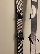
Dazzle camo Jeff 96 + Harlaut Pivots size upgrade

whatsamonad

Member
Got these babies in 186. I currently have a pair in 181, so I’m gonna ski both to see if longer really is better for me (I’m 6’).

The 181s feel great but I’m more of a high speed charger. Even though I’m on the lighter side (145 lbs), since these are mounted pretty forward and so heavily rocketed I feel like I can benefit from the extra 5cm.

Who couldn’t use an extra 5cm? I know my girlfriend could too

The dazzle camo + Harlaut Pivot 15s is ?
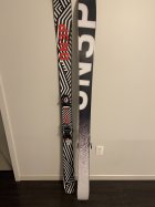
1034610.jpeg

1034611.jpeg
 
14407262:WI_skiSour said:
Those are pretty tight.

And I'm probably in the minority that doesn't think ON3Ps look particularly all that good.

yeah, i think some definitely don't hit for me. But you can't tell me the 2016 kartel isn't the best graphic oat
 
14407349:BearsOnKetamine said:
This is just me but I need the under glow from the green

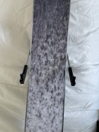
Disappointed in the team black bases tbh. They fit the colors but the gradient is really low resolution in person, like someone blew up a tiny JPEG. Idk if other bases look like this but it’s pretty shit looking
 
14407373:whatsamonad said:
Disappointed in the team black bases tbh. They fit the colors but the gradient is really low resolution in person, like someone blew up a tiny JPEG. Idk if other bases look like this but it’s pretty shit looking

Good to know I was thinking abt getting mangos. Does anyone know if the duck camo is a good print?
 
14407376:BearsOnKetamine said:
Good to know I was thinking abt getting mangos. Does anyone know if the duck camo is a good print?

Pictures of the duck camo look sick, I hope it’s not low quality like this
 
14407385:BearsOnKetamine said:
I’m sure u could talk to them abt it but they’re bases idk if it matters that much

Yeah I regularly emailed them, I’m sure you could too. Probably just these bases which look like this on purpose, I just think they look very shitty
 
14407373:whatsamonad said:
Disappointed in the team black bases tbh. They fit the colors but the gradient is really low resolution in person, like someone blew up a tiny JPEG. Idk if other bases look like this but it’s pretty shit looking

If they intended the gradient to change more smoothly then they would have done so. It's clearly not the intent.
 
14407418:Session said:
If they intended the gradient to change more smoothly then they would have done so. It's clearly not the intent.

Sorry maybe I didn’t write what I didn’t like about it very clearly.

The pattern is fine, I like the rough gradient thing. However, the particles themselves are really low quality. It looks extremely blurry and the graphic isn’t sharp. Here’s a close up picture, you can see the entire graphic is blurry.

Now I’m not saying it’s their fault, it probably is supposed to look like that. I didn’t realize it would be all blurry from the picture and think it looks bad in person tho.

1034714.jpeg
 
14407376:BearsOnKetamine said:
Good to know I was thinking abt getting mangos. Does anyone know if the duck camo is a good print?

I’ve seen it in person, it was okay but sleet camo looked better IMO. Also you can get a ton of last graphics too by emailing them

14407466:whatsamonad said:
Sorry maybe I didn’t write what I didn’t like about it very clearly.

The pattern is fine, I like the rough gradient thing. However, the particles themselves are really low quality. It looks extremely blurry and the graphic isn’t sharp. Here’s a close up picture, you can see the entire graphic is blurry.

Now I’m not saying it’s their fault, it probably is supposed to look like that. I didn’t realize it would be all blurry from the picture and think it looks bad in person tho.

View attachment 1034714

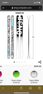
1034718.png

Pic def looks a bit different
 
All sublimated based will look soft and lose definition upon close inspection as the graphic is going thru almost 2mm of opaque UHMW - which isn't clear like a 0.5mm nylon topsheet. Also why dark colors like black won't seem fully saturated, as there is plastic with light passing thru it above them. Same on every sublimated base.

It is why base graphics tend to stick to more basic patterns/colors.

Sorry to hear that you aren't stoked on the look, but it has nothing to do with the quality of the design assets. Just that there are limits to what sort of detail can make it through 2mm of UHMW.
 
14407502:iggyskier said:
All sublimated based will look soft and lose definition upon close inspection as the graphic is going thru almost 2mm of opaque UHMW - which isn't clear like a 0.5mm nylon topsheet. Also why dark colors like black won't seem fully saturated, as there is plastic with light passing thru it above them. Same on every sublimated base.

It is why base graphics tend to stick to more basic patterns/colors.

Sorry to hear that you aren't stoked on the look, but it has nothing to do with the quality of the design assets. Just that there are limits to what sort of detail can make it through 2mm of UHMW.

Thanks for the response! Honestly I really don’t care that much since it’s the bases and the ON3P logo on the base still looks great, just wasn’t what I expected.

Skis are still heat and I love the Dazzle camo. Surprised I haven’t seen more customs with that top sheet.

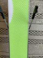
Did the base material change? Or maybe it’s just the black white combo? Because my Magnus 90’s from a few years ago with the classic green have bases where the pattern looks much more sharp, which is what I was comparing these to. Pic attached

1034726.jpeg
 
14407515:whatsamonad said:
Thanks for the response! Honestly I really don’t care that much since it’s the bases and the ON3P logo on the base still looks great, just wasn’t what I expected.

Skis are still heat and I love the Dazzle camo. Surprised I haven’t seen more customs with that top sheet.

Did the base material change? Or maybe it’s just the black white combo? Because my Magnus 90’s from a few years ago with the classic green have bases where the pattern looks much more sharp, which is what I was comparing these to. Pic attached

View attachment 1034726

Same base material. It has to do with the variation in the graphic process.

The green is screen printed - so you have colored epoxy ink that sit on the backside of the base. Those lines thus stay tight and the color is spread across the base flat. If you saw it from the other side, you would notice it looks sharper (and much brighter) as well, but because if it sitting on the back - and not within the plastic - it looks a bit cleaner.

All the other bases are sublimated - essentially we're heating the ink under pressure to the point that it becomes a gas and it transfers from the sublimation paper into the base itself. The ink then sits within the material itself - vs on top of it - and in a thicker material like UMHW you get a bit of colors bleeding together as the gases move into the material. It makes any color transitions look a bit soft.

Sublimation allows us to sublimate whatever we want - where screenprinting has limited both in terms of what you can apply and the economy of scale. Some bases - like the team graphics - would be a bit clearer as a screen print, but to produce them through that process we would need to carry hundred of units of each base graphic. And that process would make it so we couldn't do custom bases like the GrizzlyCorn, the new Point Break base coming soon, etc - that are only available through sublimation or UV.
 
14407529:iggyskier said:
Same base material. It has to do with the variation in the graphic process.

The green is screen printed - so you have colored epoxy ink that sit on the backside of the base. Those lines thus stay tight and the color is spread across the base flat. If you saw it from the other side, you would notice it looks sharper (and much brighter) as well, but because if it sitting on the back - and not within the plastic - it looks a bit cleaner.

All the other bases are sublimated - essentially we're heating the ink under pressure to the point that it becomes a gas and it transfers from the sublimation paper into the base itself. The ink then sits within the material itself - vs on top of it - and in a thicker material like UMHW you get a bit of colors bleeding together as the gases move into the material. It makes any color transitions look a bit soft.

Sublimation allows us to sublimate whatever we want - where screenprinting has limited both in terms of what you can apply and the economy of scale. Some bases - like the team graphics - would be a bit clearer as a screen print, but to produce them through that process we would need to carry hundred of units of each base graphic. And that process would make it so we couldn't do custom bases like the GrizzlyCorn, the new Point Break base coming soon, etc - that are only available through sublimation or UV.

Thanks for the explanation, that’s pretty interesting.

At the end of the day I really don’t think base graphics are a big deal, and it makes sense given the different process. Still super excited about the skis
 
Update on the length:

NS bamboozled me, turns out linger isn’t always better lmao. After a few days of skiing these on and off, they are definitely too long. Even on hard groomers I just can’t carve them comfortably. I feel the length in both the tip and tail. I’ll be selling them.

Important lesson to be learned here is that weight matters. Im 6’+ but only 145 lbs, and I just don’t have the weight to drive these. Will be sad to see them go :(

**This post was edited on Mar 22nd 2022 at 12:54:41pm

**This post was edited on Mar 22nd 2022 at 12:55:10pm
 
Back
Top